AMITA Health
BOLINGBROOK, IL
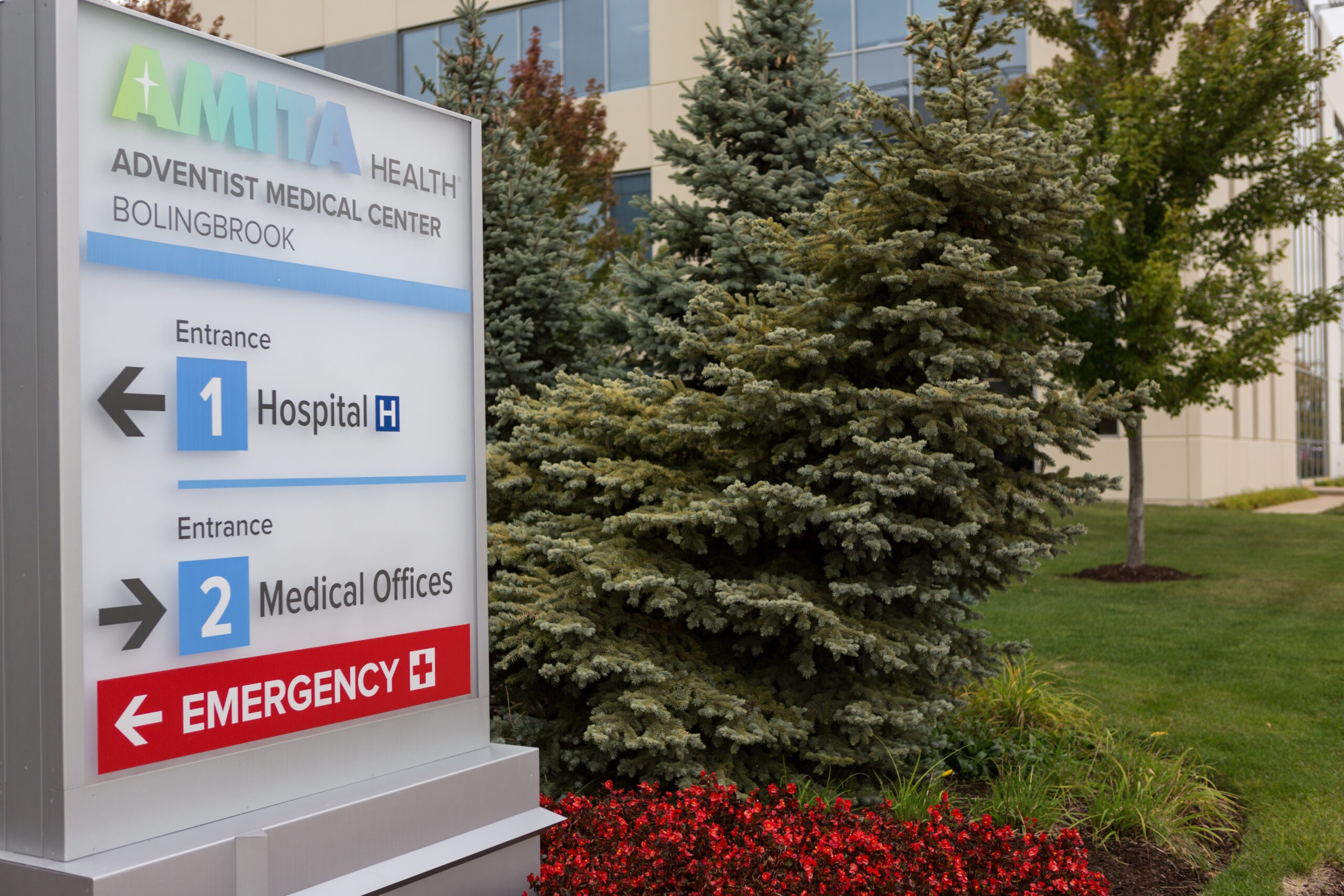
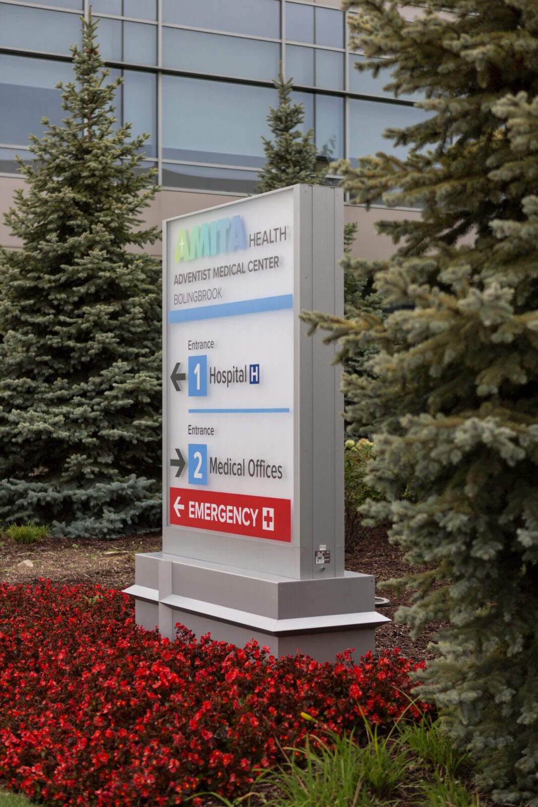
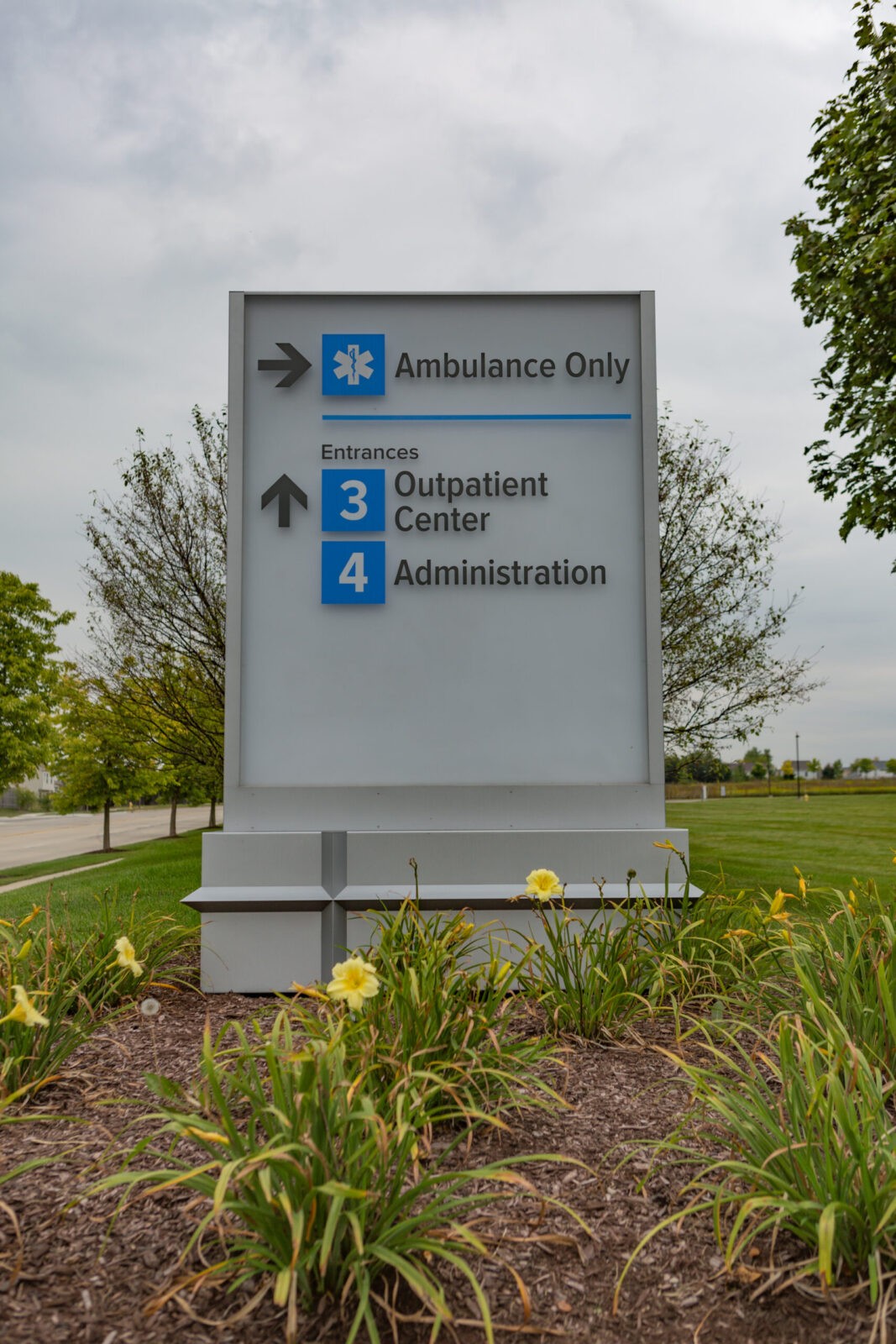
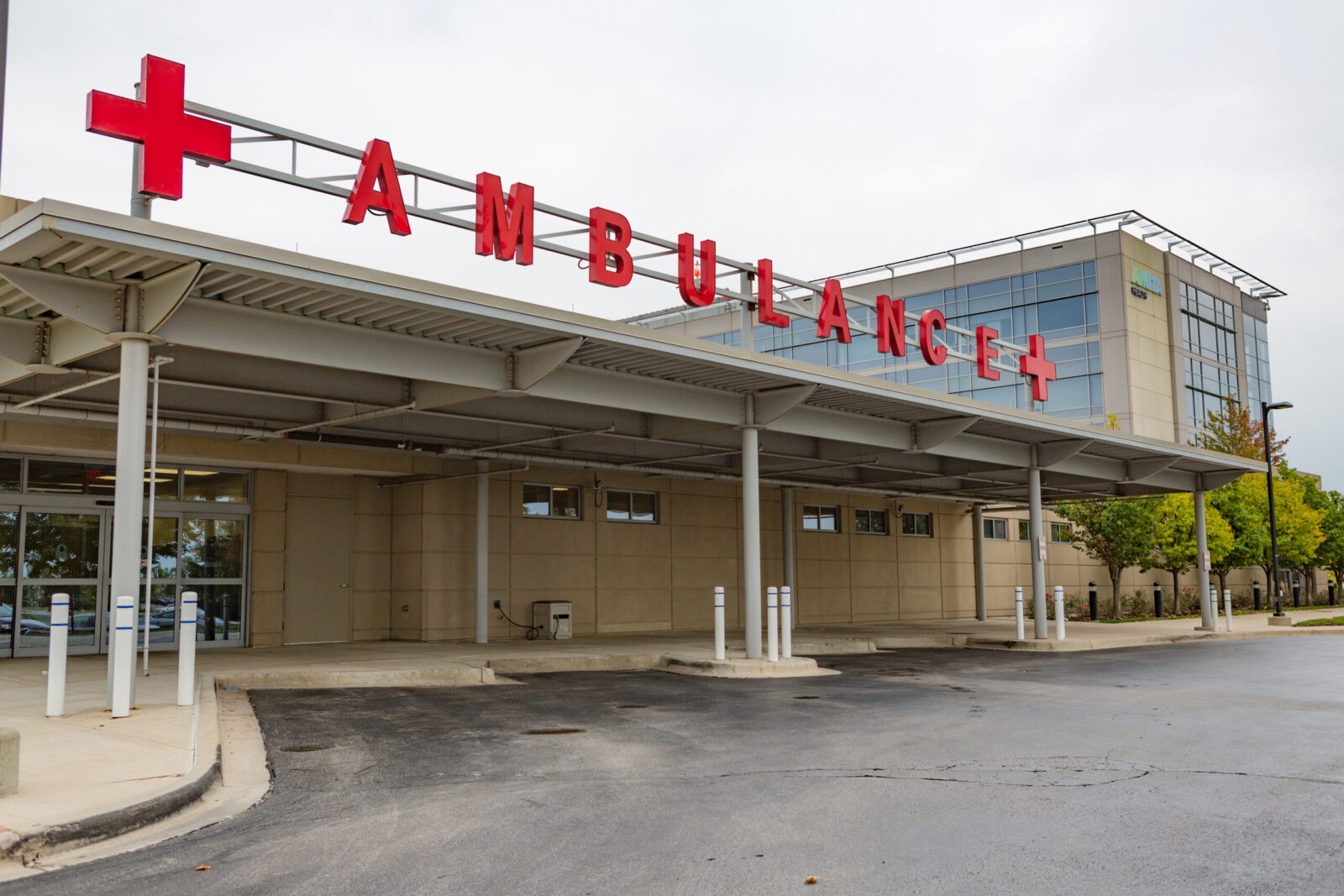
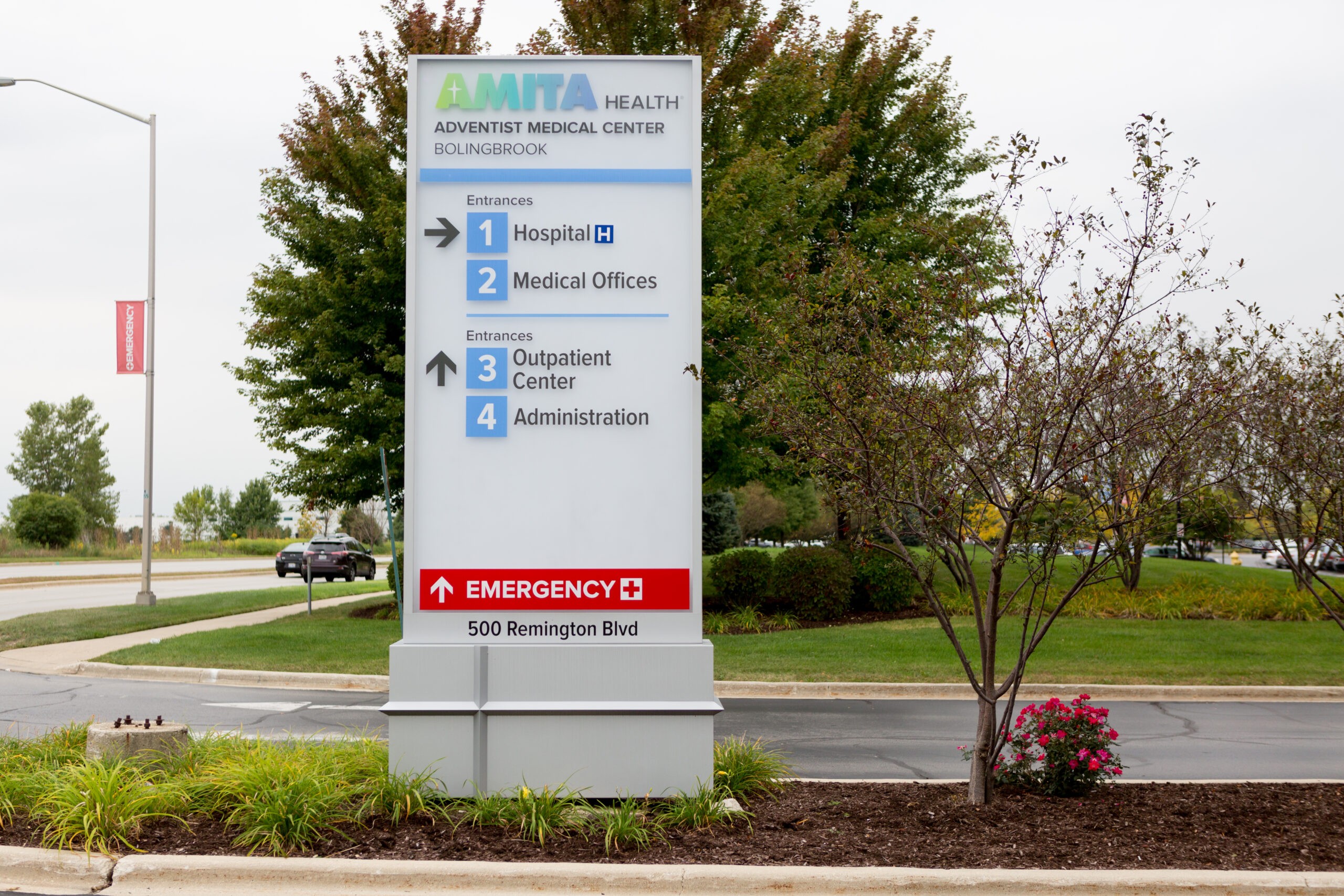
Two well-known and loved suburban Chicago healthcare systems merged to create the entirely new brand of AMITA Health. To alleviate patient confusion as their care may now lead them across multiple campuses and buildings of both previous organizations, Forcade developed a cohesive and contemporary exterior wayfinding system for all locations. The signage provides patients with clear and simple guidance as well as an introduction to the new patient-first AMITA Health brand.

The name AMITA was inspired by words from several languages that translate to the patient experience the new organization seeks to provide, including friendship, honesty and boundlessness. To ensure our exterior experience complemented the overarching patient experience we started the design process by gathering insights from all internal user groups, all the way from on-the-ground facility managers to corporate stakeholders. We also worked hand-in-hand in this effort with the internal AMITA Health marketing team and their branding agency.
Collaborating to gather an in-depth perspective about the new brand from those who built it and those who are bringing it to life inspired our design thinking. The most important element had to be providing patients and visitors with a positive experience before they walked into a door.
This insight led us to use a positive guidance model to wayfinding. We developed a “speakability” for the campuses that give people a clear sense of direction and better sense of place no matter which location they are at. Most importantly, it provides patients with a positive experience, helping to immediately alleviate the stress that often comes with arriving at a healthcare facility.

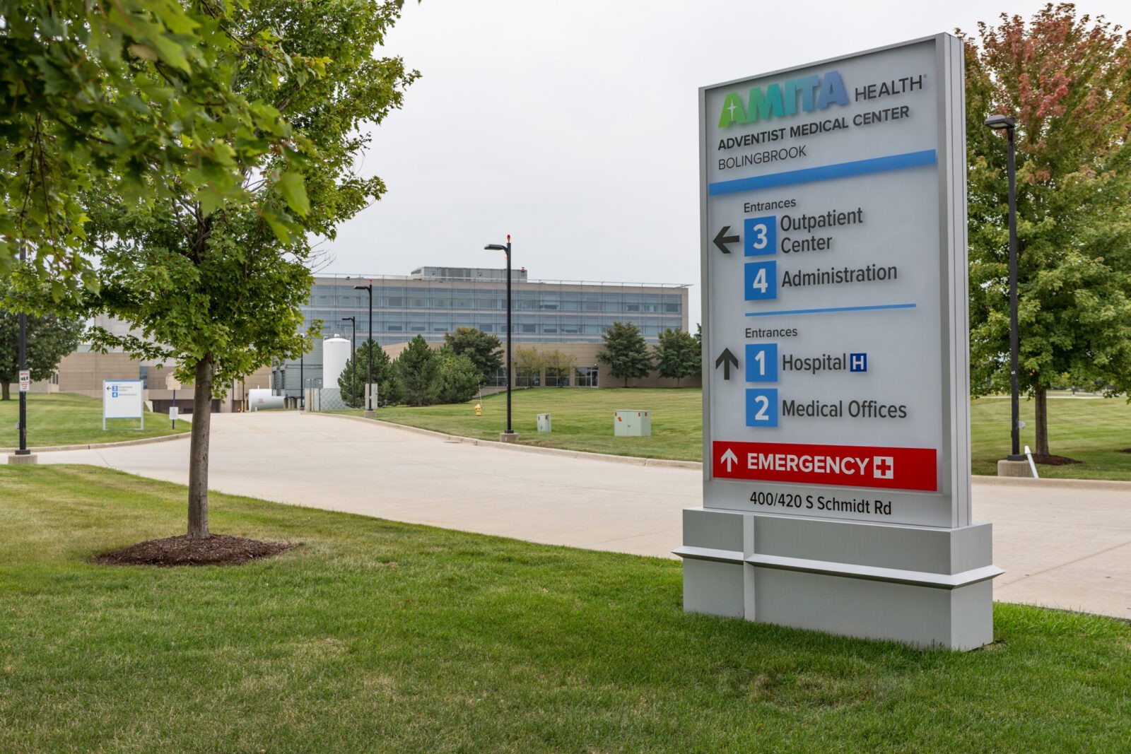
To instill a comforting feeling of familiarity across every location, we used the same vocabulary in the materials and overall design aesthetic. The first impression is a consistent architectural graphic that greets visitors, providing a reassuring sense of sameness as patients continue their health journey across different AMITA Health facilities.
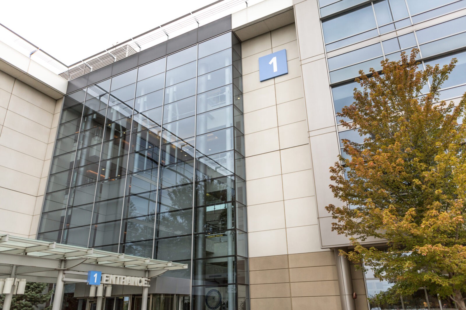
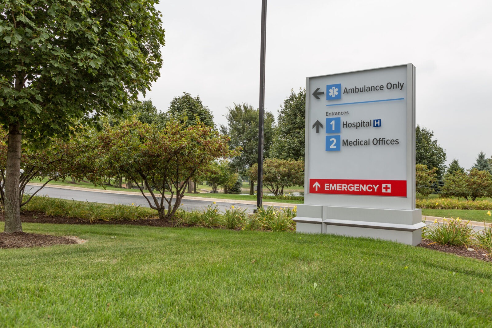
As they move beyond each property entrance graphic, visitors are clearly guided by numbers that we developed as the landmarks for the facilities. We gave everything a numerical order based on hierarchy to ensure the arrival experience was built on an easy-to-follow and find system.
Additionally, we purposefully spread the wayfinding information out, giving people just what they need at the right time, so they aren’t overburdened and overwhelmed even before they enter the front door.

One of the largest challenges of this project was completing the exterior wayfinding design for nine hospitals in just 12 months – from start to finish. This required an additional layer of agility and added speed-to-market to the decision-making process.
We closely partnered with MC Group | Icon, a nationally recognized signage manufacturer with nearly a century of experience, to meet the demands of the rapid pace of the project. Sharing responsibility in city approvals, permitting and more allowed us to parallel path design, manufacturing and installation.
In addition to creating seamless, efficient partnerships, we also built full-scale mockups. Bringing proof of concept into the field made sure what was designed worked in the real world, alleviating time spent making revisions in the manufacturing and installation processes.


Even with a near-impossible deadline and the challenge of creating a singular design vocabulary across disparate locations, we still obsessed over every detail. At first glance, simple signage and numbers seem like a pleasant wayfinding experience, but hidden in the design are elements that evoke the friendly, boundless philosophy of the new brand. This creates not only a sense of place for patients, but also a sense of purpose, which illuminates the reason they chose AMITA Health. Another hidden element we built into the design is that all signage is easy to maintain and interchangeable, allowing the system to efficiently evolve as AMITA Health continues to evolve.


