
Community Health Network Hospital Rebrand
INDIANAPOLIS, INDIANA
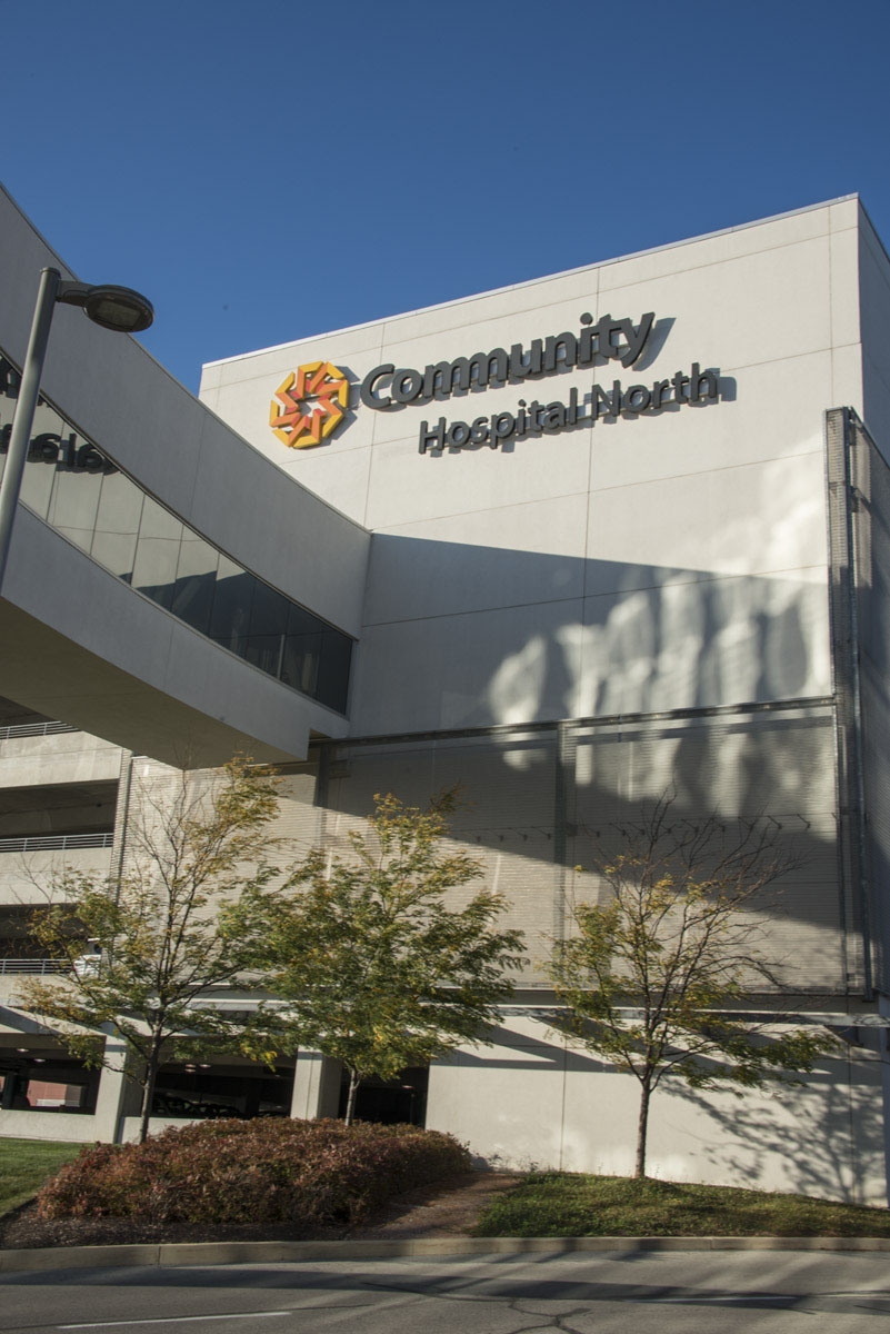
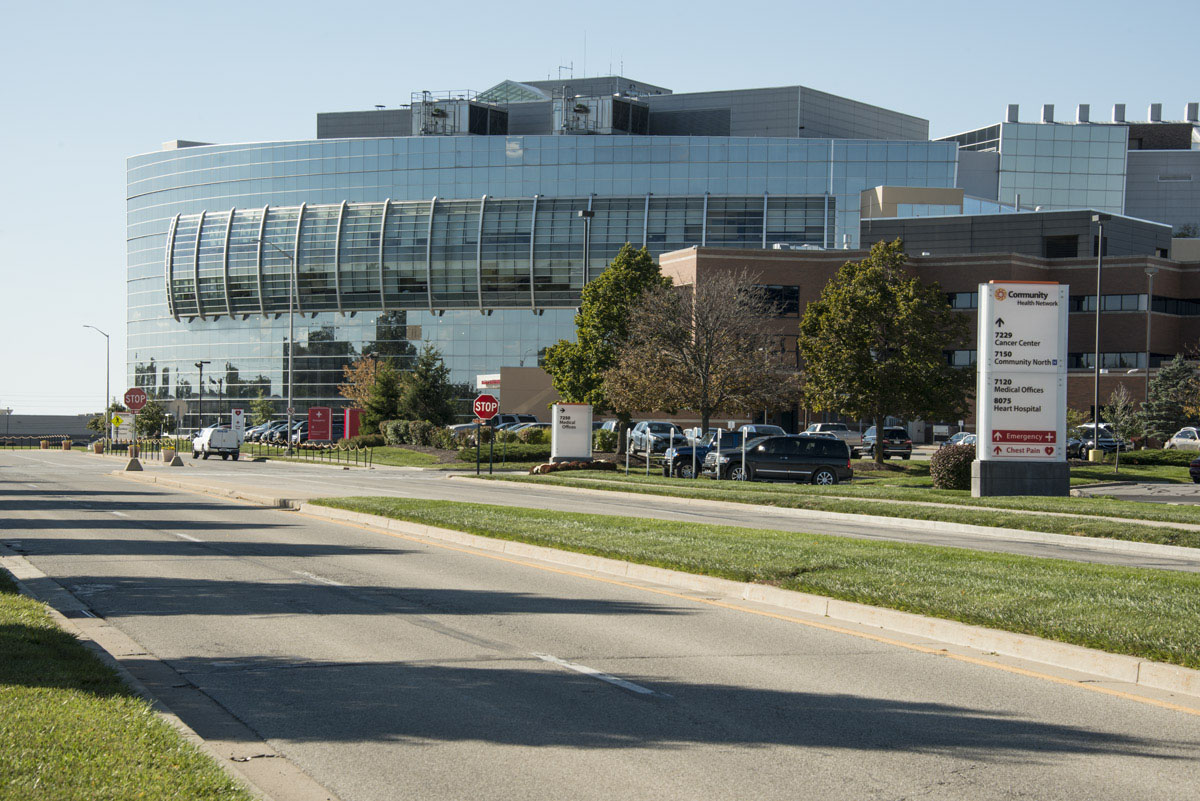
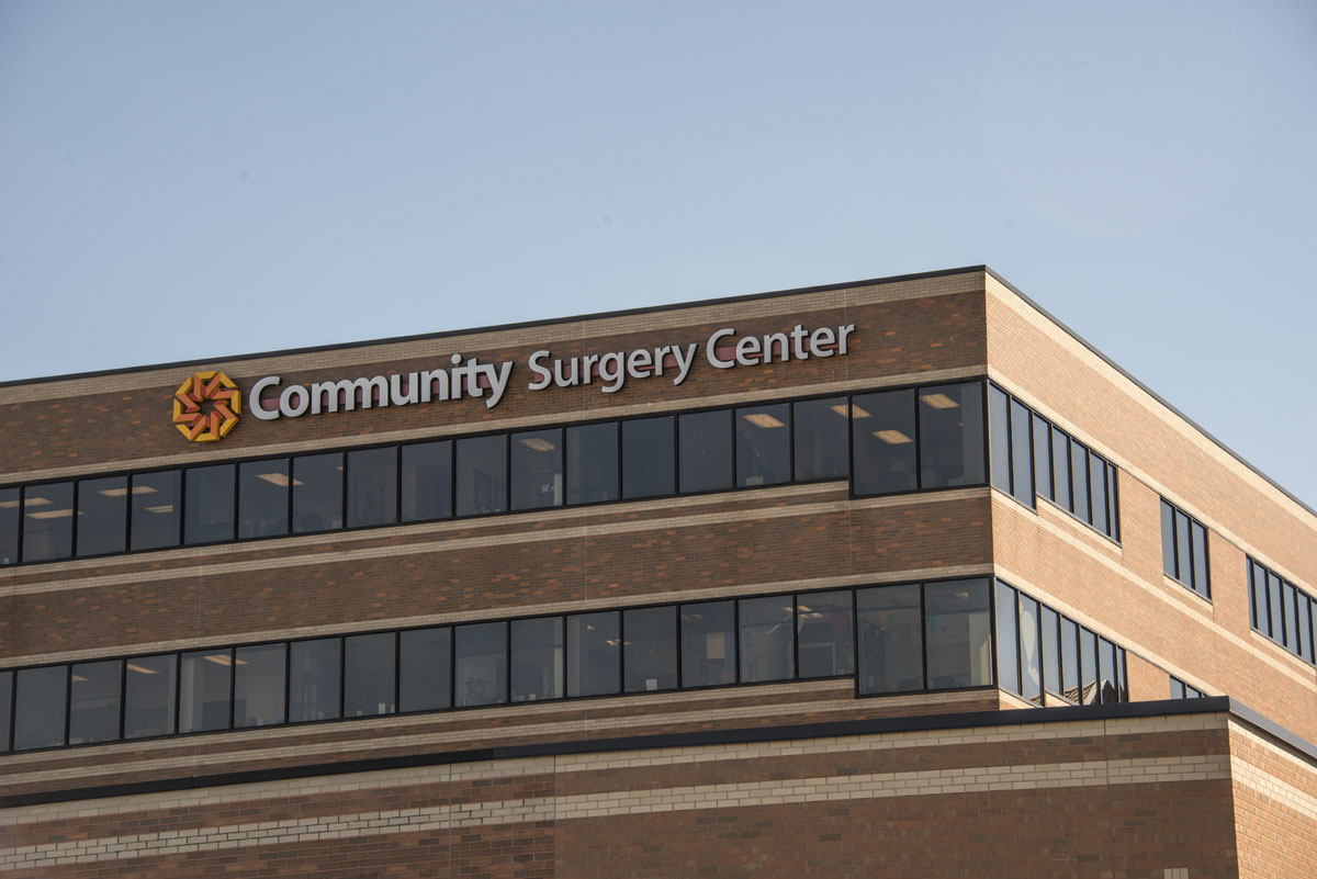
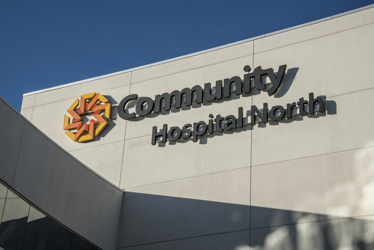
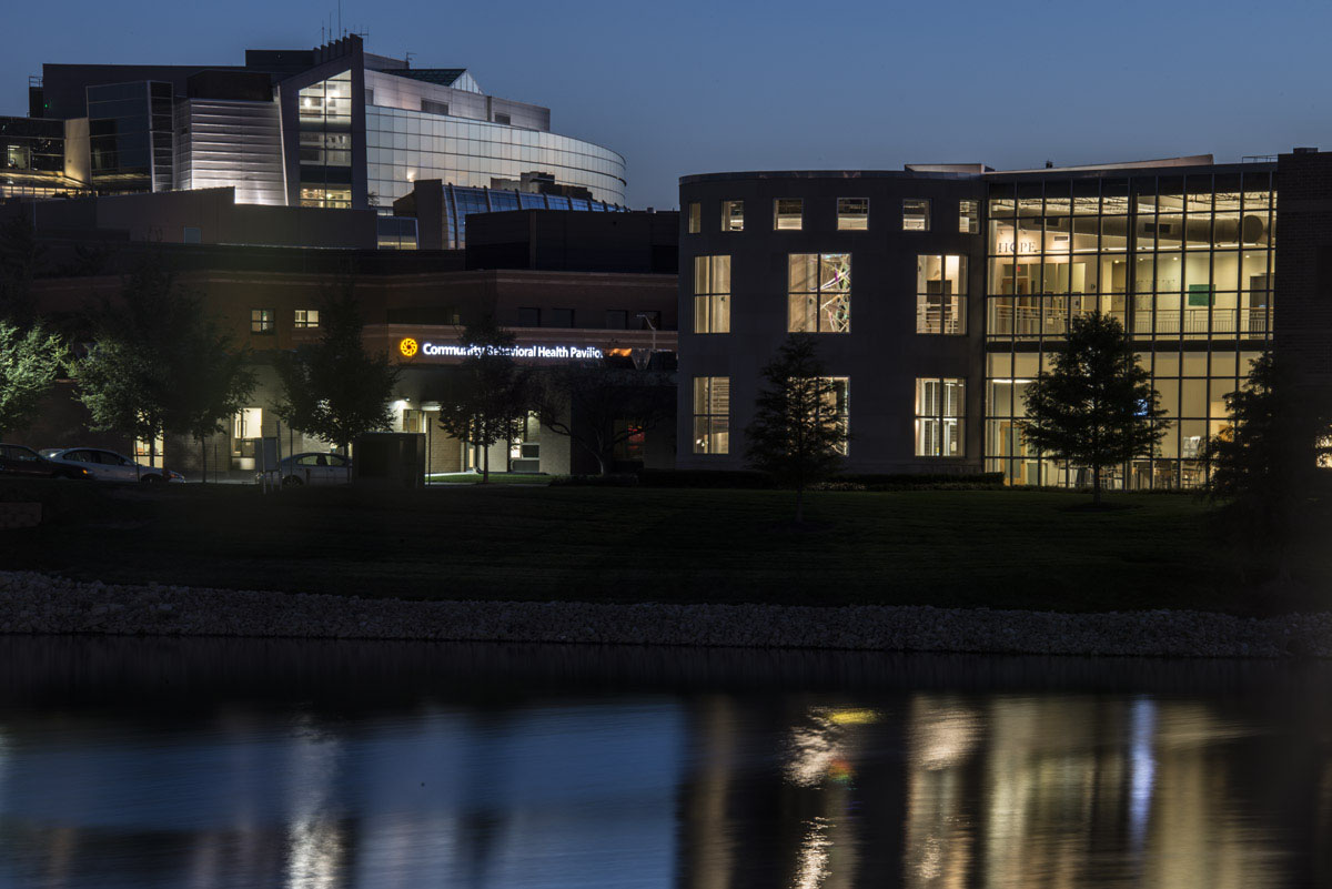
Community Health Network embarked on an ambitious plan to rebrand all of its properties, unifying 350 separate locations under a new compelling and cohesive visual identity. This extensive effort included five hospitals, 11 pavilions, four campus retrofits, their entire physician network and multiple med check and ambulatory centers.
Forcade was hired to develop an extensive signage and wayfinding plan for this enormous hospital rebrand. The project spanned 2½ years and required collaborating with six different fabricators to fully bring the brand to life across the entire network.
A healthcare design project of this magnitude required proactive planning to ensure it was implemented both effectively and efficiently. We collaborated early and closely with the marketing team and C-suite, making sure all decision makers were always informed and continuously in agreement throughout the multi-year effort. We worked together as a cohesive team to test and develop all facets of the signage and wayfinding system, which helped to eliminate any surprises that could disrupt the deadlines or balloon the budget. Range of Magnitude pricing was also developed, allowing the team to review and readdress individual budget parameters at critical points throughout the project.

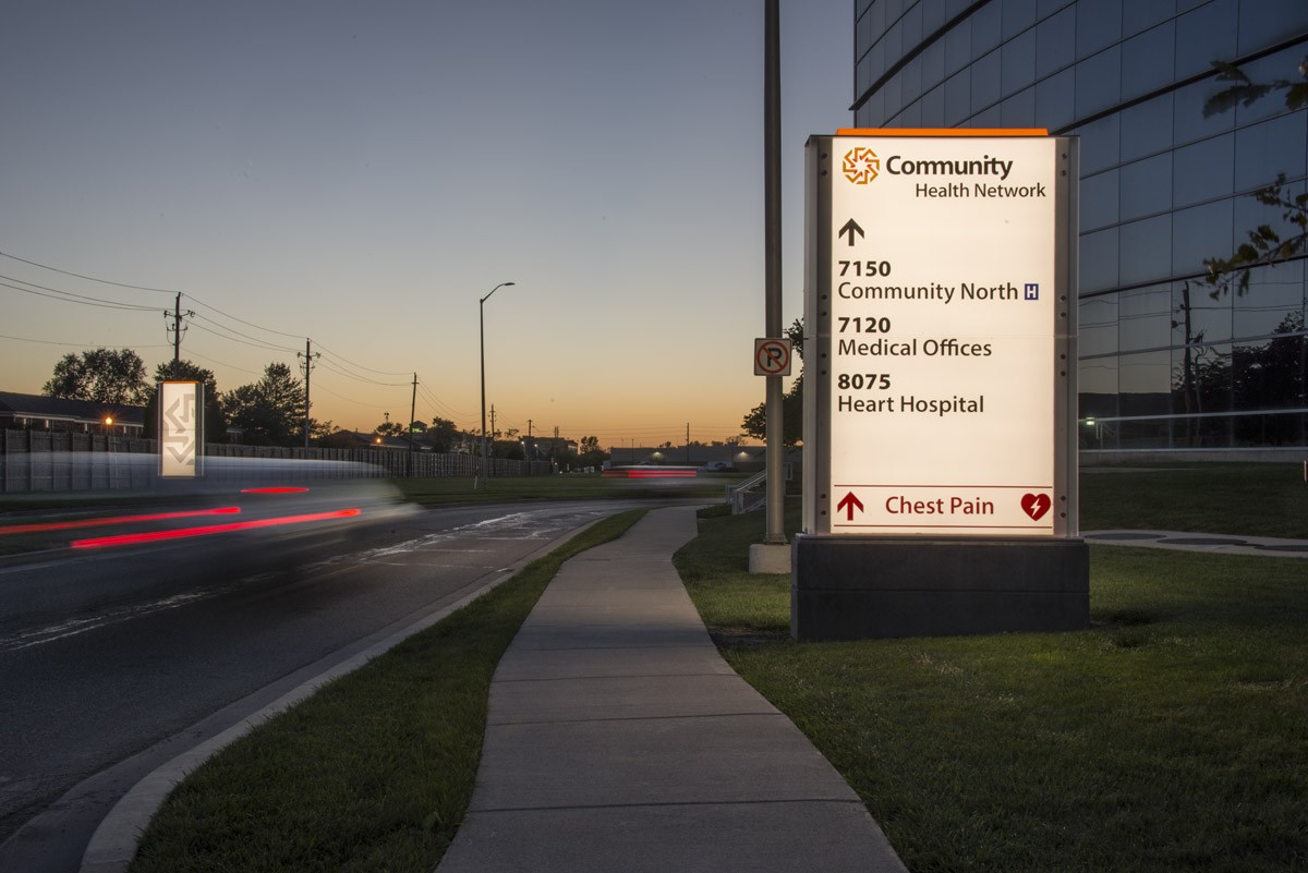
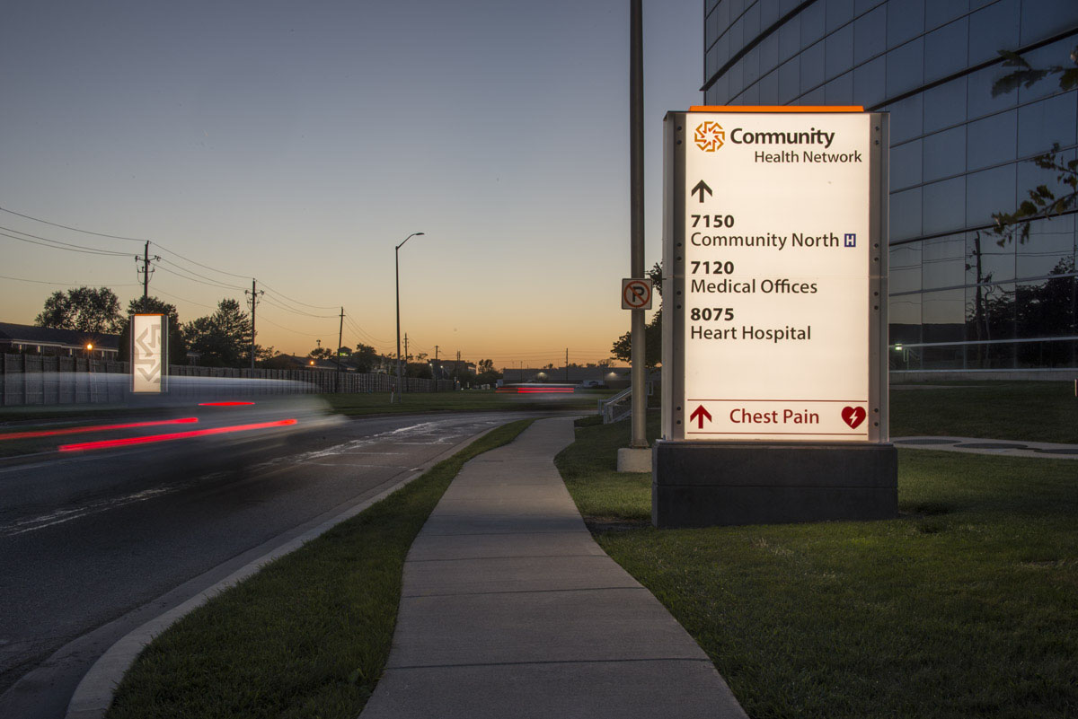
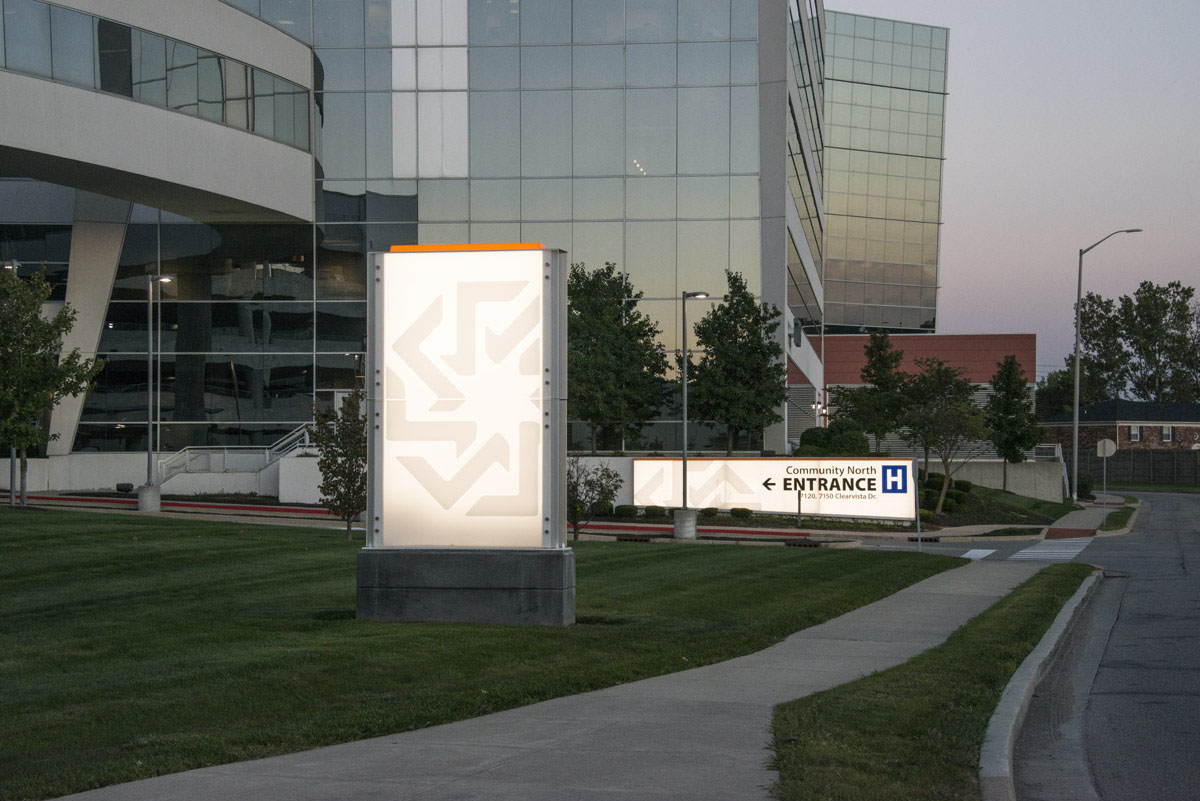
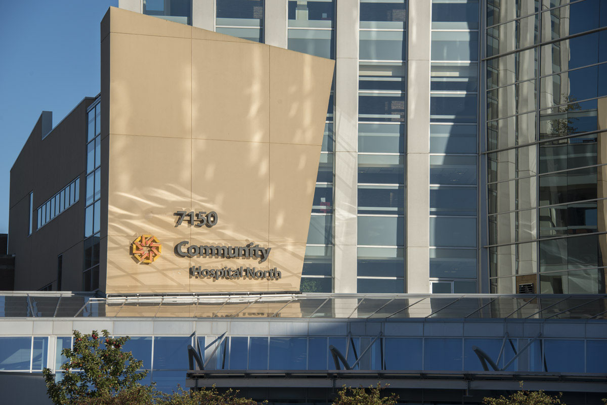
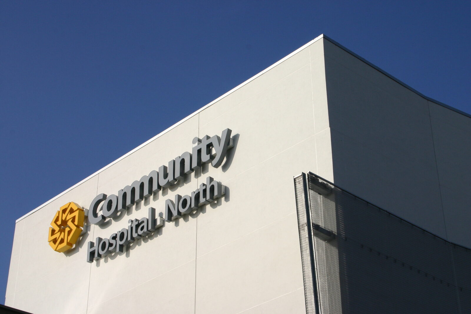
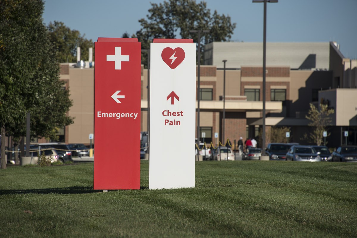
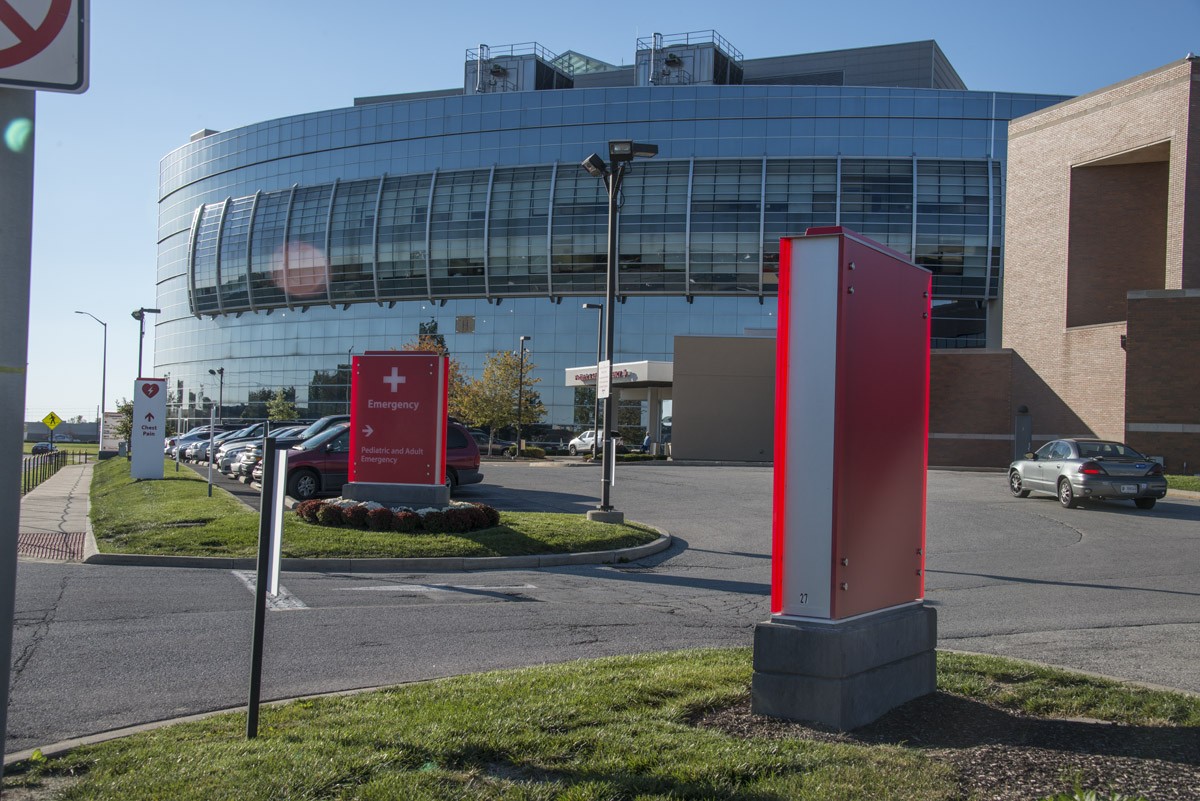
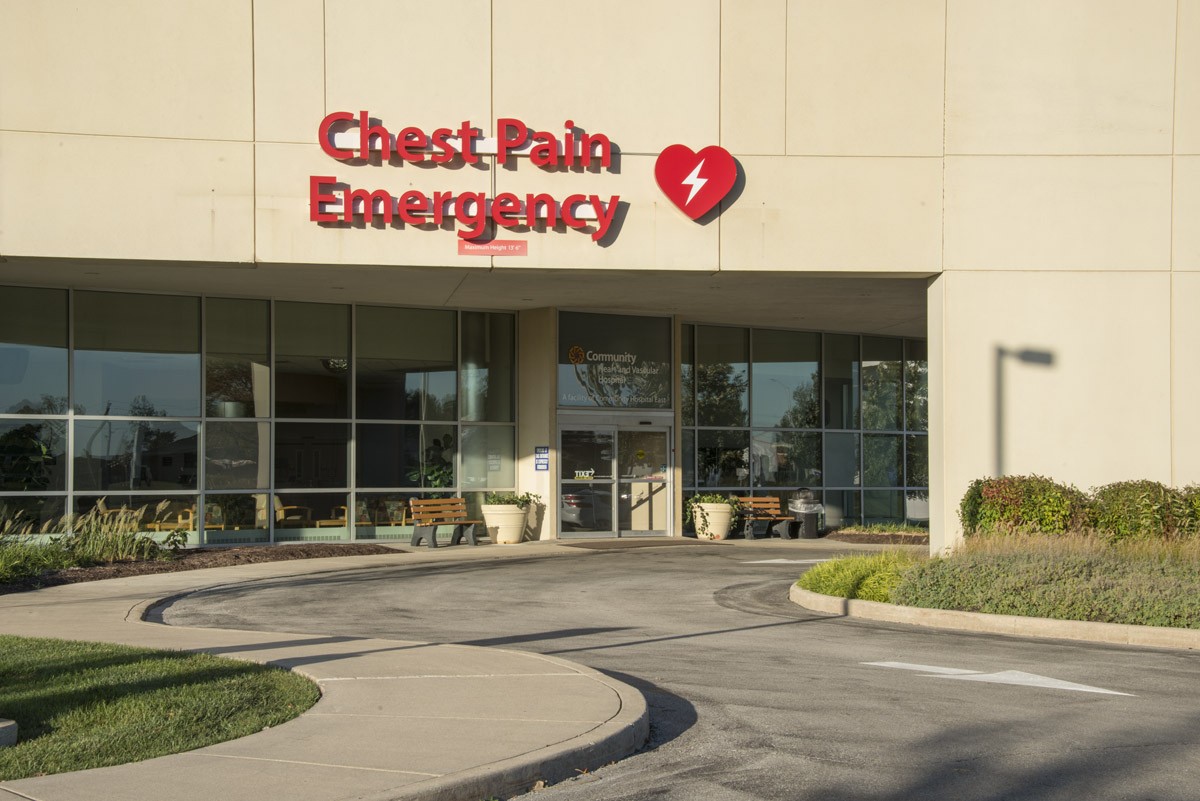
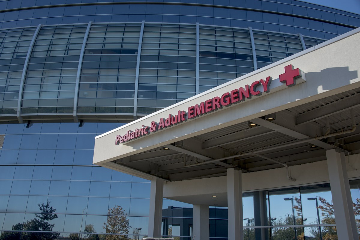
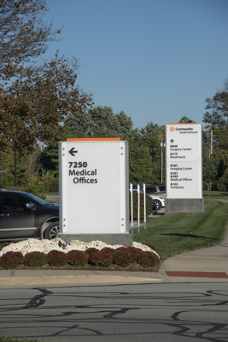
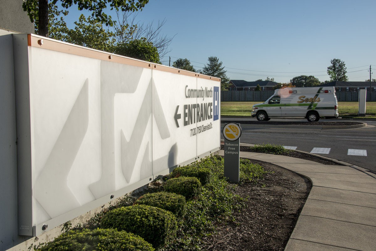
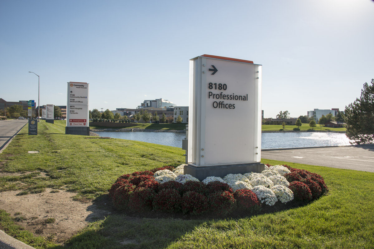
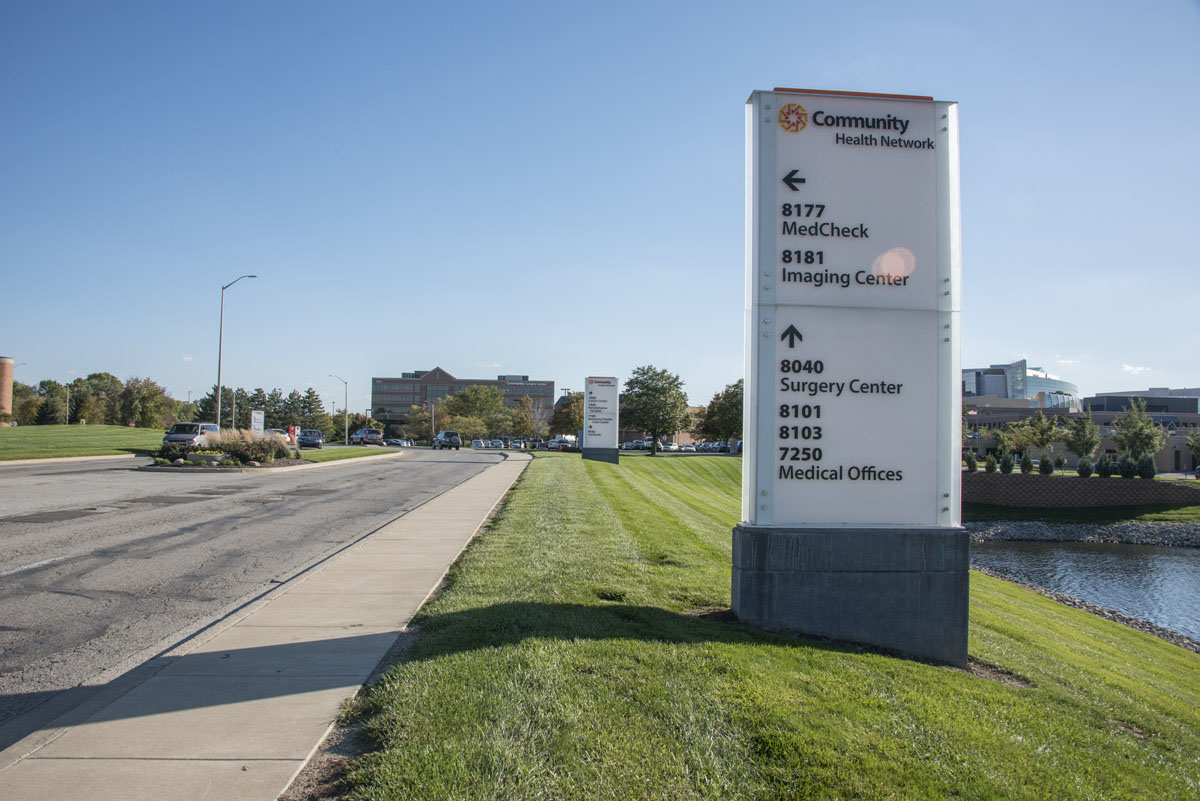
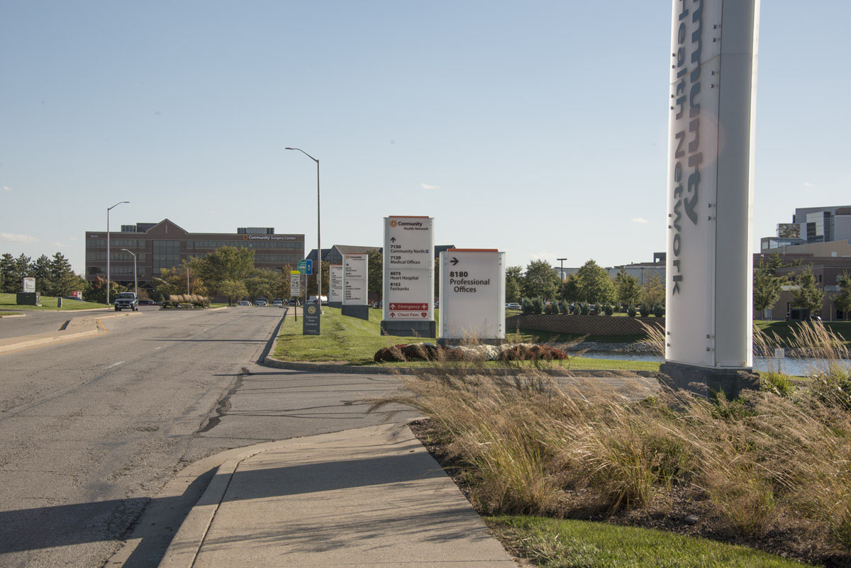
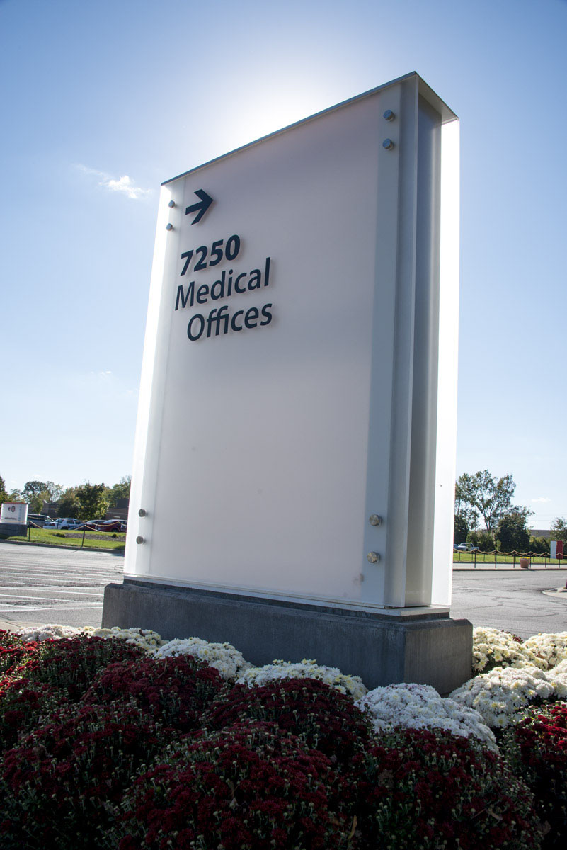
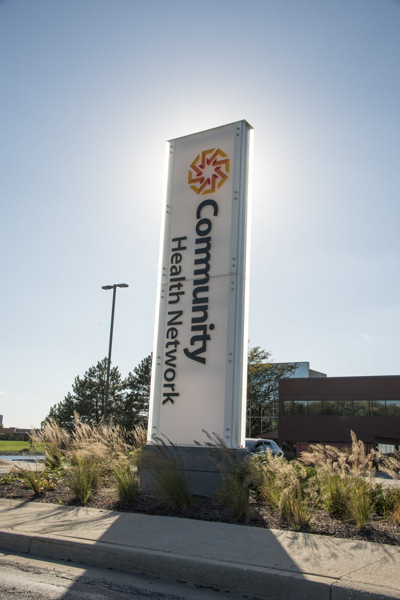
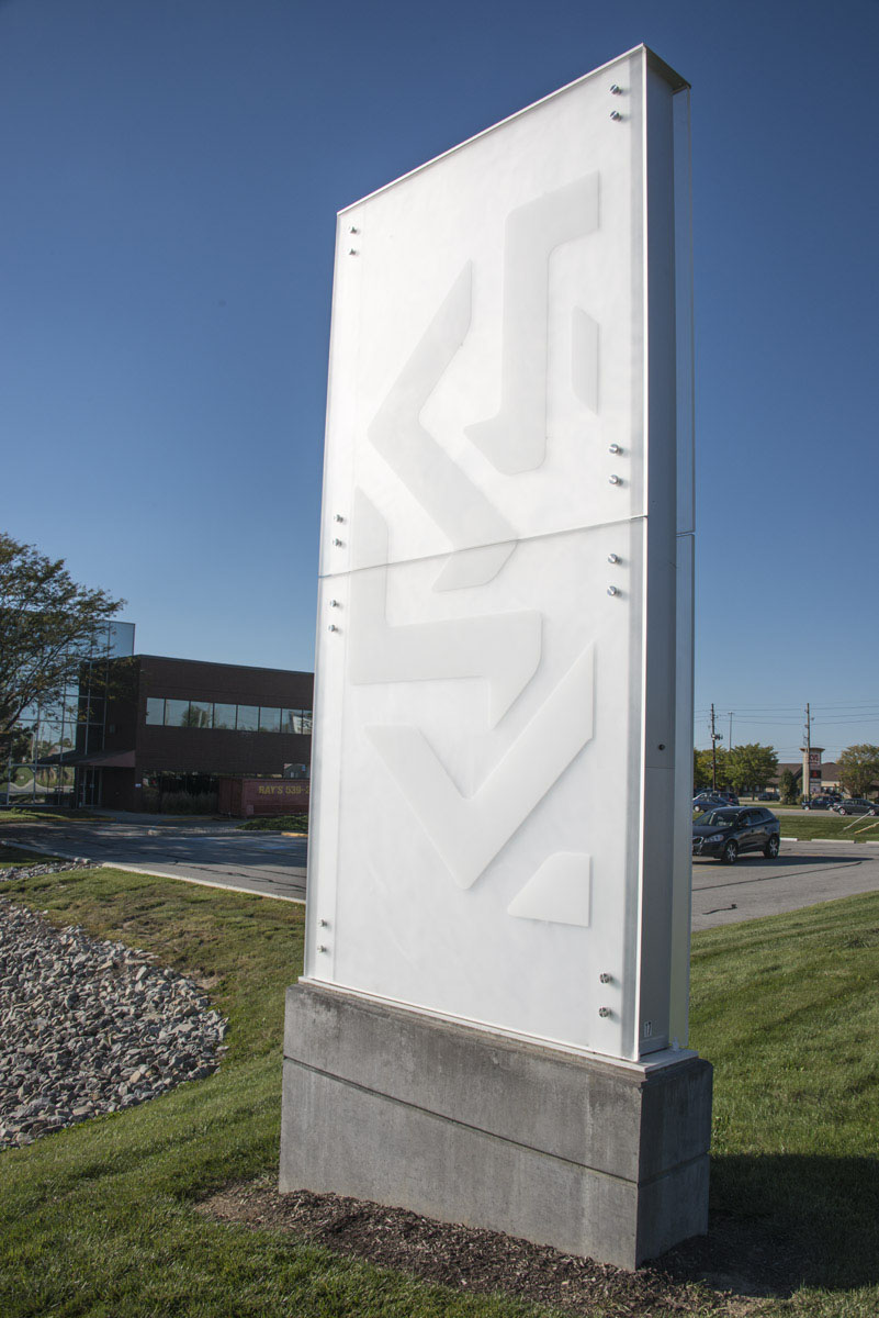
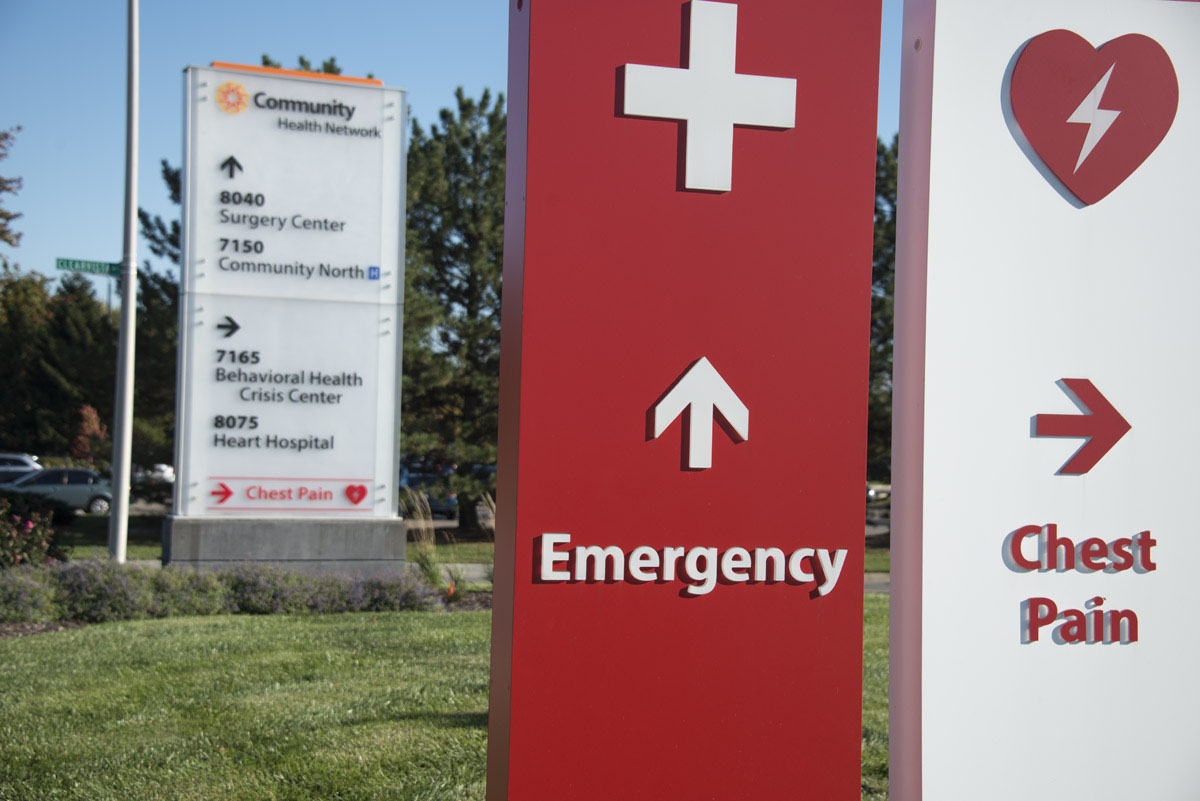
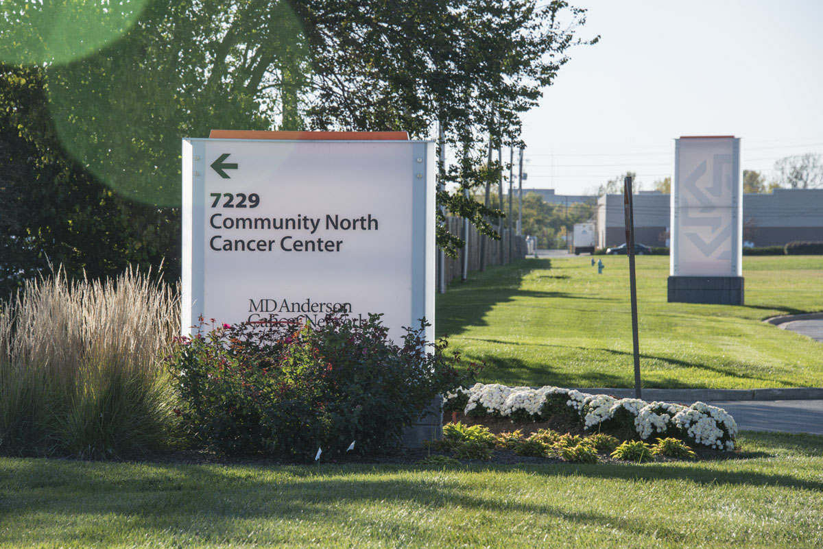
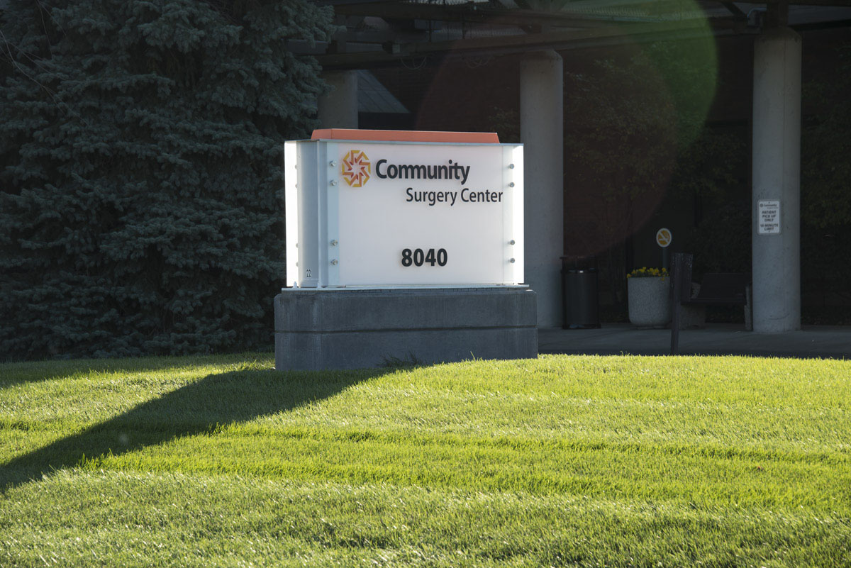
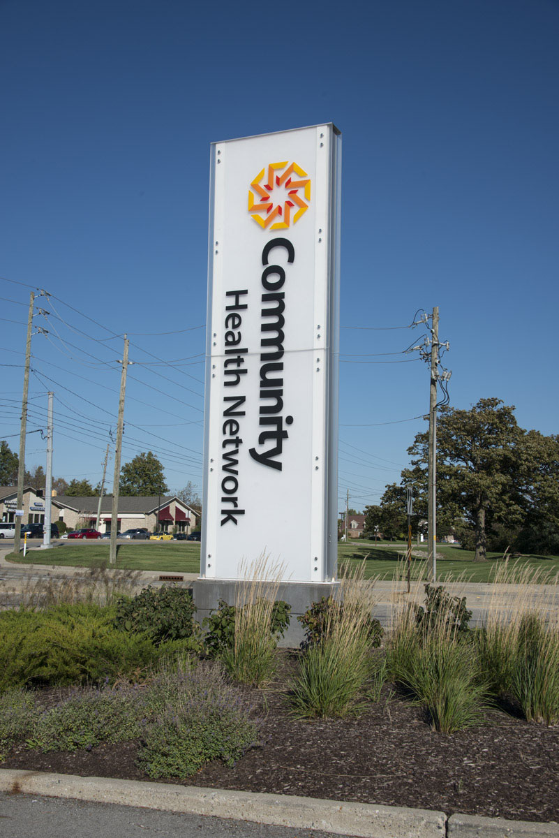
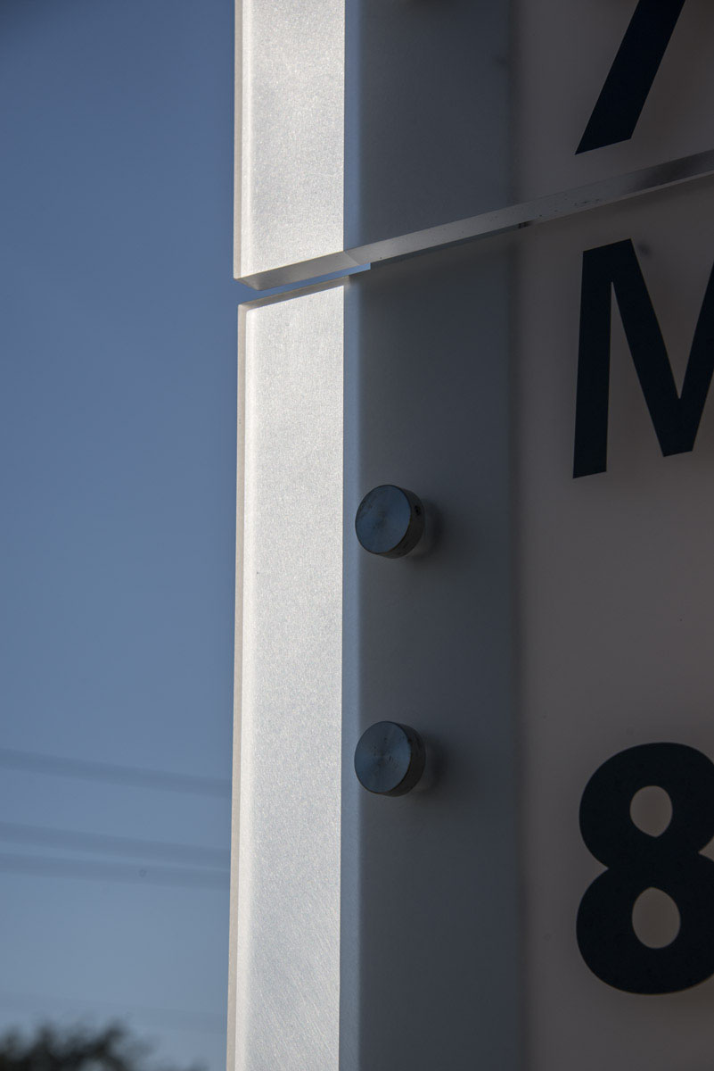
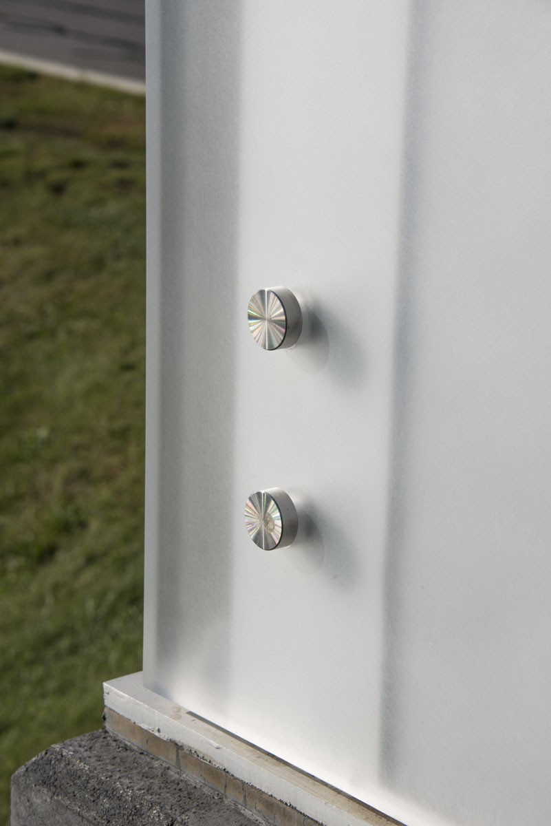
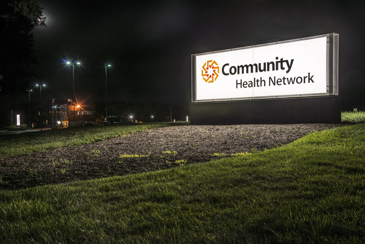
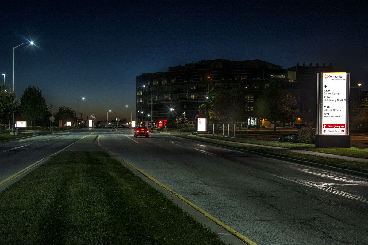
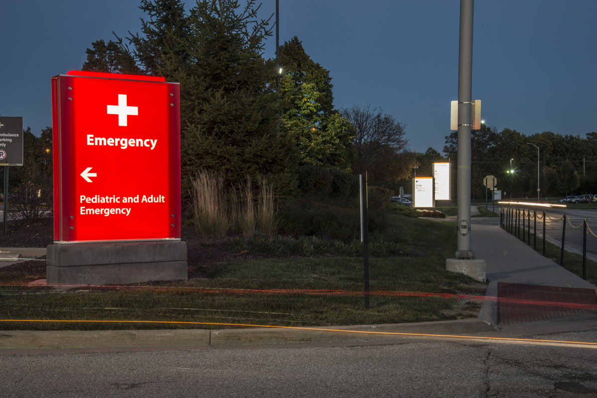
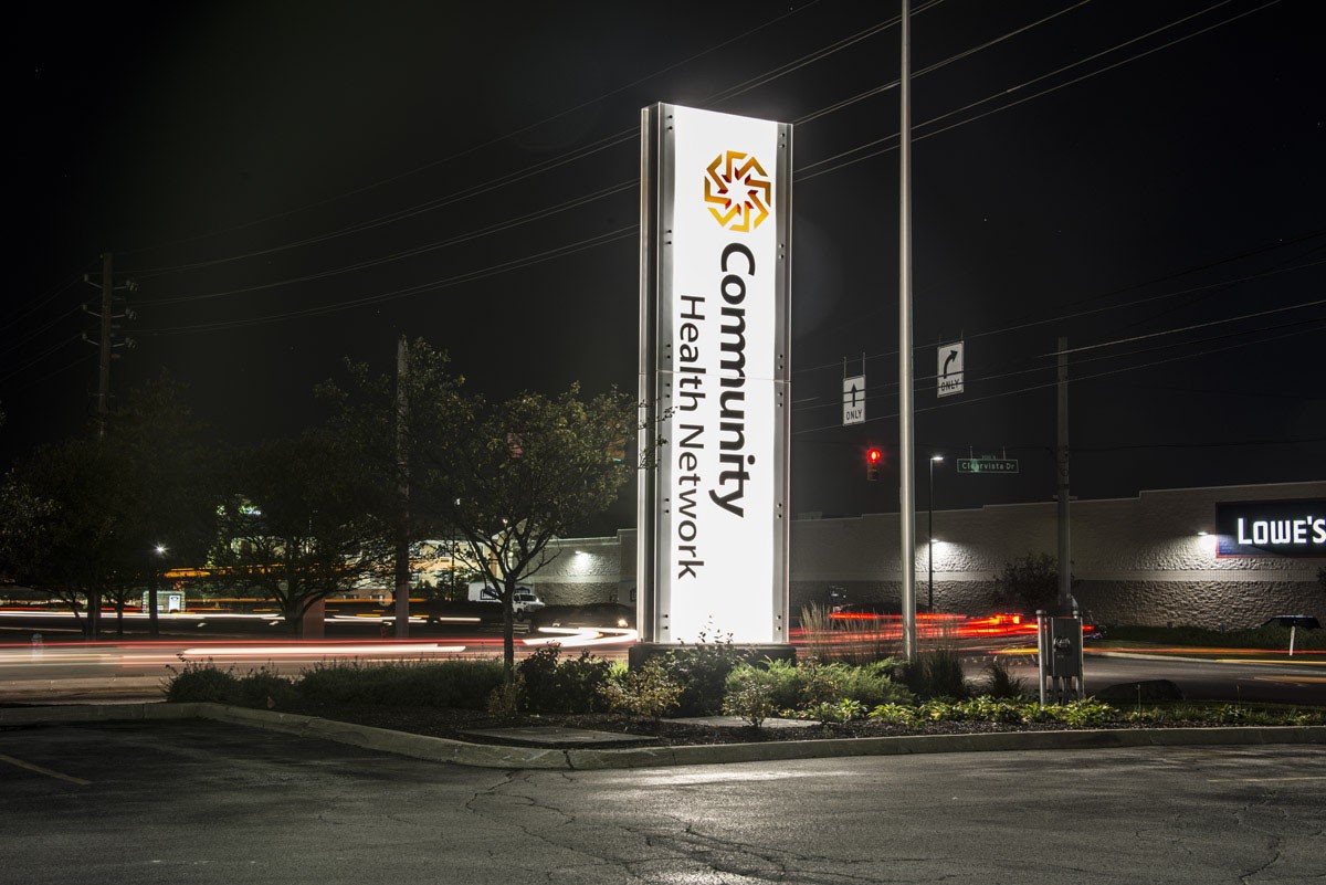
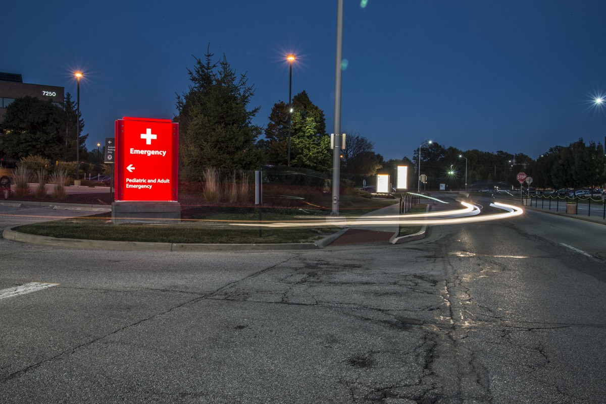
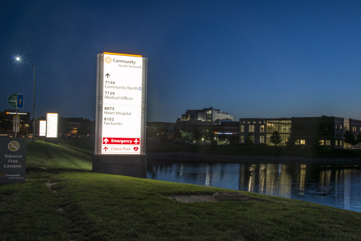
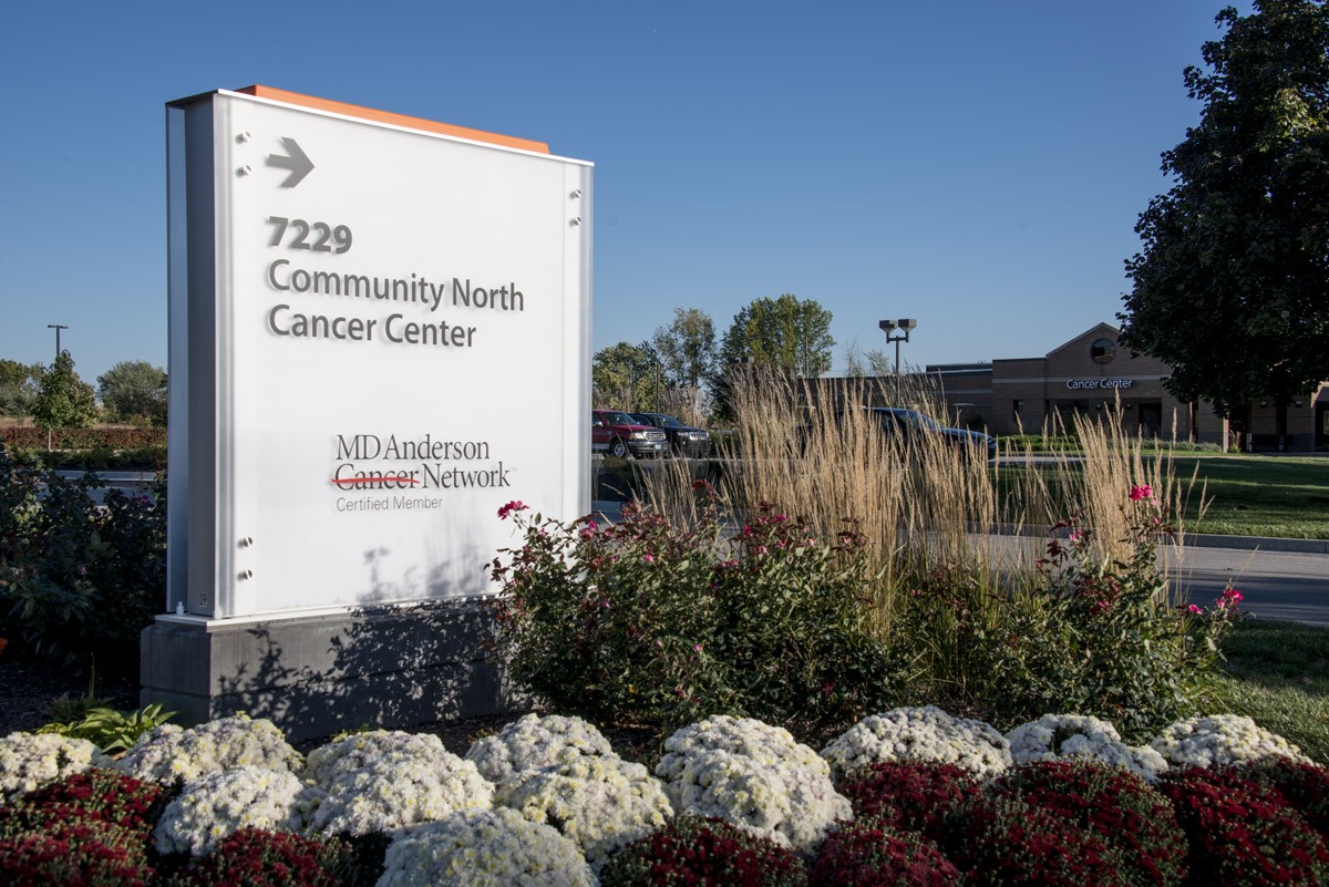
The new Community Health Network brand was simple, bright and positive. We translated that essence into the signage and wayfinding system by placing information over large expanses of white encapsulated in translucent frames. Small pops of color and interesting textural elements from the new logo provided the perfect amount of captivating interest without overpowering the purposeful simplicity of the brand. The signs were beautifully lit from within, spilling light through the translucent frames to represent rays of positivity throughout each of the properties. It was an elevated approach to healthcare design that entrenched the new brand in the physical environments across the entire network.
With the sheer scope of this project, we couldn’t solely focus on the design of the healthcare signage or the healthcare wayfinding. We also had to carefully consider how to manage multiple municipalities across the greater Indianapolis area. This required us to coordinate permits for all installed signage and even represent Community Health Network in front of governing bodies where variances were needed.
A COLLABORATION FOR BRAND UNIFICATION
Forcade’s deep experience in handling large, multi-location, multi-year projects helped Community Health Network easily and efficiently accomplish their extensive hospital rebrand initiative. It was a highly collaborative approach to healthcare design, unifying design, marketing, corporate and fabrication teams together to ensure the brand was successfully unified throughout the entire network.