
midmichigan
MIDLAND, MI
MidMichigan Medical Center was undergoing a major renovation, adding an entirely new patient bed tower that completely relocated the front entrance of the facility. As construction was nearing an end, patients and visitors were already showing signs of confusion, parking and entering in the wrong places. Once inside the multi-building, 180-acre campus, their navigation challenges continued.
Forcade was hired to eliminate this confusion by completely overhauling the existing signage and wayfinding. We took down nearly every exterior and interior sign and fully reprogrammed a new hospital signage and wayfinding system, totally transforming the experience for patients, visitors and staff at MidMichigan Medical Center.
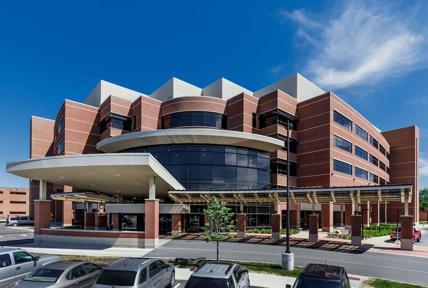
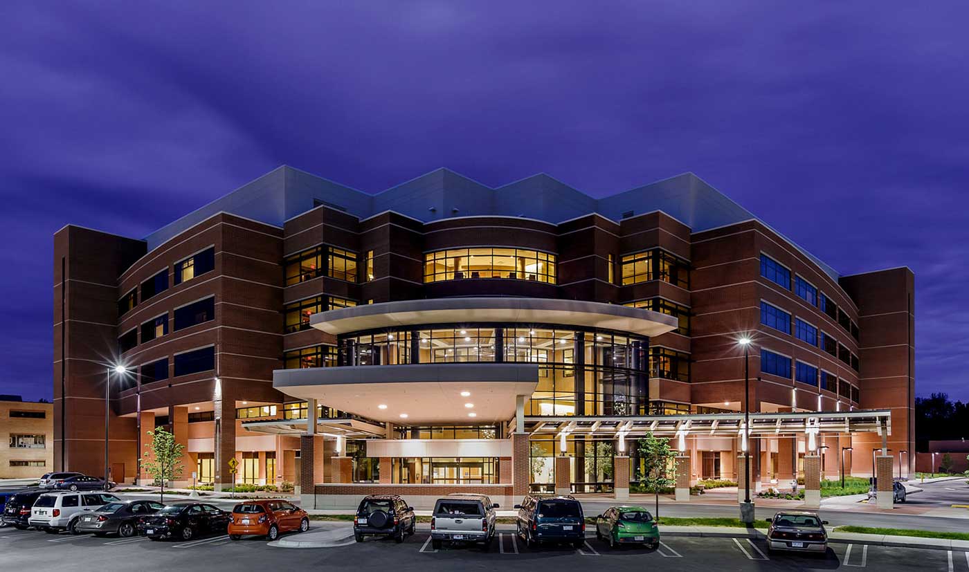
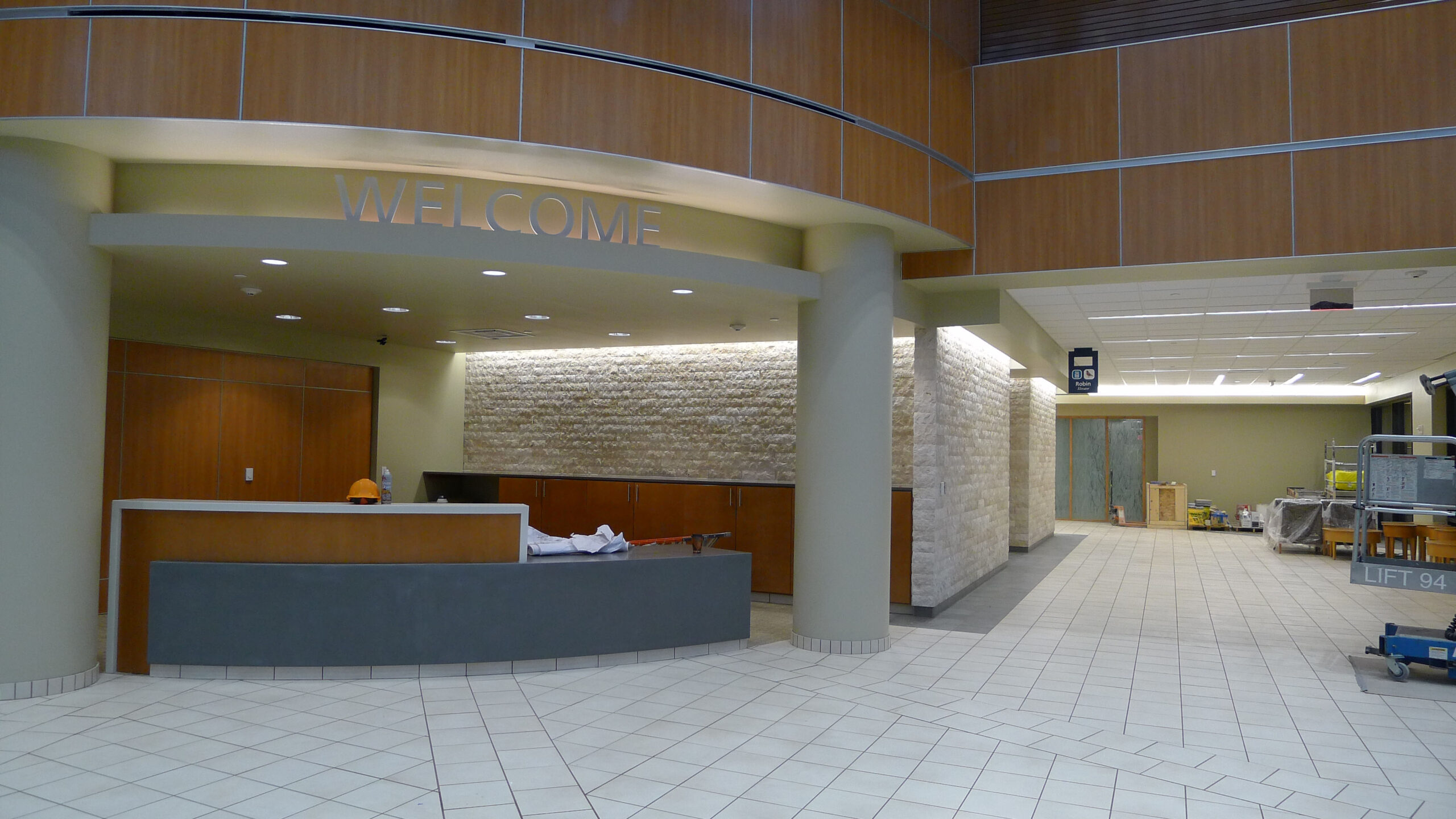

Arrival is the first and most important element in healthcare design. An effortless and pleasant arrival helps set the mind at ease. To ensure people could easily reach their desired destination on this large campus, we created a hierarchal system of exterior signage.
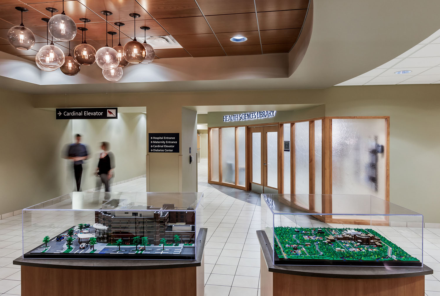
Large, illuminated directional signage was strategically placed throughout the multi-road campus entry points. The sheer size of these signs allowed easy decision-making even with a large amount of directional information. As visitors ventured deeper into the campus, medium-sized, illuminated directional signage confirmed they were going the correct way and provided further navigational instruction. Smaller, destination signage provided simple visual verification that a visitor arrived in the right place.
In addition to creating an easy-to-follow signage and wayfinding hierarchy, we made sure every exterior sign complemented MidMichigan’s brand. Bold use of blue and dimensional ribbing on the signs connected to the brand and the exterior architecture, providing a cohesive experience from the outside in. All exterior signs also took into account future additions and changes, using an abraded acrylic material that can easily be re-abraded to eliminate the “ghosting” effect common when peeling off old vinyl letterforms to change the language on the signage.

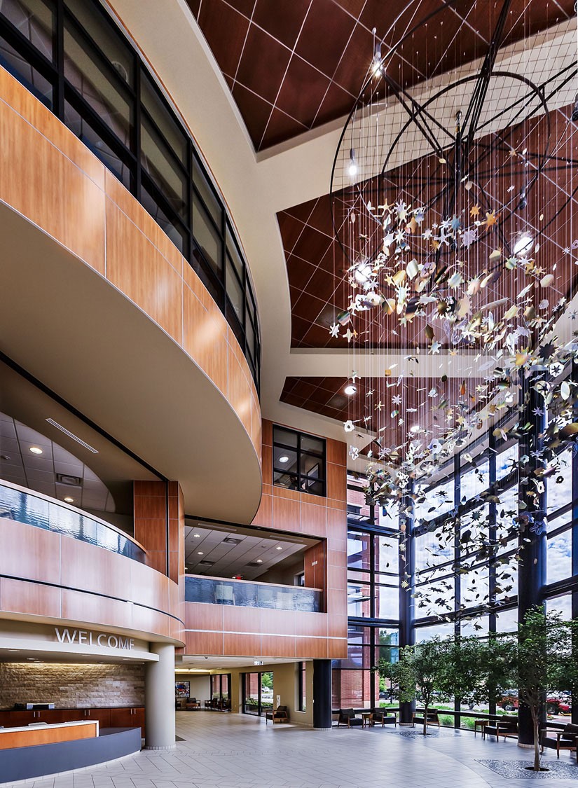
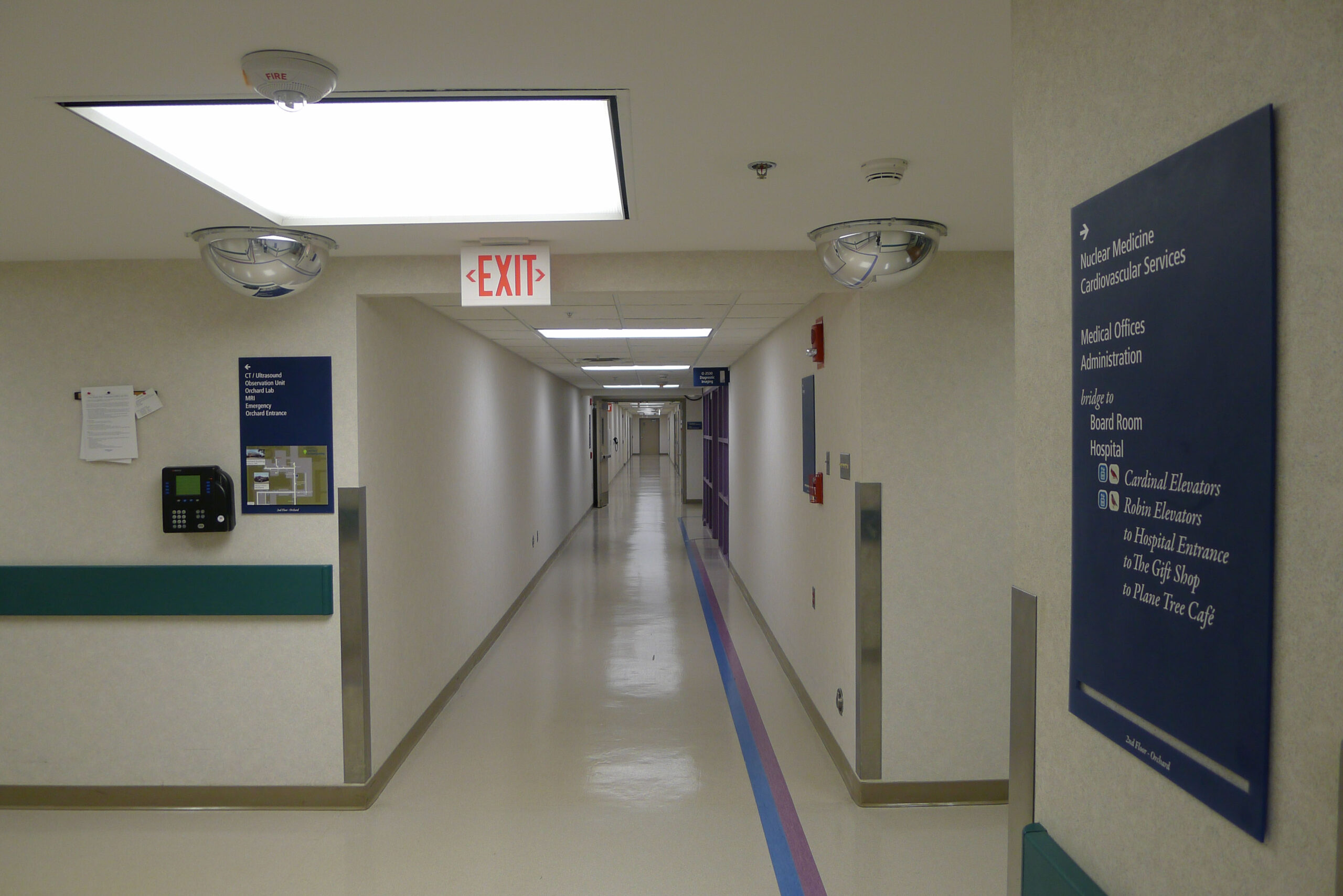
Multiple buildings connected by long corridors posed an interior design challenge that we solved in unique ways. By avoiding the typical blandness of healthcare signage and healthcare wayfinding, we created a system rooted in memorability and speakability.
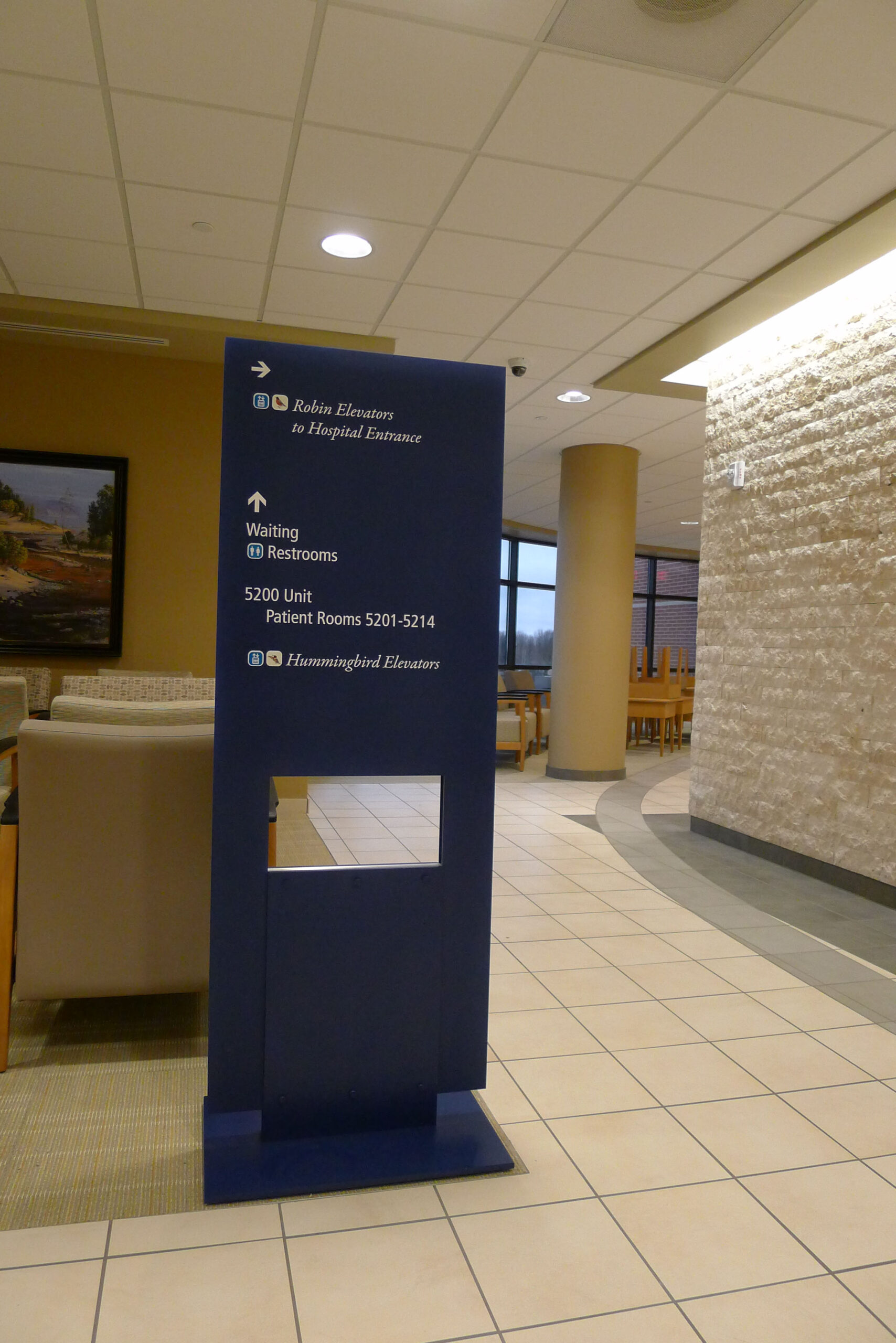
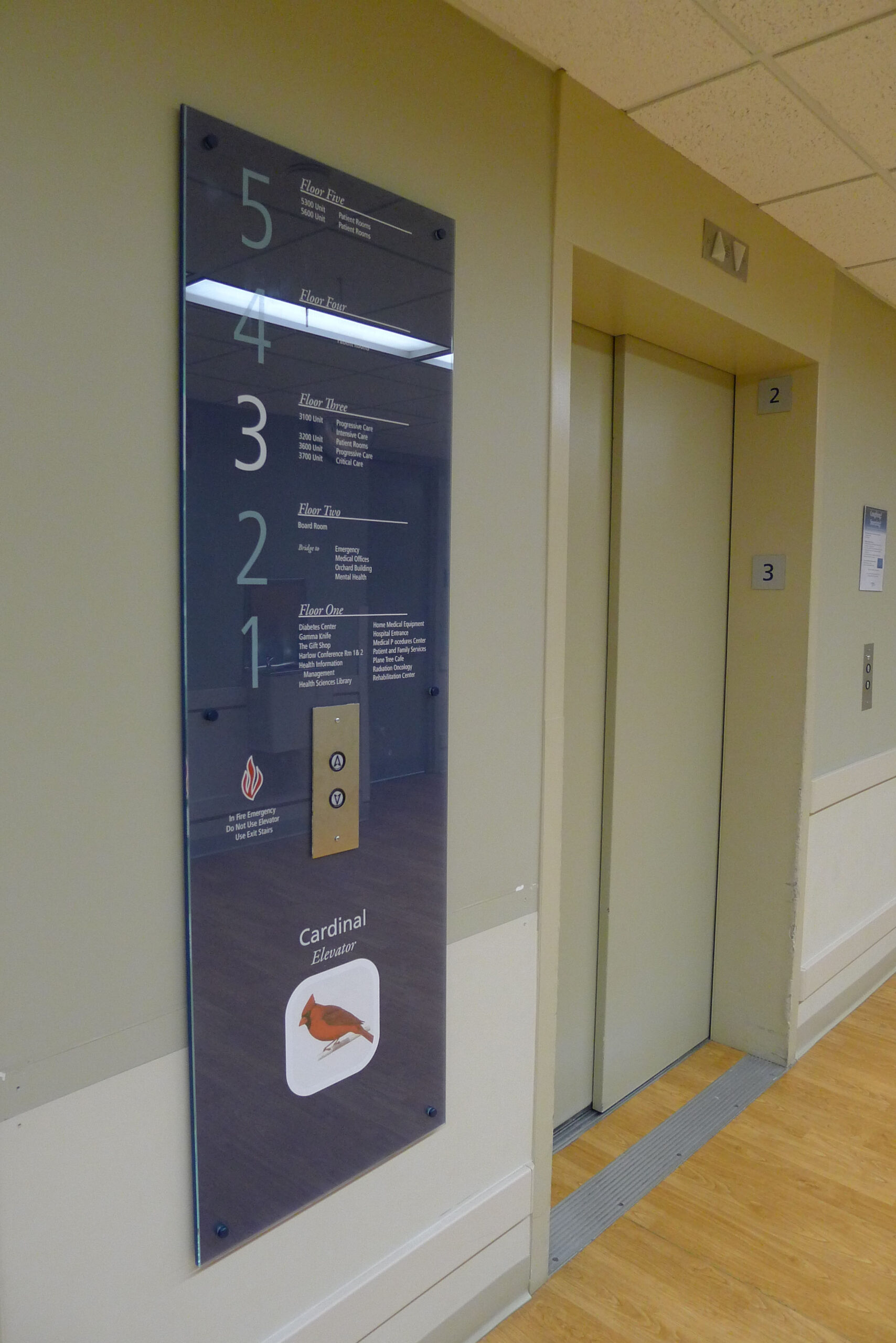
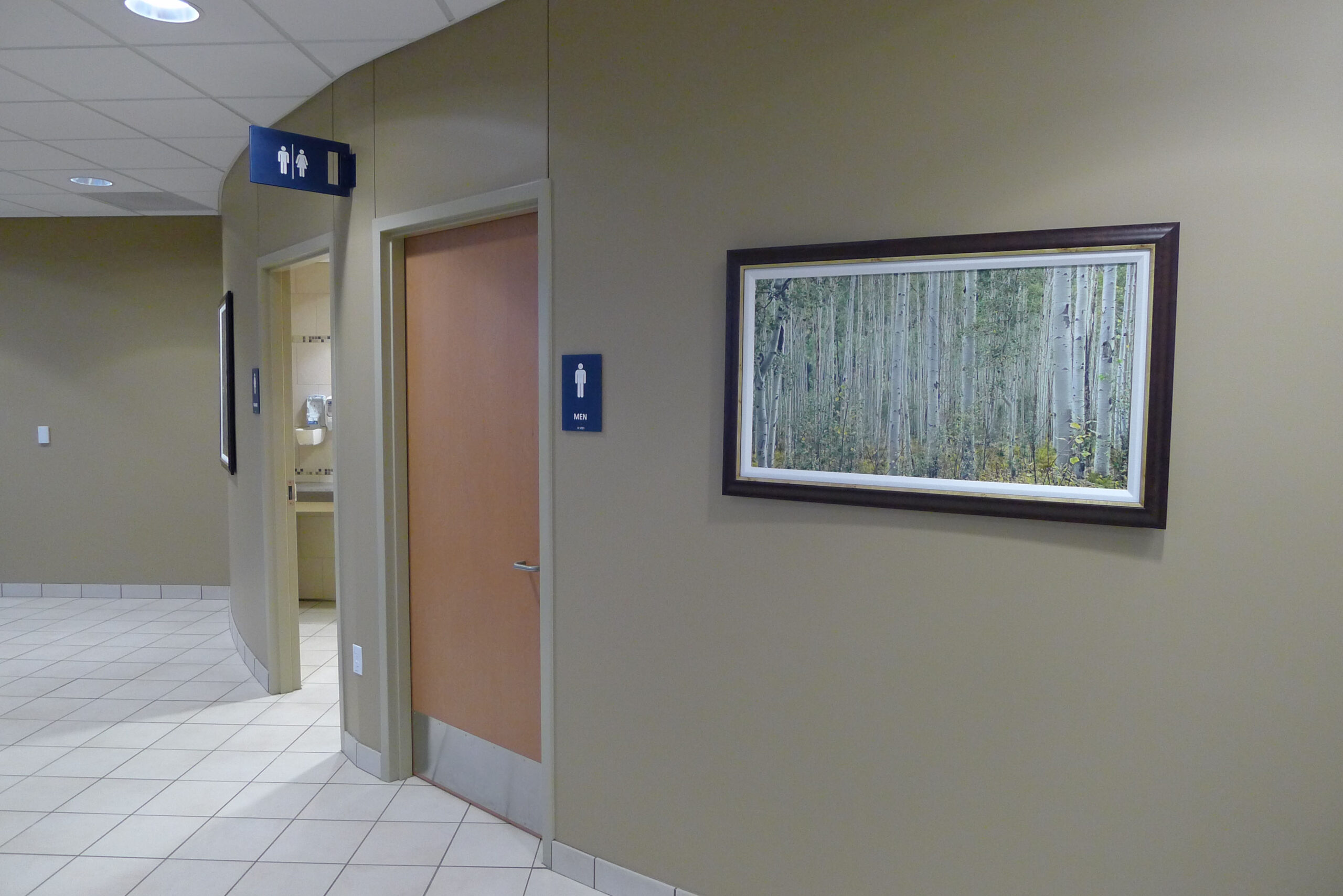
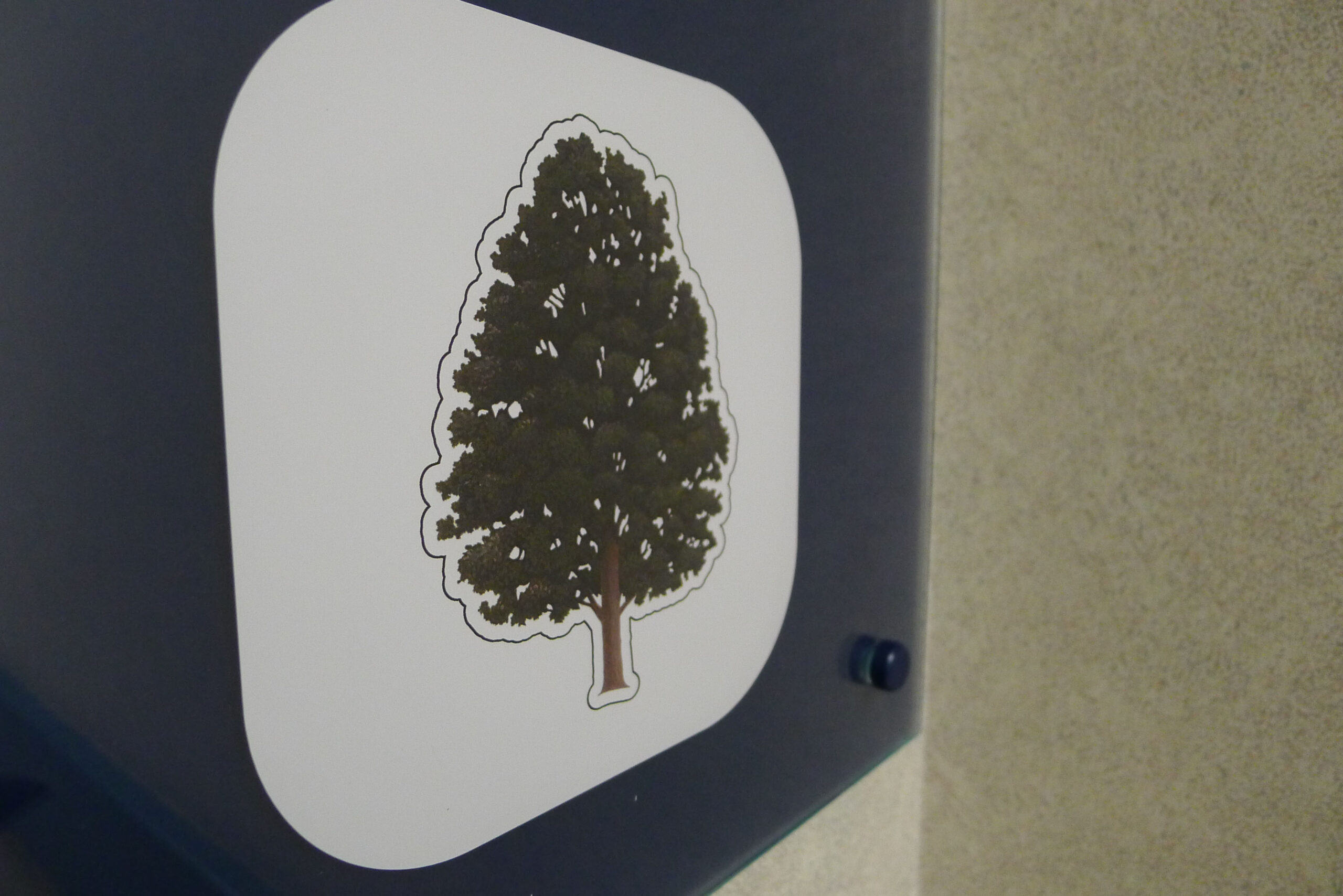
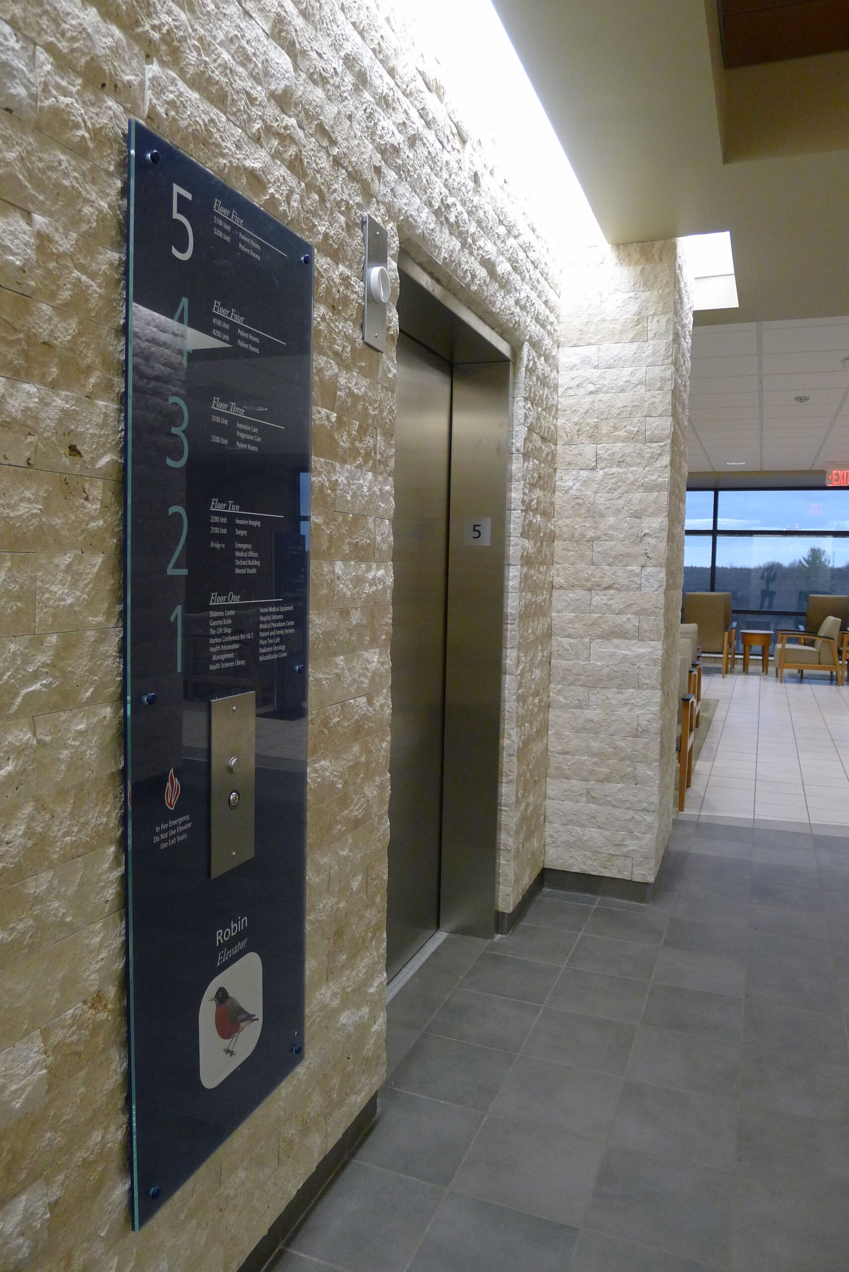
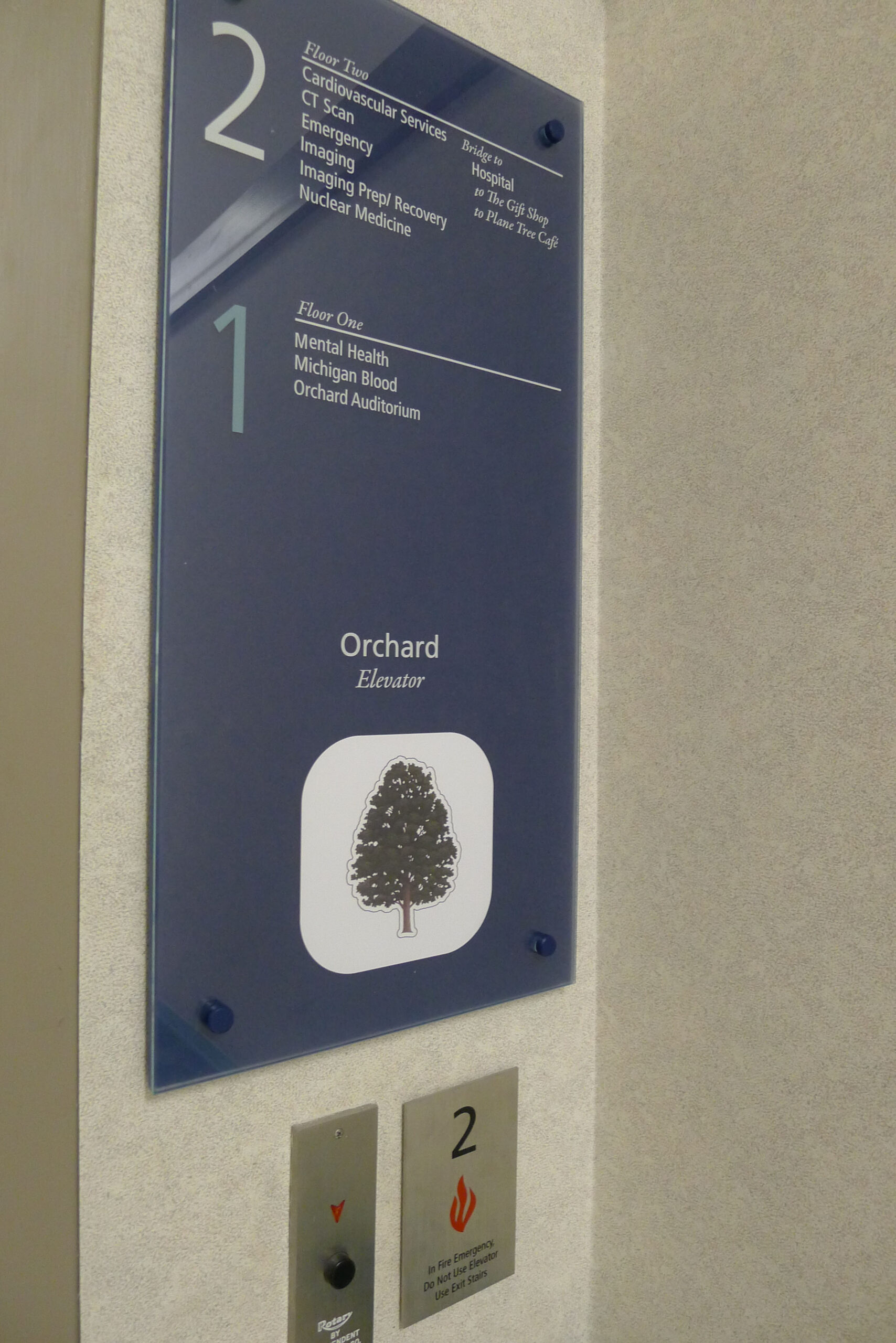
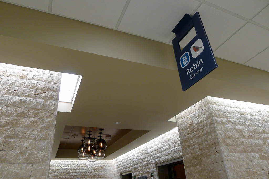
Each elevator bank on each floor was named with a bird indigenous to the area. From Chickadee to Cardinal, the bird names were complemented with beautiful illustrations hand-drawn by a local Audubon Society artist. The birds were represented by their own unique colors and even sounds, providing multiple ways to speak to each location. For example, while providing directions, a staff member could call out a color or bird name to make it effortless for a visitor to know when they arrived in the right area. It was an easy and memorable solution to difficult wayfinding and using the beauty of birds also provided a calming effect as patients and visitors navigated the extensive interior.
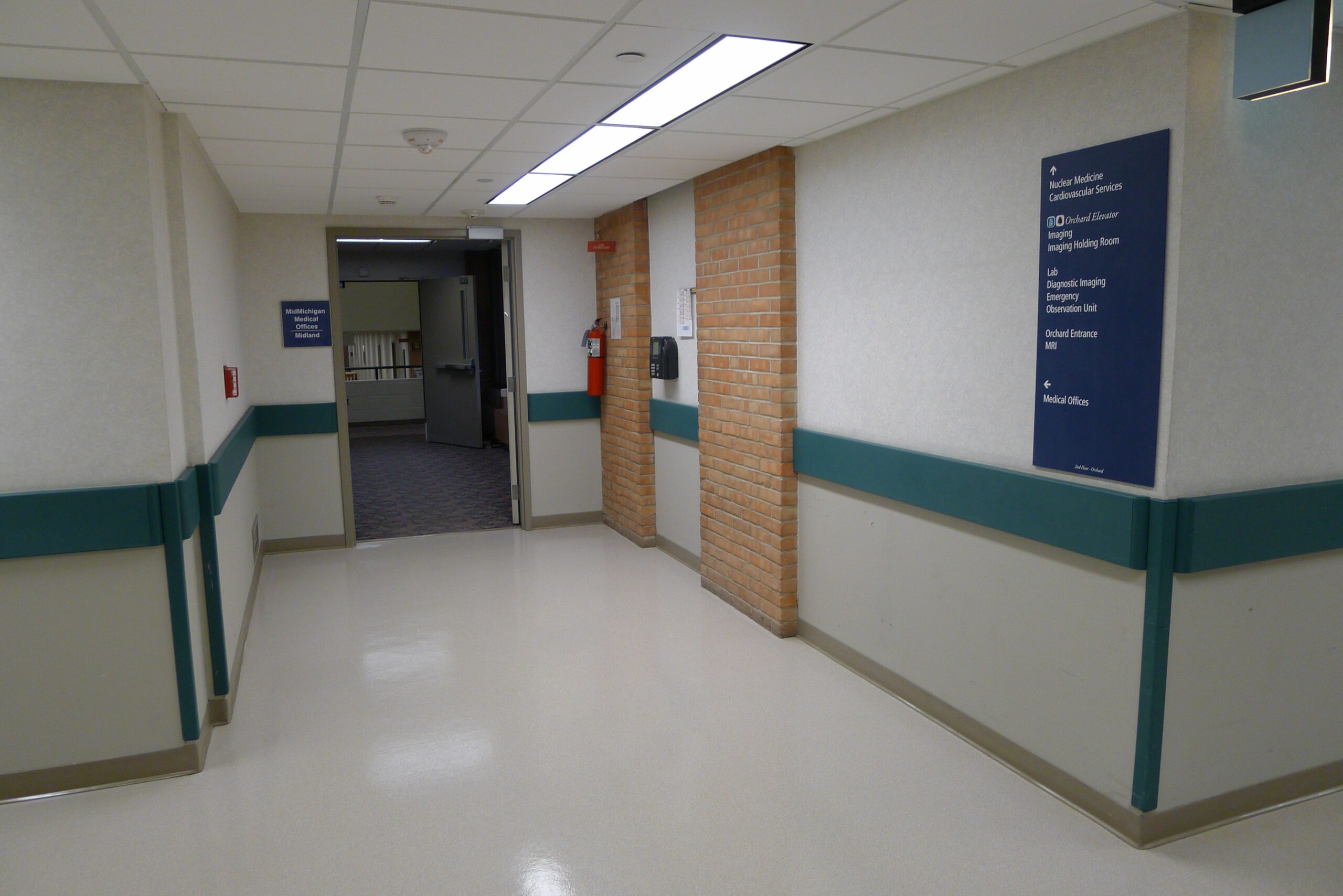
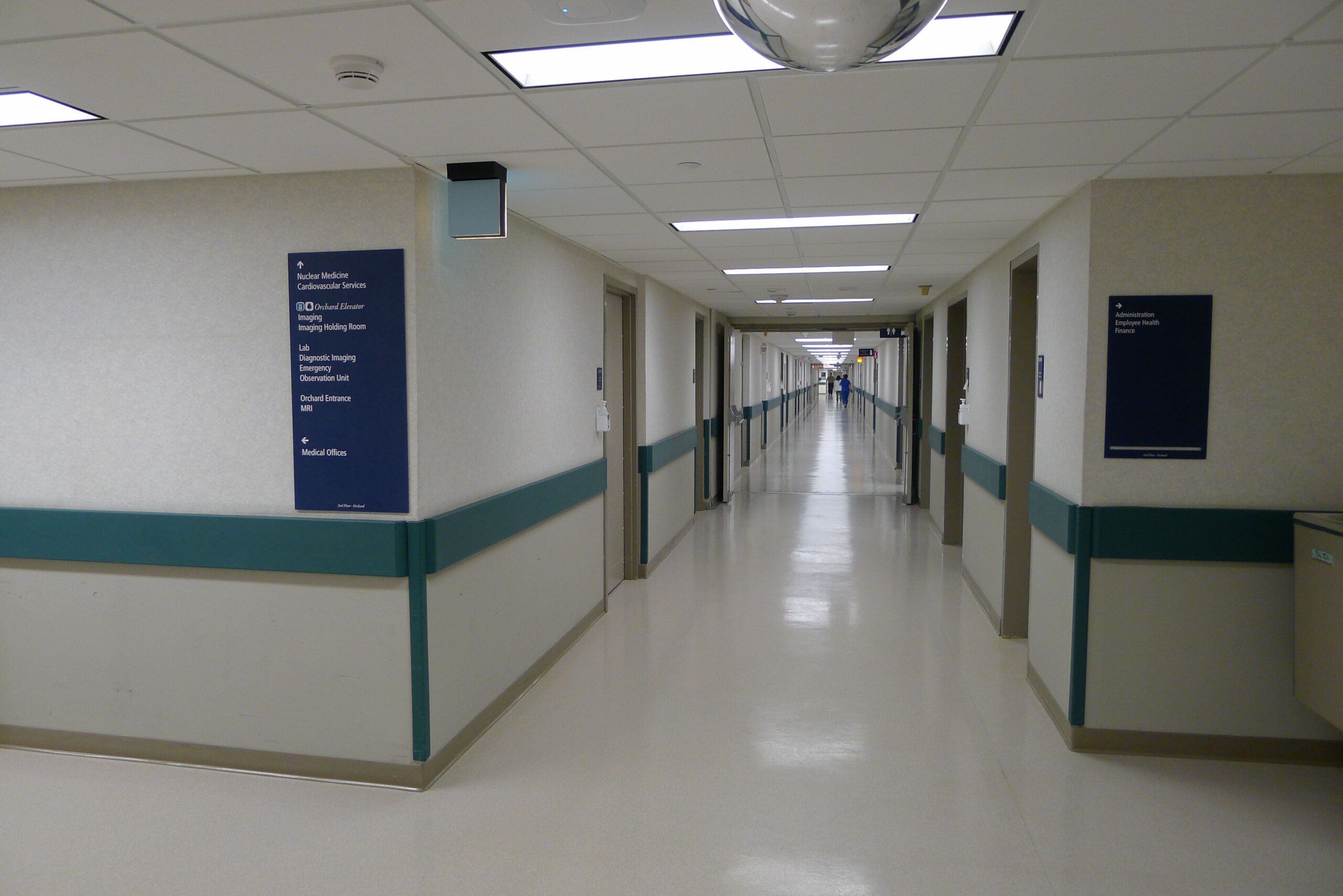
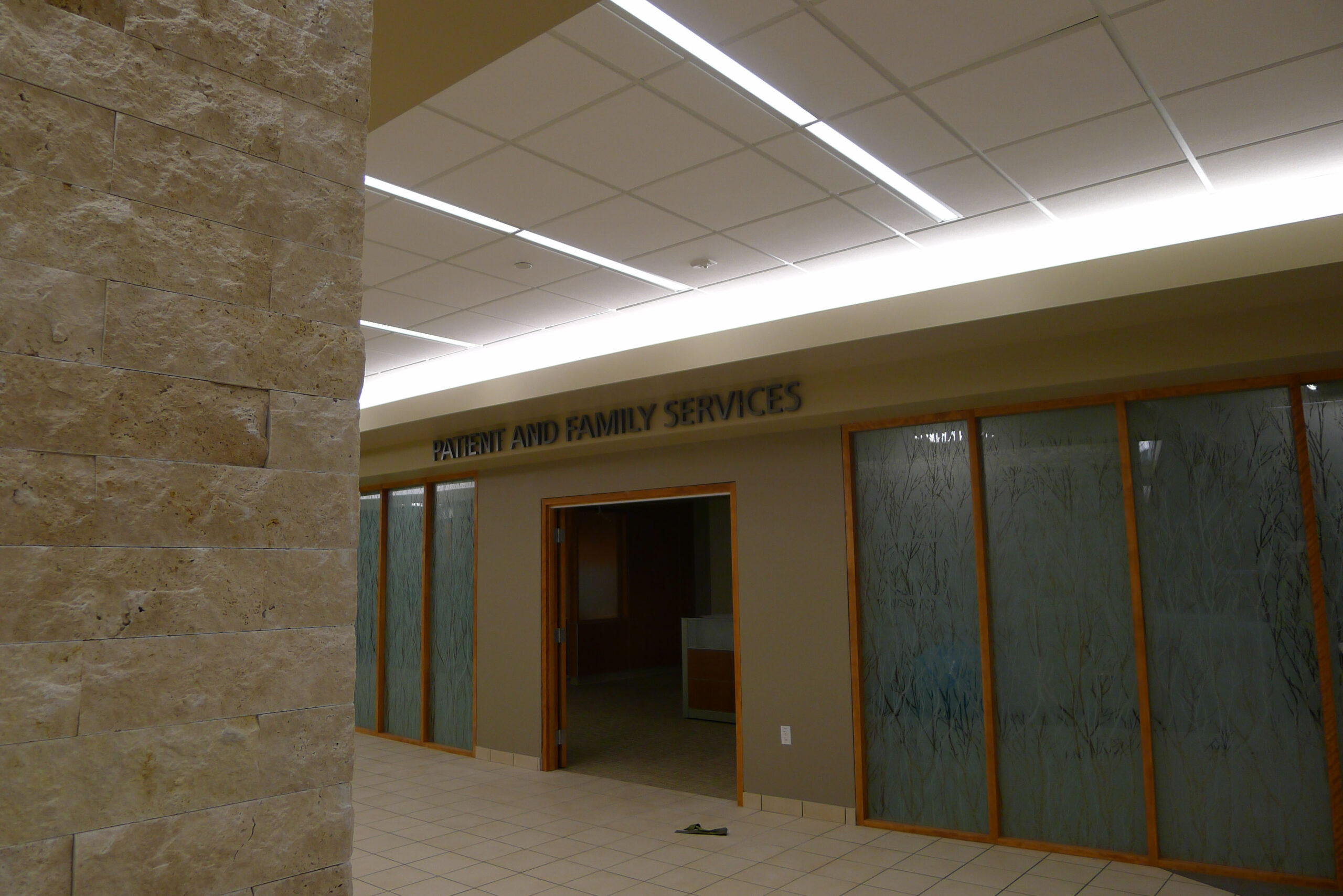
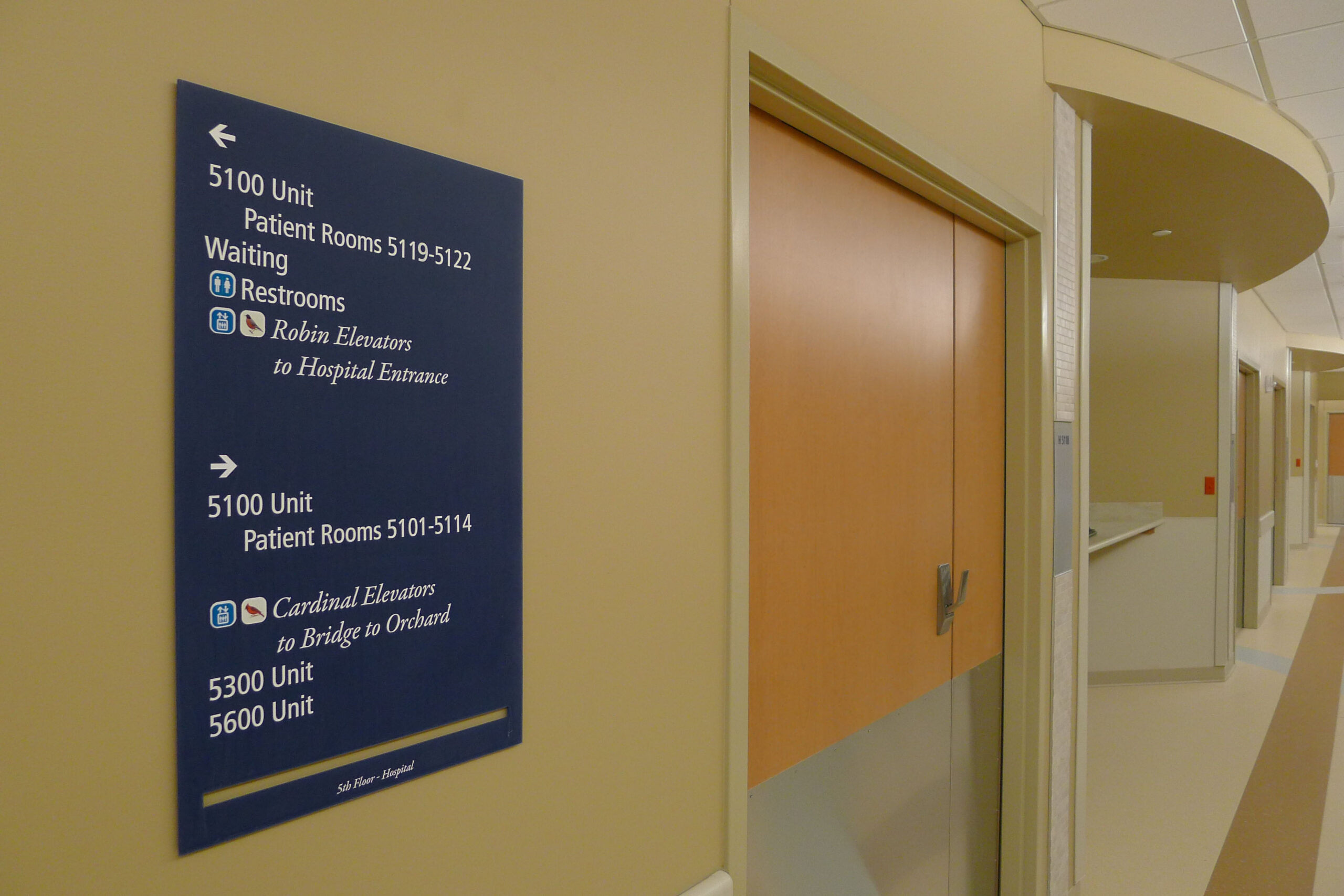
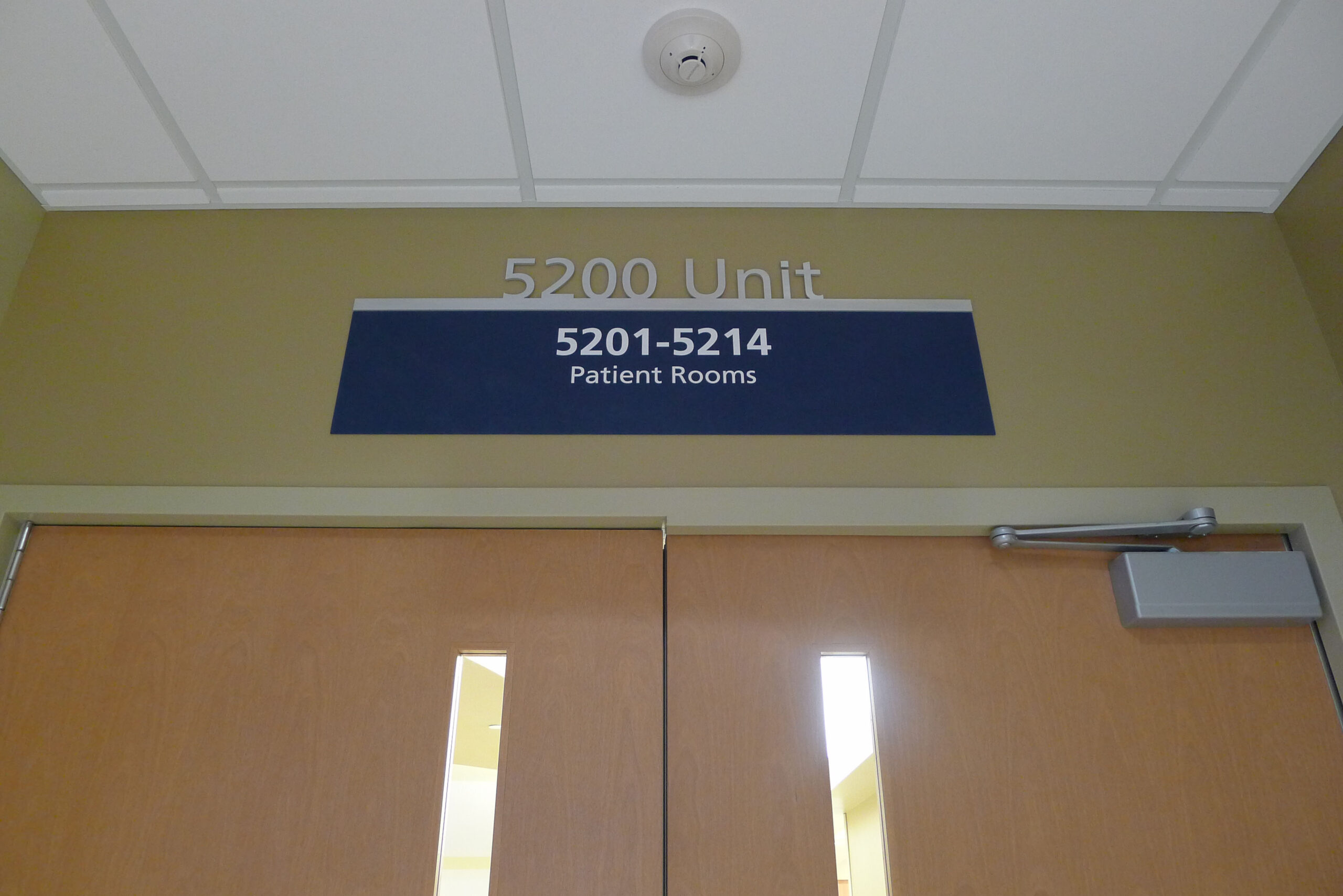
To further add to the speakability of our signage and wayfinding plan, we used directional language. For example, “Robin Elevators to Hospital Entrance” provided a more clear and easier-to-follow set of directions than just simple destination lists with arrows. These “speakable” signs were placed on bold blue backgrounds, connecting to MidMichigan’s brand, but more importantly making them impossible to miss in the large interior space.

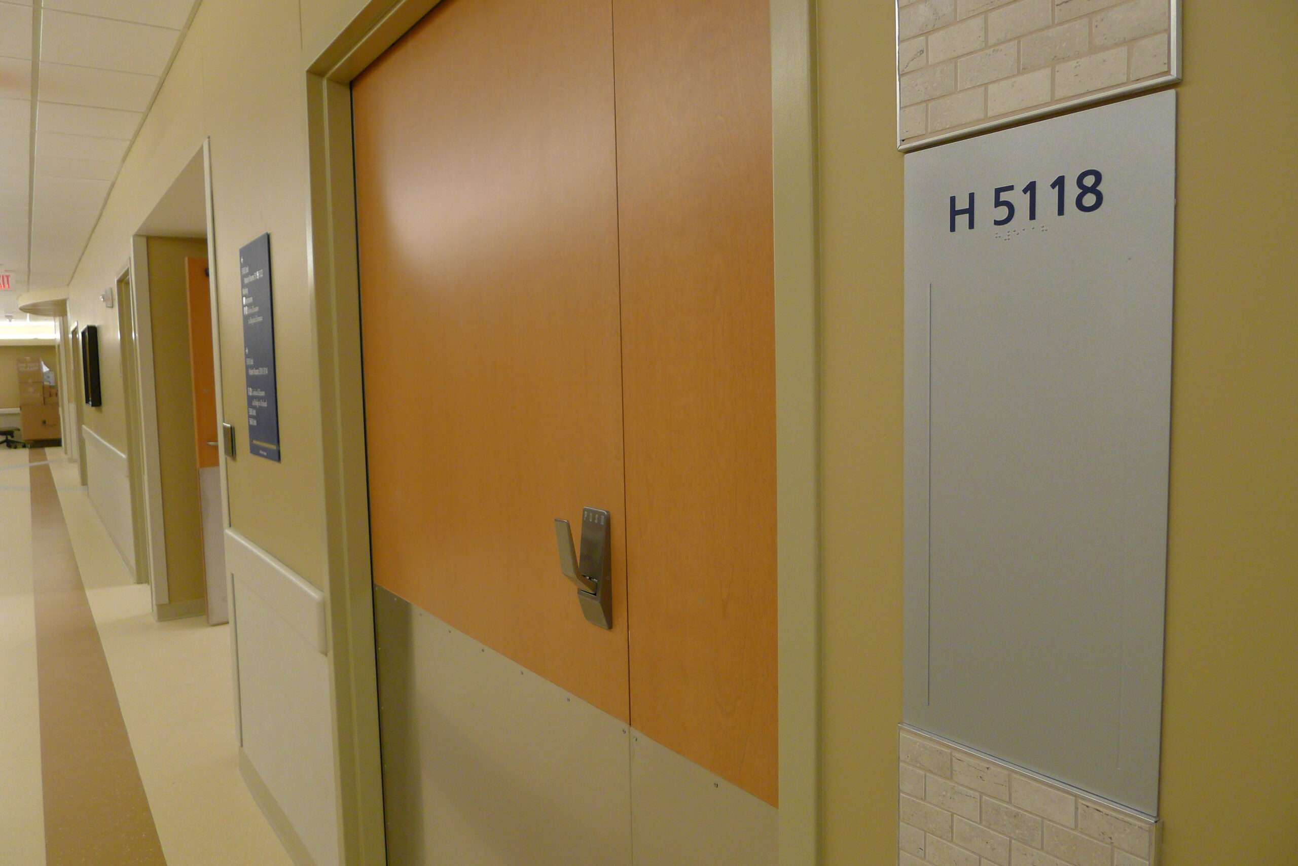
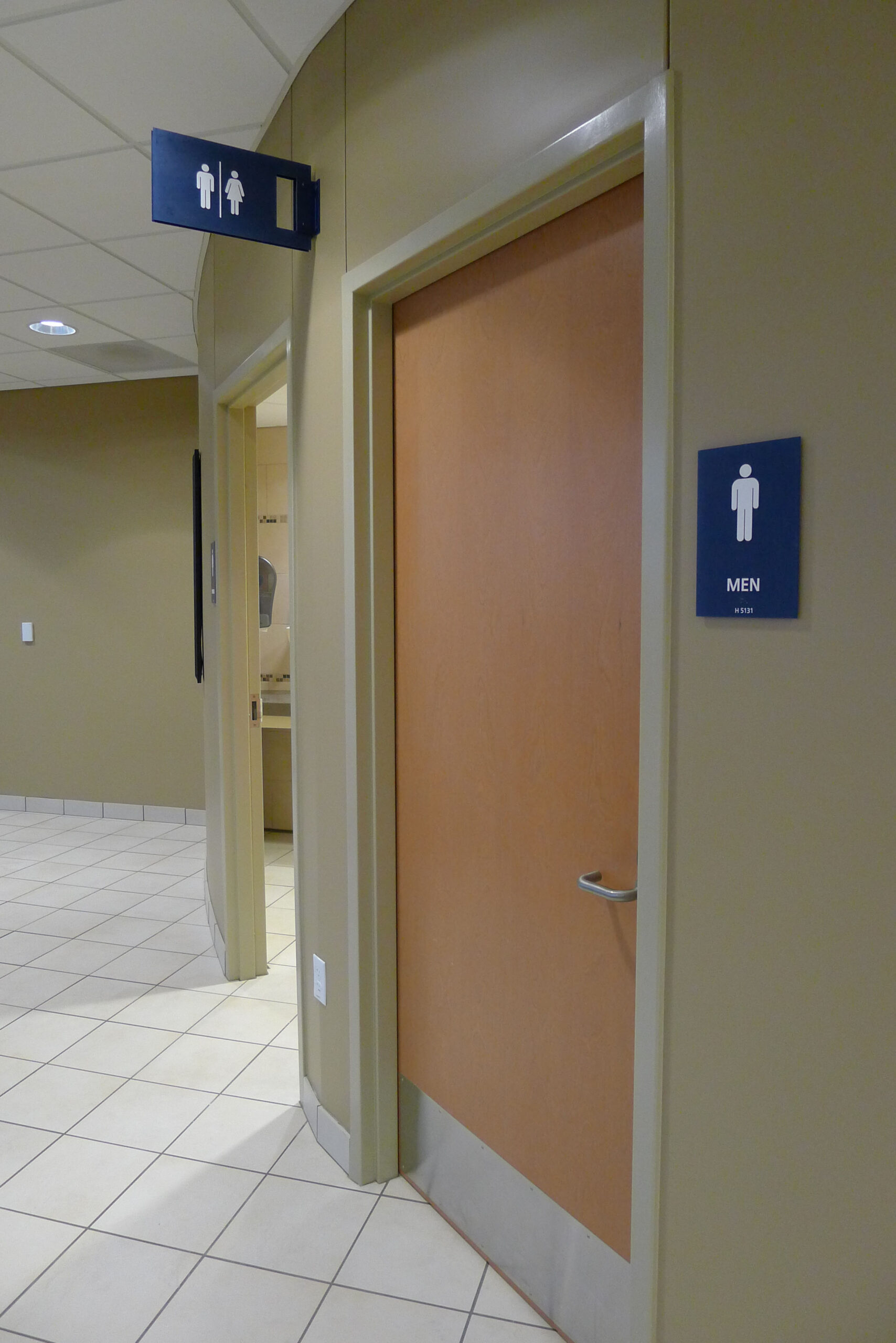
We used budget-friendly techniques to connect the signage to the architecture. This included adding cutouts to many of the signs. It was a simple detail that turned even the most ordinary signage into a connected and pleasant experience with the rest of the space, providing people with a greater sense of “place” in addition to a needed sense of direction.
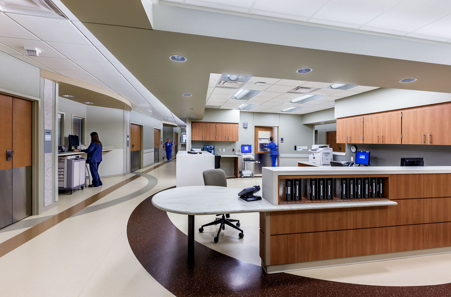
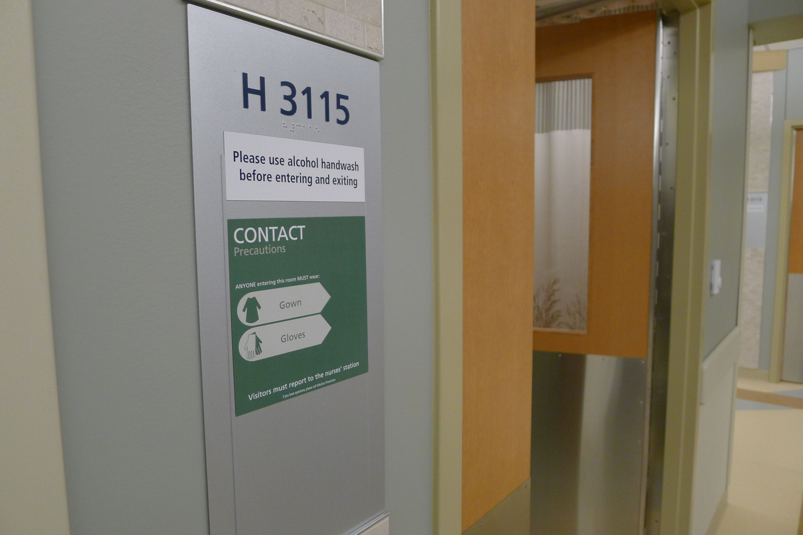
We even provided clever design solutions to the most used, but typically most unpleasant signage in a hospital. Required precaution signs outside of patient rooms were made from pre-printed, full-sheet magnetic paper. Staff could simply grab the necessary precautions and magnetically stick them on a custom-designed metal room number sign. It decluttered the usual mess of ad hoc precaution signage, delivering an added layer of patient safety and a more pleasing entrance to the room.
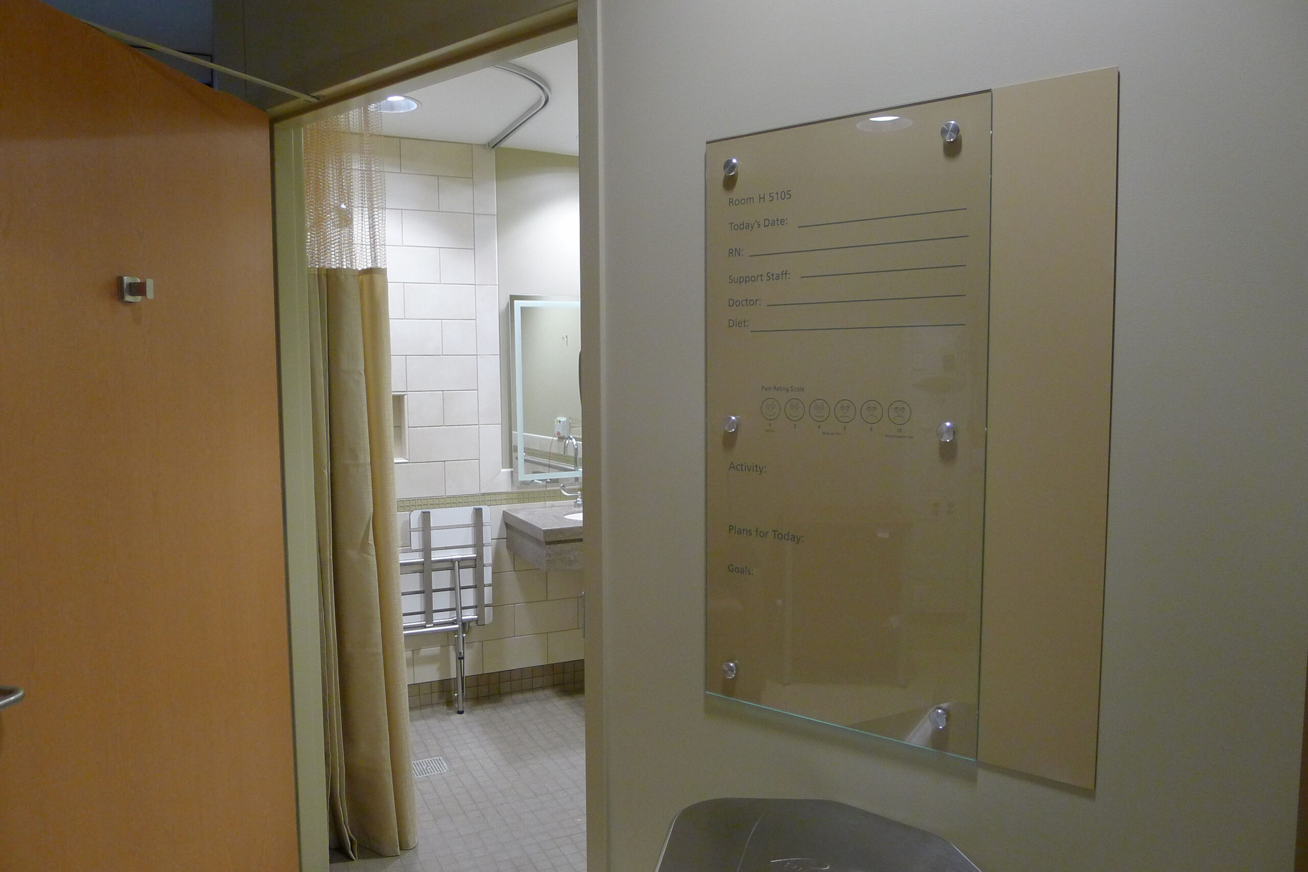
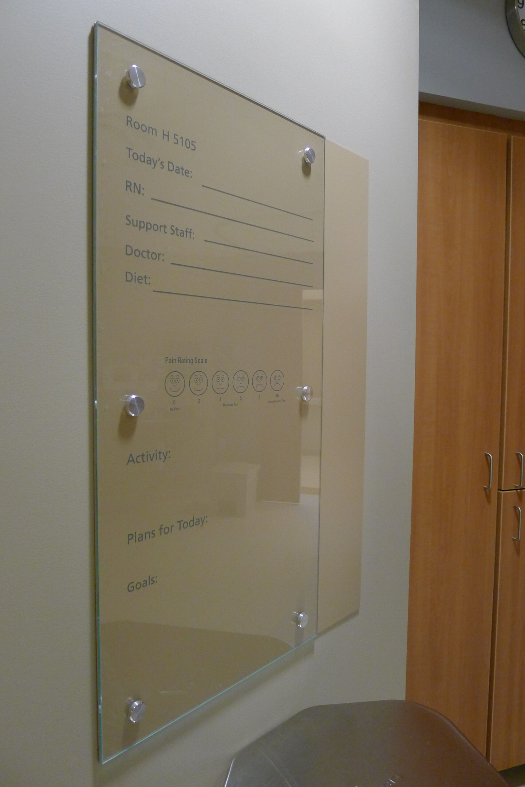
Inside the room, we replaced the cold, sterile whiteboards that provided patients with important daily information with beautiful dry-erase glass that seamlessly integrated into the design of the space. Simple and clever signage and wayfinding touches like this are too often ignored and go a long way in helping to improve overall patient satisfaction.

MidMichigan Medical Center was typical to the common challenges found in modern day healthcare design. It was a large facility that continued to grow and evolve over time, with each addition adding an entirely new layer of navigational challenges. Forcade used its 30+ years of healthcare signage and wayfinding experience to build an impactful yet economical plan for resetting the system to MidMichigan’s current size and structure, and also to the organization’s further evolution that’s sure to come.