
Shaker Lakes
CLEVELAND, OH
The Nature Center at Shaker Lakes is a 20-acre natural sanctuary located just minutes from downtown Cleveland. This conserved green space was founded in 1966 and provides the more than 2 million people in this metro area with an opportunity to enjoy and connect with the outdoors.
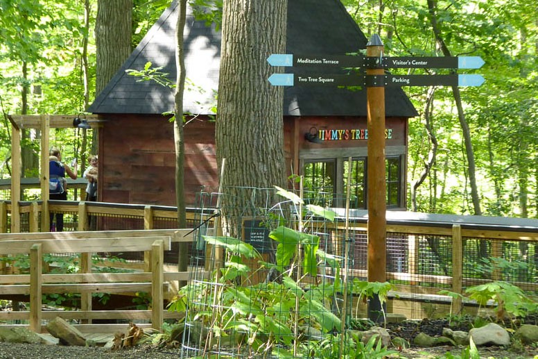
Forcade was part of the revitalization of the Nature Center’s entire infrastructure, moving from a simple system of trails to a more engaging and inclusive experience, including an accessible boardwalk. The design assignment consisted of a wide array of signage, brand integration and donor recognition.
Click a photo for gallery view.


Our design plan naturally centered around nature. All materials were purposefully selected to complement and accentuate the beautiful surroundings they’d be placed in. Sanded and stained rough sawn cedar wood. Earth- and sky-toned colors. Bronze-toned, satin finish metals. Every element of the design truly became a natural extension of the experience.

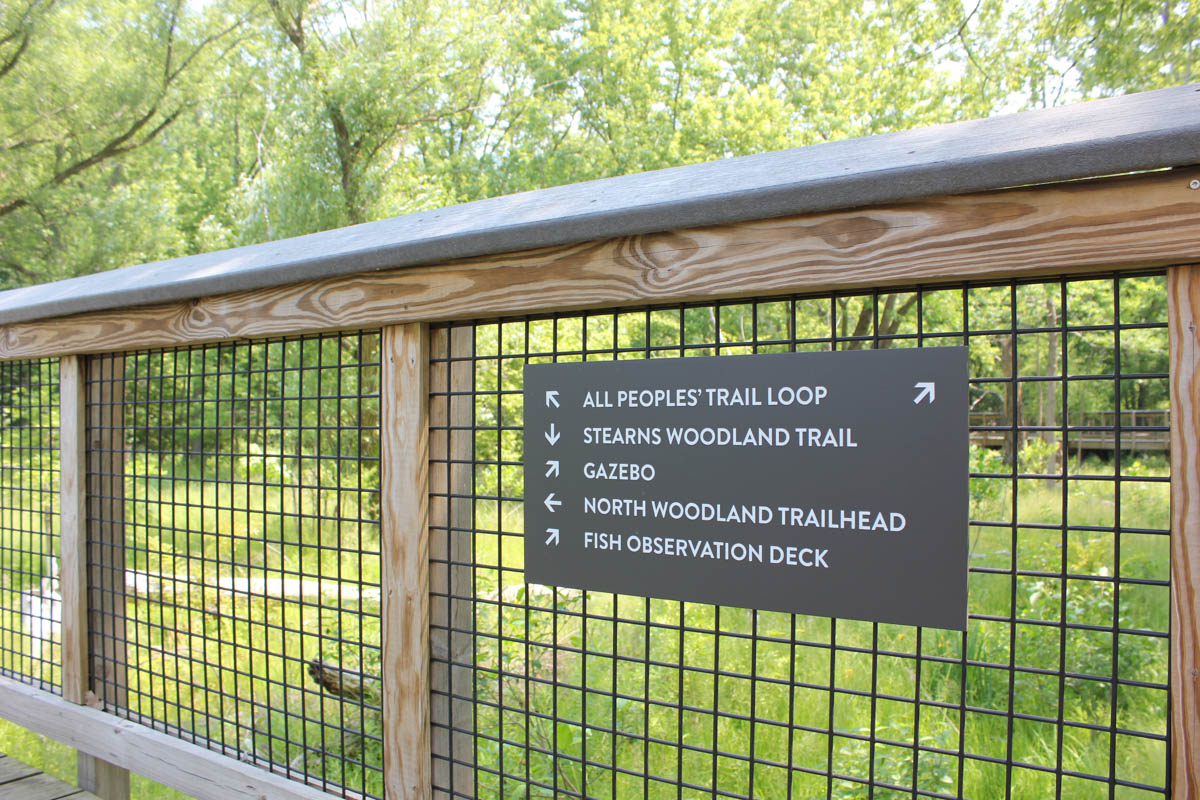
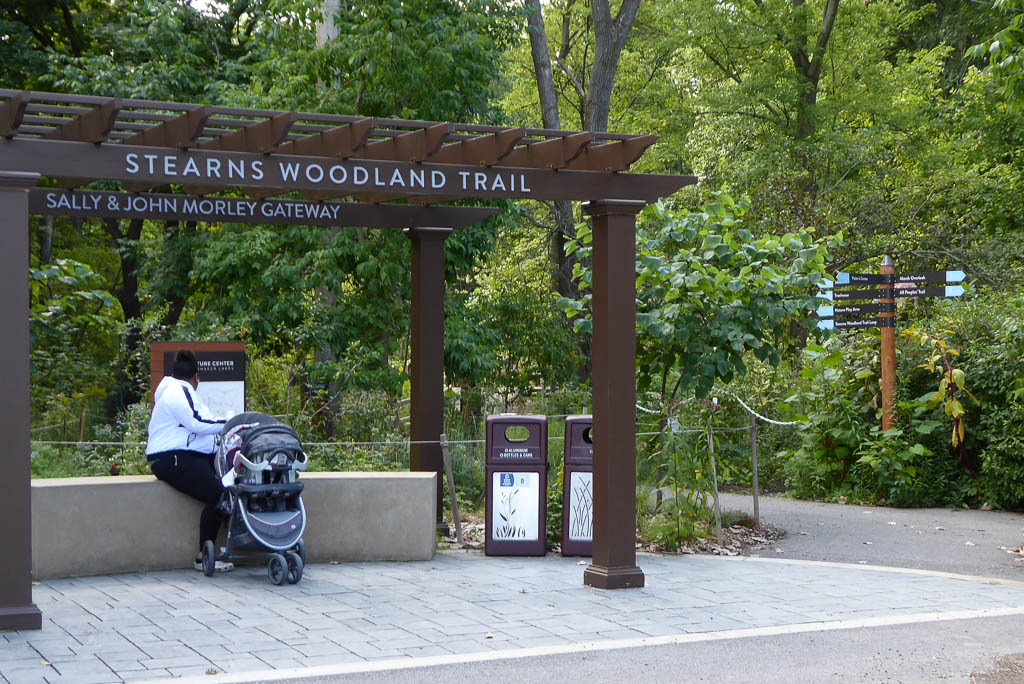
The meandering trails throughout the magnificent beauty of the Nature Center created a sizable wayfinding challenge. We wanted visitors to feel like they could leisurely unwind while winding through the 20-acre property, but still always feel confident knowing where they were and how to get to where they wanted to go.
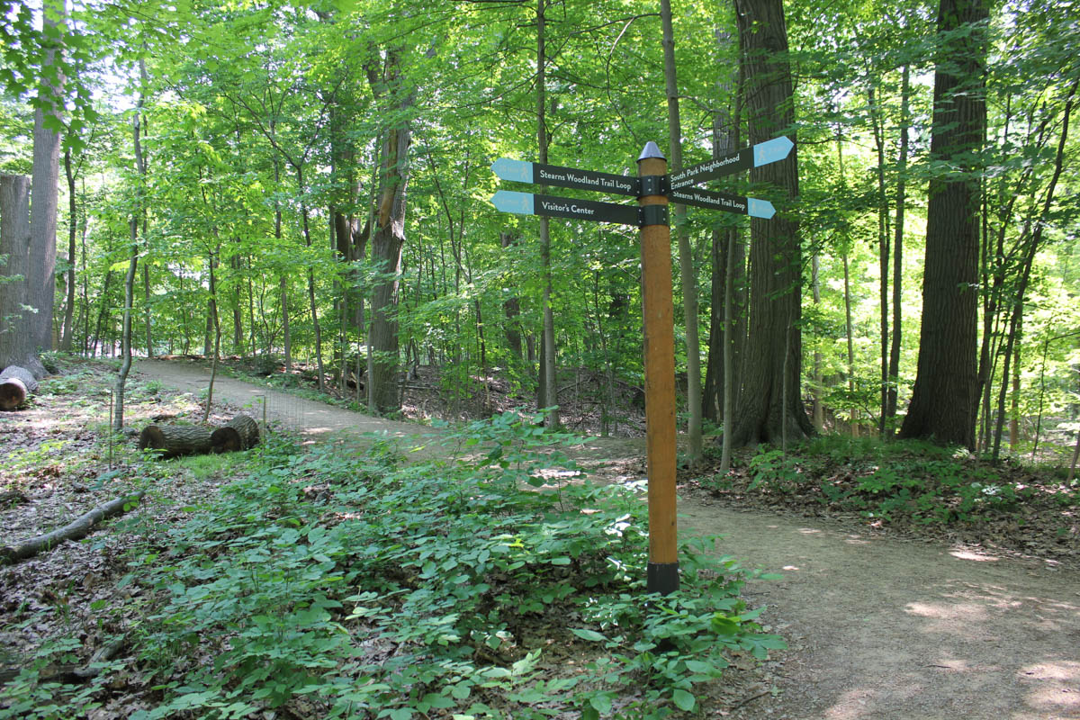
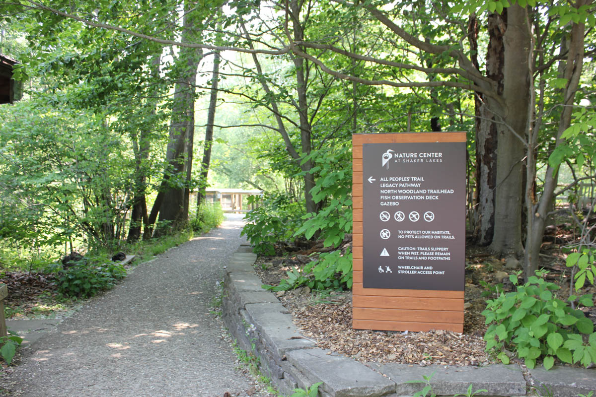
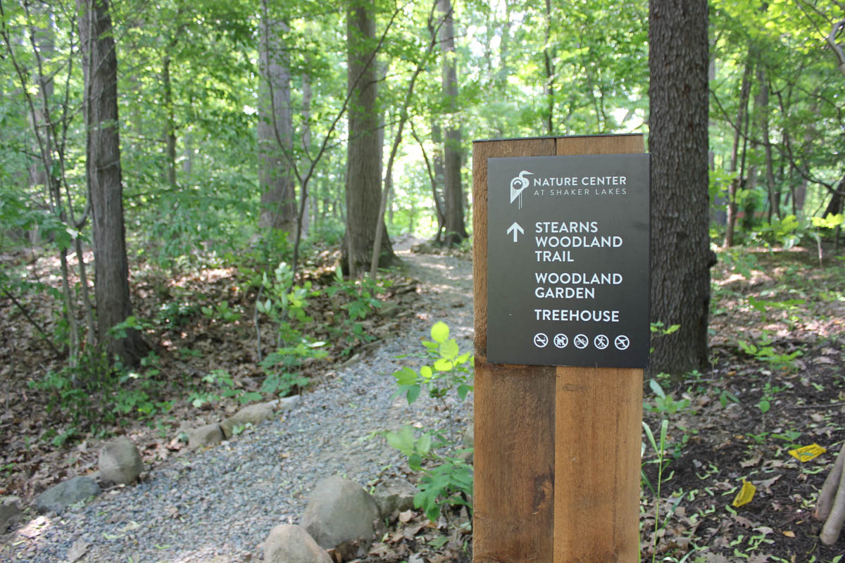
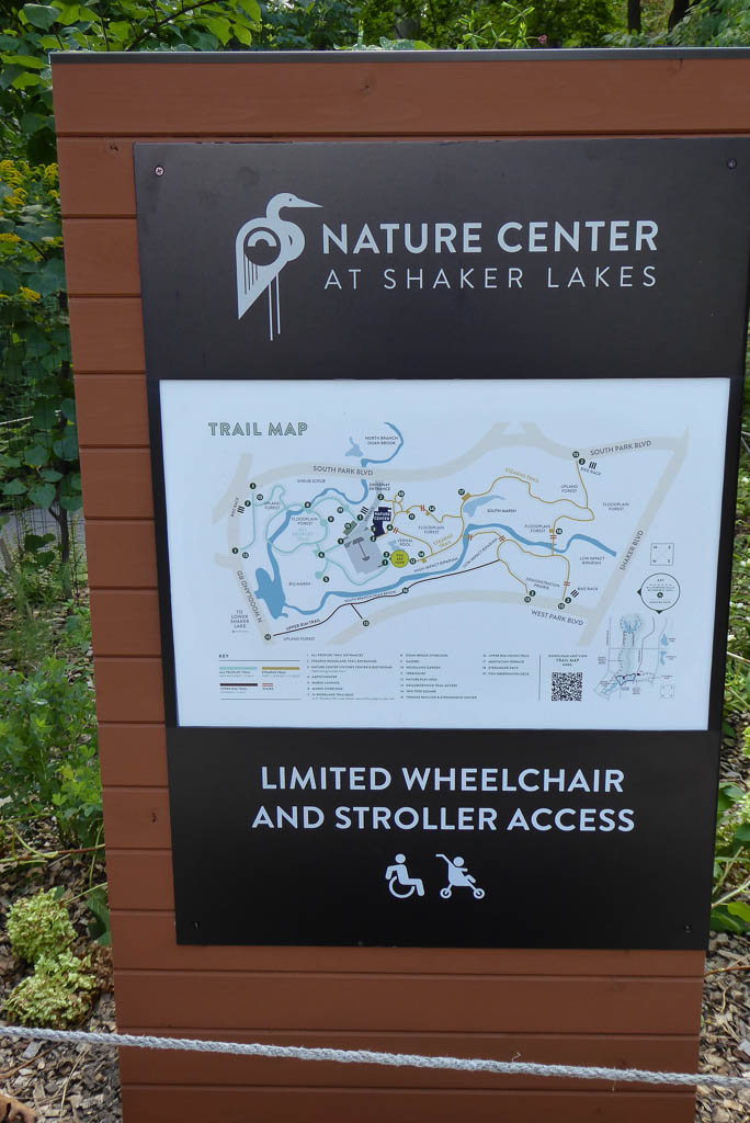
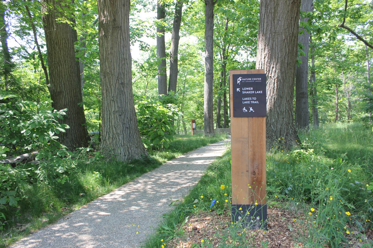
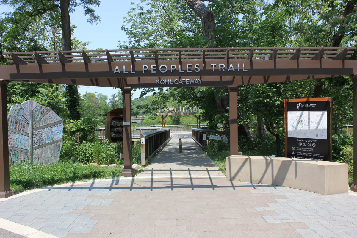
Our design solution was twofold. First, we placed simple-to-read and easily seen wayfinding signage at key points along the trails and boardwalk, including junction points where visitors could clearly keep their bearings and make choices on where to go next. This also included large maps at trailheads allowing people to plan the paths of their visit before embarking on their journeys. More than 80% of the signage featured a natural wooden element, mostly attractive western cedar, to beautifully and seamlessly integrate into the natural surroundings of the trail system.
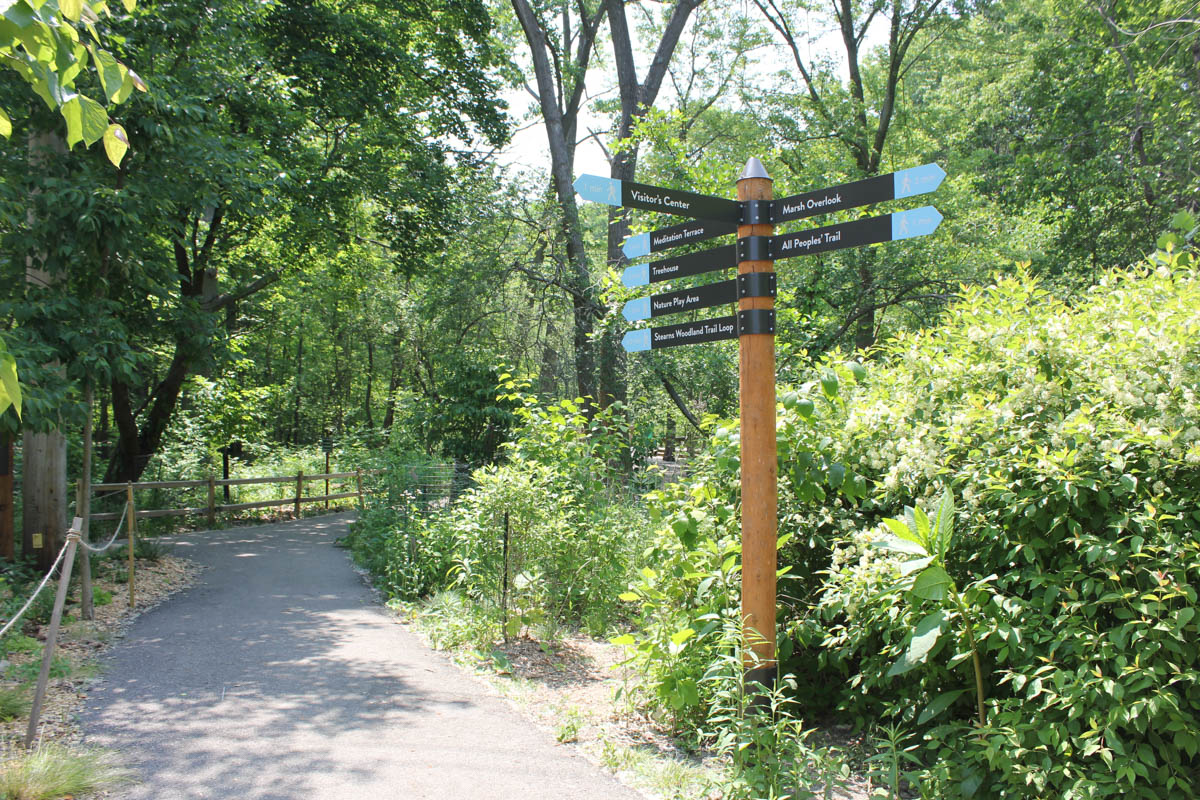
The second element of our design solution was to add a sense of wonder and fun into the wayfinding, providing visitors with inspiration, not just information. This included large wooden signposts sprinkled throughout the trail system that featured several double-sided, aluminum-paneled arrows pointing in different directions and the time it took to walk to the destinations. This design “wink” mimicked the fun signs often seen on vacation featuring the mileage to far-flung places, but also provided real, useful information and inspired a bit of spontaneity for people to head in different directions within the Nature Center.
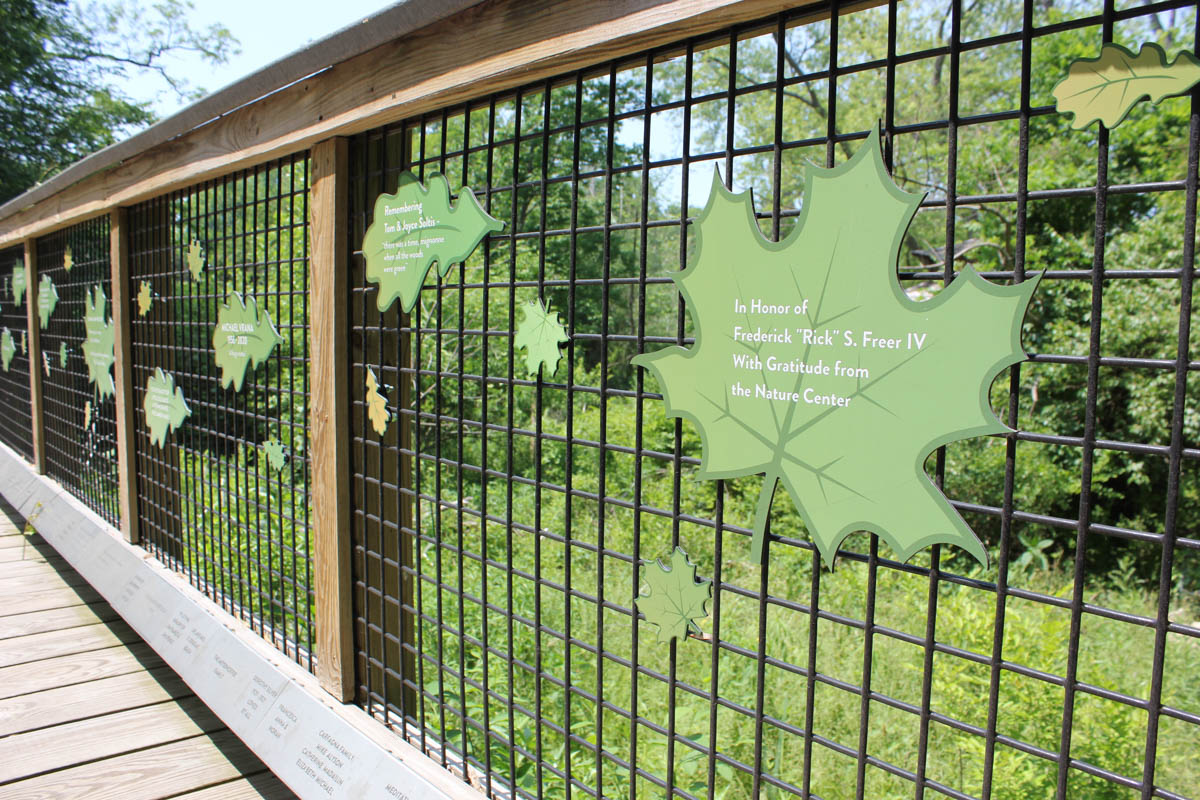
But our wayfinding wasn’t just about moving people from point A to B. We also used the same natural wood and metal materials to create signs throughout the property calling out indigenous trees, interesting plants and flowing waterways. Rather than inspiring movement, these signs purposefully encouraged people to stop and enjoy the moment.
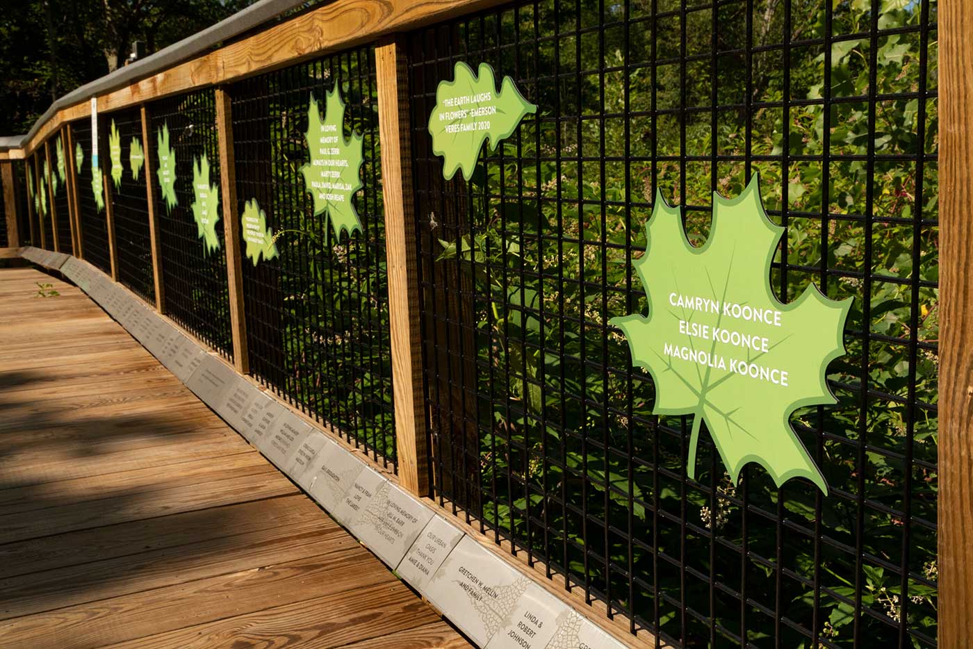

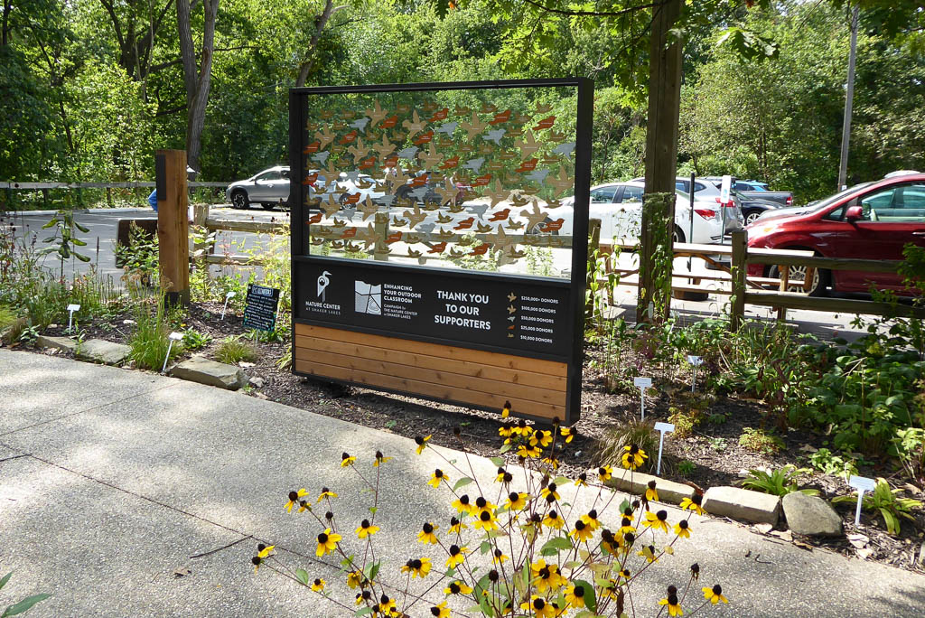
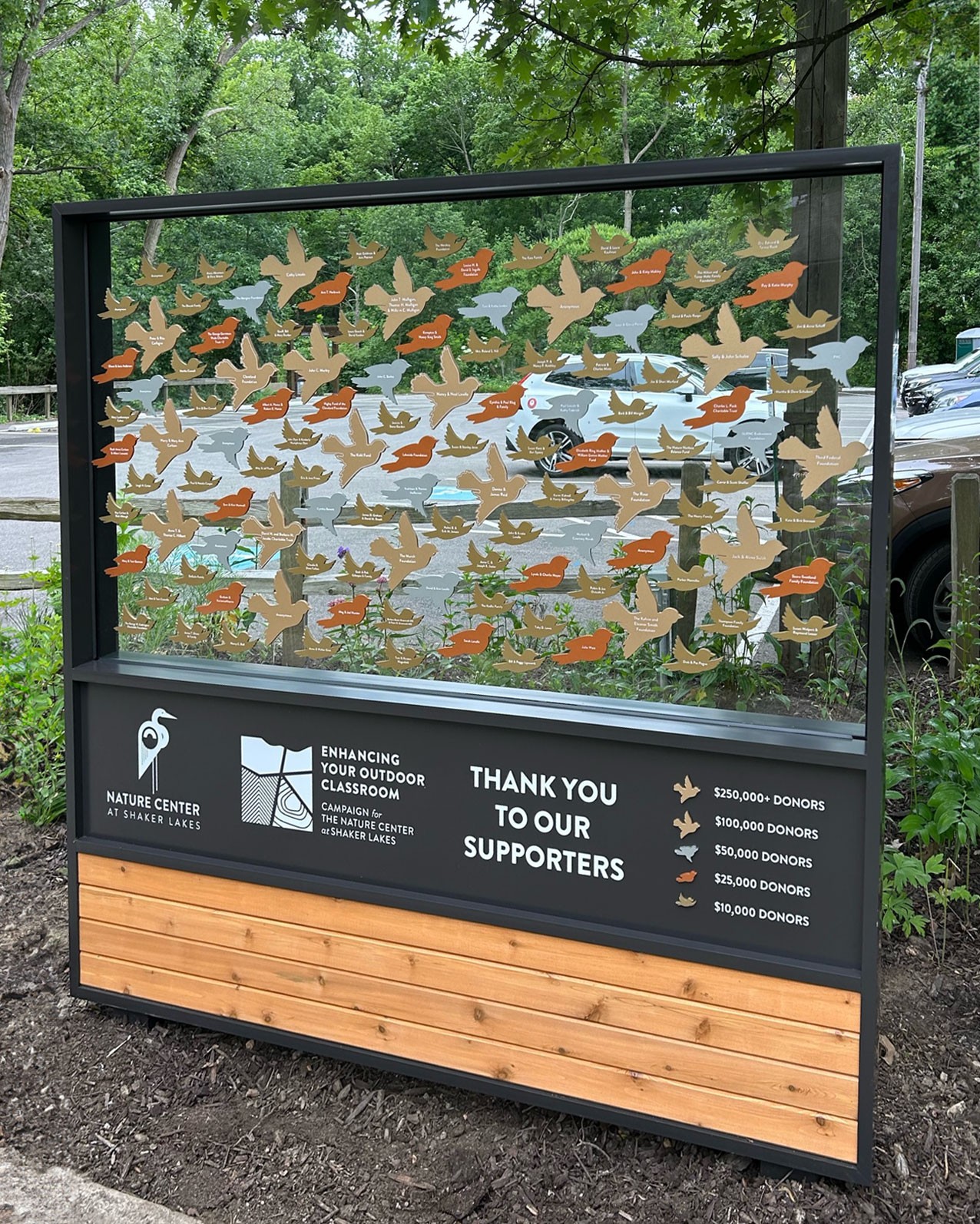
The goodwill of donors is what makes the Nature Center possible. We incorporated several design elements throughout the property dedicated to recognizing the people who’ve donated to the revitalization efforts.
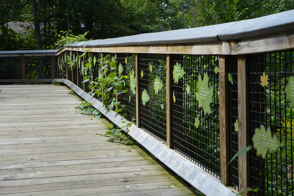
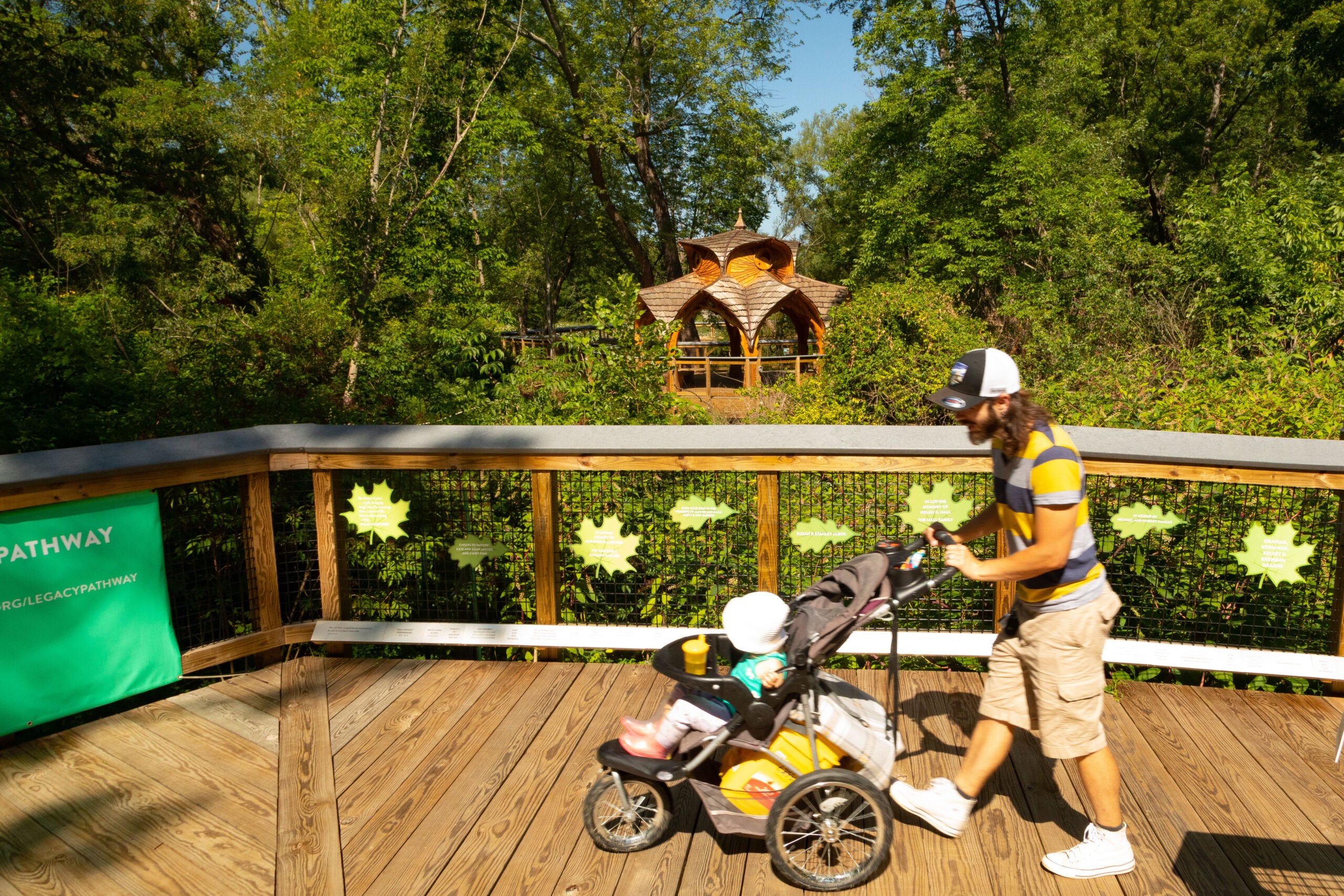
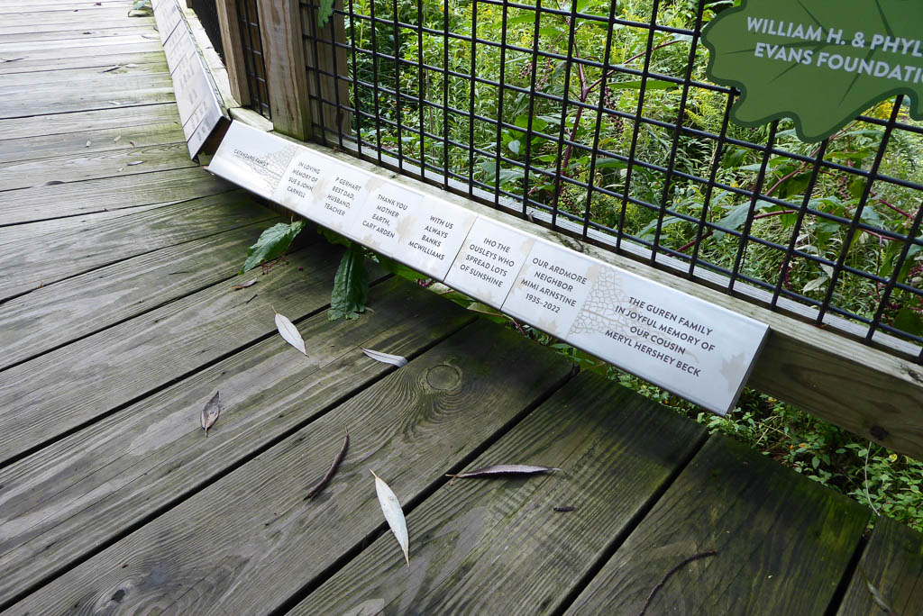
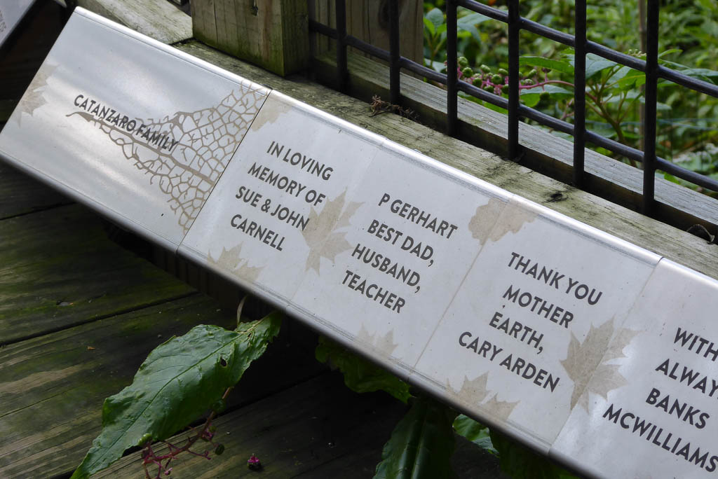
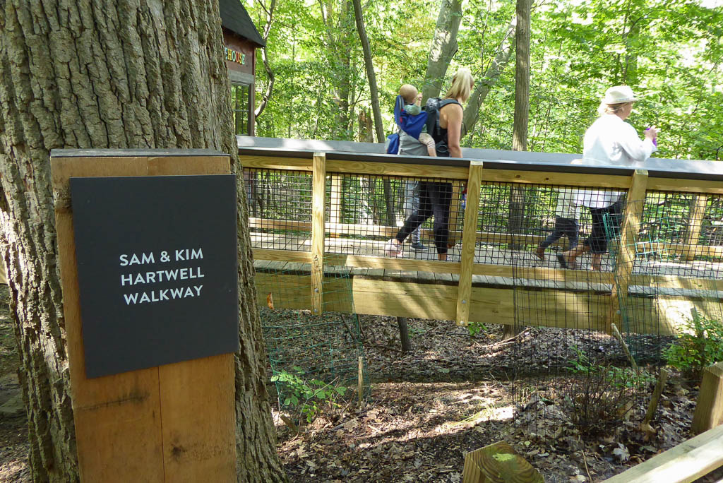
Many of the donations went toward building a new pedestrian boardwalk, named the All Peoples’ Trail, which provides important accessibility for everyone to enjoy the Nature Center. Cladding the boardwalk’s angled toe kick with etched stainless-steel signage provided recognition to the many people who’ve donated to date, and also left plenty of room to add more donors as they join the cause.
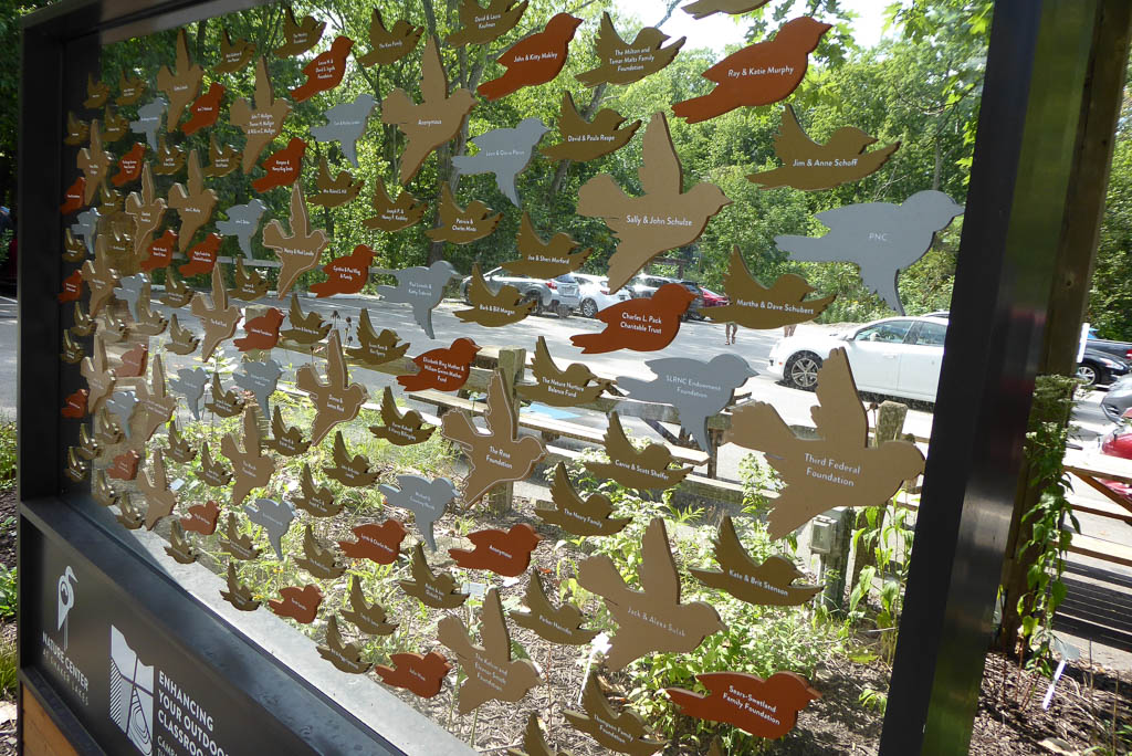
The boardwalk’s metal grid fencing provided a backdrop to feature donors who contributed at a higher level. We put these names on large leaf signage representing trees indigenous to the local area. Using leaf patterns here, and also etched on the toe kick signage below, helped to seamlessly connect both recognition levels to the surrounding area that the money went to preserving.
We specially featured donors who gave $10,000 to $250,000+ on a large 6 ft. x 6 ft. custom sign located in a prominent area of the Nature Center. To continue with our nature-based design theme for donor recognition, these names were printed on individual birds captured in flight between see-through high-UV acrylic panels. The sizes and color of the birds denoted the different donation levels. The result was stunning, as if a visitor was seeing these birds actually flying through the backdrop of the Nature Center.
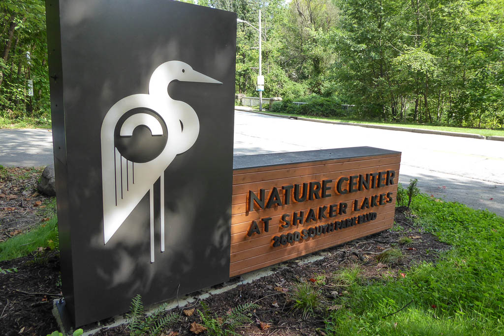
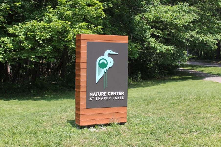
The Nature Center revitalization efforts included an updated identity system and reimagined logo that was completed prior to our engagement on the project. The stunning new heron logo was inspired by the style of famed Ohio modernist artist Charley Harper. To capture this remarkable artwork in our design plan, we seamlessly incorporated the new logo throughout the signage, bringing the new brand to life throughout the property.
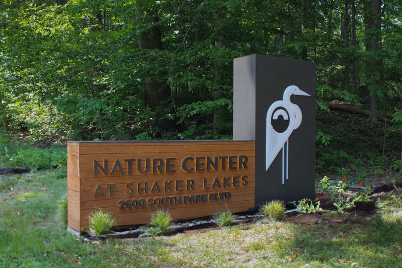
This included a new main entrance sign featuring a 6½ ft. tall illuminated white acrylic logo routed out of a bronze-toned aluminum panel. It created a highly striking and brand-centric entrance experience and was attached to a tongue-and-groove, rough-hewn cedar sign with halo-lit channel letters that beautifully featured the name and address of the property.

Our carefully crafted design plan cohesively connected an enormous property that traverses many different outdoor areas. Using nature as the North Star in every design element, the Forcade team helped to continue this important location’s longstanding tradition of bringing the benefits of the natural environment to the people of metro Cleveland.