In the swirl of the global pandemic and recession, at a time where the healthcare industry’s margins are razor-thin, where does an organization find resources to fund and fuel innovations
On December 12, 2020 Northwest Lower Michigan experienced its first winter storm of the season. And combined with holiday lights and a wood-burning fireplace, it made for some spectacularly festive views. Blu, our 19-month-old Vizsla especially enjoyed a return to smashing through snowdrifts.
But imagine if you were a tree in the woods, rooted in place and dealing with this onslaught.
Individually, each snowflake is manageable. During the course of the storm, there are millions that float by in their seemingly innocuous trajectory. However for those that land, the weight becomes less and less manageable until ultimately, the tree is bent almost beyond recognition. Some snap under the strain.
But wait - aren’t all trees able to handle this? What is it that assures some survive? The answer lies in their design.
Some deciduous trees have shed their leaves, once useful for photosynthesis; but in a snowstorm they become a liability. Many trees invest in multiple trunks using different angles to share the burden of feeding the main body. Similarly, coniferous trees with a solid base seem to manage the additional weight more easily.
In the middle of a forest, however, some trees put all their energy into one primary trunk as they seek sunlight in competition with taller trees. They hold their leaves longer to maximize their investment as more sunlight becomes available later in the year. And as they invest in concentrations of leaves or needles at higher altitudes, they sacrifice the necessary balance of a strong, stable base.
Okay, so all these hiker’s observations may be interesting (or not), but how do they relate to wayfinding?

Wayfinding’s “Winter Storm Effect”
Think of your staff: the hardworking caregivers circulating through the halls everyday, posted at unit desks or in offices close to public circulation. Much like the tree in the middle of the woods, they are rooted to their units, their routines. They see people “float by in their seemingly innocuous trajectory.” However for those that “land,” those in need of help, the weight of distraction, interruption and personal escort become less and less manageable.
But wait - aren’t healthcare cultures and facilities meant to handle this? What is it that assures that some survive? The answer, again, lies in their design.
Yes, you have a policy to greet everyone with eye contact, a warm smile and an offer to help if needed. But the combined “weight” of these interventions may eventually cause your culture to snap. Mitigate this by designing a system of proactive wayfinding elements so guests are empowered rather than asking for help.
- The problem of a single trunk
- Relying on the elusive “silver bullet” to solve wayfinding challenges, whether you’ve been sold a digital platform or physical signage, negates other potential means of navigating for those who will ultimately need help.
- Updating tools is always a challenge in healthcare cultures, though we know that almost as soon as they’re launched they can be outdated. Using several platforms, managed by multiple departments only exacerbates the disconnects - for staff and patients.
- Like the trees that invest in multiple trunks at multiple angles from a single starting point, we can help design a system that diversifies the burden of communication (print, digital, verbal, training and the built environment) to better support your organization’s wayfinding culture.
- The problem of hanging onto leaves
- You may find you’ve invested a lot of money in those tools, and “by God you’re going to get your money’s worth.”
- But anyone who studies complex communication systems knows that it takes multiple efforts, at multiple levels, to maintain the health of those systems. Learning and adapting must be part of the process.
- An early focus on a human-centered approach to assessment can help you avoid investments that come at too high a cost: both financially and for your patient/staff experience reputation.
- The problem of imbalance
- Often the burden of sharing wayfinding information falls disproportionately on those who are least equipped to manage it: volunteers, busy nurse practitioners, even contract staff in coffee stands or parking garages.
- Those in decision-making roles may fail to see this burden, since their experience of the problem is less evident. They may ultimately see it reflected in lower HCAHPS scores, but by then it’s too late.
- Like the balanced conifer, build a strong base of wayfinding communication by training everyone: staff, volunteers and contractors to consistently reference integrated tools in a multi-pronged approach to communicating concisely and correctly. And share the knowledge with patients and families throughout their journey.


The time to prepare is now.
With the widespread release of vaccines, we can look toward a day where COVID-19, with its visitor restrictions, won’t be as much of a barrier to human interaction. Eventually that “snowstorm” of patients, family members, new residents, vendors and others will return to the physical and virtual hallways of your institution: each with their own trajectory. The time to prepare for this eventuality is now. Like the trees with multiple trunks, willing to shed their old leaves or designed with a solid base, your culture, people and facilities will be better able to manage the inevitable - by design.
These challenges are magnified with the pandemic-related loss of staff and the inability of many healthcare cultures to maintain a strong financial base. Early investments in proactive wayfinding design can ease this burden. Like a successful tree, starting from a strong strategic base, making smaller, more diverse investments and maintaining daily discipline while adapting, learning and branching out - a flexible wayfinding approach will result in positive outcomes for months and years to come.
No matter what storms arise.
Gain an understanding of both physical and informational environments
Which interaction would you choose?
Scenario 1
You’re not feeling well: dizzy, a bit nauseated, a headache that keeps coming and going, occasional blurred vision. So you make an appointment with your primary care doctor. Once you sit down with him, he asks about your symptoms. You share the details, telling him you worry that this might be some form of brain cancer. He takes your word for it, schedules an MRI and refers you directly to a brain surgeon.
Scenario 2
You’re not feeling well so you make an appointment with your primary care doctor. Once you sit down with her, she asks about your symptoms. You share the details, telling her you worry that this might be some form of brain cancer. She asks a few more questions about what you’ve been doing since the symptoms began, gives you a quick but thorough exam, then tells you you’re dehydrated and prescribes Gatorade and a good nights sleep.
Now this is decidedly not brain surgery. Most would obviously choose the interaction in the Scenario 2. And yet, in the world of healthcare wayfinding, we often find that clients approach a consultant expecting that they’ll respond like the doctor in Scenario 1. In fact, they may have reinforced their own assumptions becoming more convinced of the worst-case scenario:
- They’ve worked hard to build a Request for Proposal that details the very problem they’ve diagnosed for themselves.
- They look for vendors who will do both the MRI and the brain surgery, choosing the vendor who can demonstrate they’ve done the same work on someone that looks just like them.
- Or worse, mandating the work go to the lowest bidder. Or even worse, choosing the firm that built the MRI machine (e.g. a sign company) to do it all.
Sure, these scenarios are exaggerated, but we’ve shared them to illustrate a point: as consultants that care about your outcomes, our standard of practice does not allow us to take on a wayfinding project without first doing an initial assessment. Like the doc in Scenario 2, it may take a bit longer to understand the decisions that led you to your current status; we may need to do a quick physical review of your facility and interview both staff and patients/families to gain a clearer understanding of the challenges they face. But only by doing this can we give you an accurate assessment of how we might help truly resolve the problem. In the long run, the up-front investment can pay off exponentially in ROI.
To continue the analogy, there are two aspects to your physical health that a doctor needs to know: 1) the clinical basis for the current condition, and 2) the aspects of your lifestyle that may have caused the condition. Similarly, we need to look closely at the two aspects of your wayfinding challenge: physical and informational.
Physical
The physical environment is often a barrier to wayfinding. Anyone who's ever gone to a complex hospital campus can attest to how confusing and frustrating the experience can be. By taking time to walk the facility with the client team, we use our experienced eyes (and the input of people we meet) to see the things that our clients typically miss.
We’re not saying it’s anyone’s fault. This is mainly because they have “problem blindness,” the fact that familiarity with the facility means they walk by the problem every day, never realizing its impact. This always leads to multiple a-ha moments - “OMG I never realized that was there!” or “why do we use that word?”
The review of the physical environment also includes the nuts and bolts aspects of the work of wayfinding: form, color, scale, materials, reflecting the architecture and the brand, and a study of the existing installed base of standard wayfinding elements: digital tools, printed information, static signage elements.
But what people KNOW is more important than what they SEE.
Informational
We start off by making observations in the physical environment. But we may very well find that empowering staff and patients with information in advance can resolve many of the wayfinding issues, often at a much lower cost, with more successful outcomes.
Working with our clients in an iterative process, we learn more about internal constraints and opportunities while at the same time understanding the “levers” within the culture that determine how things get done. Only then can we design a process to navigate these opportunities in ways that will be sustainable.
This initial process of discovery results in multiple low cost, high impact ways to improve wayfinding. Through site tours, observations and team meetings, we develop a customized action plan to improve both the spaces you occupy and your staff effectiveness in delivering the wayfinding experience.
We know for sure that all clients have limited resources to expend on this effort, especially in the new landscape of COVID. Further, we understand that this might go beyond the scope our clients anticipate for the initial project. But we also know that wayfinding signage alone may solve a short-term problem, but will not fully address the underlying condition. We help our clients to be effective stewards of the resources they have, testing and proving the value of wayfinding tools before expensive long-term investments are made.

The Details
Now you might be asking, what does it cost to do this initial assessment? Of course, we can’t say for sure without understanding more about the size of your facilities and the scale of the problem, but of course this all begins with a conversation. Our initial assessment phase includes the following:
- Virtual research: In advance of the trip, we schedule multiple opportunities to meet virtually with representatives from across the organization to understand the issues you face in terms of terminology, connectivity and the tools you use to deliver wayfinding. These cross-functional calls allow many voices to be heard and stories to be shared - safely, at a distance.
- Three to five days on site for “boots on the ground” research:
- Observing patient and staff behaviors, interviewing individuals to understand workarounds that they may have designed for lack of a better system.
- Meeting with leaders across disciplines to assess the “interoperability” of the current wayfinding system, physically and informationally.
- Talking with both staff and patients to understand what challenges they’ve faced; often this information is freely shared in the moment because we are neutral facilitators, and are there to actually solve the problems they’re sharing.
- Designating one or two problematic routes to which we might apply new wayfinding logic and tools.
- Scheduling meetings with internal patient advocacy groups such as Patient Family Advisory Councils.
- Photographing the environment and building a data set for further study.
- Final deliverables:
- A comprehensive initial needs assessment that includes potential terminology and tools as part of an initial testing phase;
- A photograph-driven narrative of proposed sign types to prototype along a designated route, and a process for design, specification and fabrication of the prototype test, and
- Once prototypes are built, a process for touring the facility and receiving feedback from patients, visitors, volunteers and staff.
Summary
There is no silver bullet for wayfinding. Signage alone cannot solve the problems of unfortunate architectural decisions, and the latest digital technology is an expensive diversion if not handled as part of a systemic wayfinding strategy.
An empowered staff member or volunteer understands the behaviors and tools that work together to deliver an experience. An empowered patient comes to you confident, stress-free and ready to address their primary concern: the health issue at hand. By listening carefully, building trust and uncovering your hidden assets, we can strengthen your facilities, systems, people and culture to catalyze sustainable change from within for greater experience impact.
That was the question.
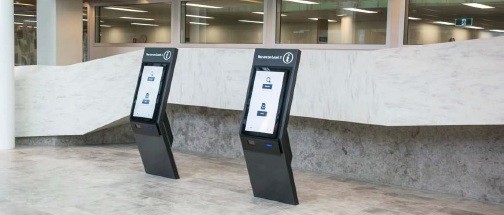
As part of a broad digital strategy, Westmead Hospital, a 900 million dollar redevelopment project in Sydney Australia, was contemplating the potential impact of a kiosk-based “arrival” system. They engaged in a research process led by ID/Lab, a Melbourne-based design consultancy which has been developing a comprehensive wayfinding design strategy for Westmead. Connect_CX were asked to consult and peer review this research process and findings.
We established from the outset that one potential finding must be that kiosks are not necessary. Based on extensive surveys and interviews with staff, patients and family members, the goal was to first define the need for such investment, and second to understand the terms by which the system might be designed and integrated into the broader wayfinding strategy and IT environment.
Data Sources
- Surveying staff over two weeks and collecting 3288 responses.
- Engaging in 8 focus group workshops with 34 consumers, a diverse range across gender, age, language, ethnicity and consumer types, to explore and map their experiences with Westmead services.
- Interviewing 12 staff members/volunteers to better understand their work processes and interactions with consumers.
- ID LAB also spent time observing key service points in Westmead and consumers interacting with the recent installed digital kiosks at Blacktown Hospital, located 13km from Westmead’s campus.
- These primary data were supplemented by existing clinical research and reviews of how digital wayfinding technology has been deployed in other hospitals around the world.
“On a busy day probably 50% of our time is spent directing patients — navigation kiosks would be really helpful. If patients could “arrive” themselves that would also save a heap of time — that’s a significant part of the job.”
— Therapies Clinic reception staff
Establishing the need: key findings
We’ve written extensively on the need to design the nouns and the verbs when a health system considers an investment such as this. Facilities and operations may be able to check a box once the tender is complete and the purchase order is signed, but every person around these new kiosks must have a basic knowledge of how they work in order for the investment to pay off, and processes must also be adjusted accordingly.
Additionally, they must integrate with other forms of communication so that users are not confused by the provision of different content, including terminology, numbering systems, map graphics and the like.
And finally, they need to be designed and tested alongside end users (staff, volunteers, patients and families) so that designers/developers have no blind spots with respect to content, usability, form, maintenance, etc.
These key findings are recorded in the report:
1. There are significant problems with the entire system of wayfinding communications tools at Westmead, which results in high costs on staff time and negative consumer experiences.
2. A vast amount of staff time at points of service is spent on the following:
- 26% “arriving” patients,
- 24% wayfinding directions,
- 20% booking appointments,
- 8% patient enquiries,
- 12% other administrative tasks.
3. Consumer and staff attitudes towards self-service kiosks are generally positive, as long as they supplement rather than replace options to interact with service staff.
“If people could self-serve using a kiosk it would free me to spend more time better organizing the appointments, speaking with patients on the phone to confirm their details and create a better experience for them.”
— Dental reception staff
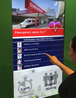
4. Consumer frustrations are most acute when dealing with the Emergency Department, but simple interventions could help alleviate negative experiences.
“Rather than standing at triage and being ignored, it would be good to know earlier how long you need to wait…real time updates would help a lot with our anxiety when waiting.”
— Jacqueline, ED and outpatient consumer
5. Consumers want to be able to book appointments online and access more information online about planning their journeys to appointments within the hospital. The kiosk should integrate with these pre-visit efforts.
“My one wish is that we could book outpatient appointments online — I’ve waited 45 minutes on the phone to do a simple administrative procedure.”
— Belinda, ED/outpatient consumer
6. Consumers want better and more flexible queue management systems at appointments and to avoid duplicate filling in of health data (via digital tools, printed forms, verbal confirmation, etc.).
7. Consumers are confused about the hospital services and amenities that are available to them, and receive conflicting information.
8. Students on hospital placements have distinct wayfinding needs that entail general familiarity with the hospital, and this need is not currently well served.
9. Appointment letters are inconsistently designed and often ineffective in communicating wayfinding information.
Understanding the User: Consumer views on kiosk design
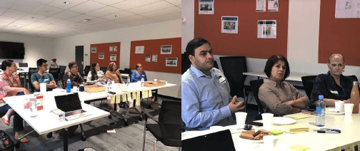
The focus groups were especially helpful in determining design considerations for the kiosk. On the whole, attitudes toward kiosks were positive and many consumers expressed their preference to use them rather than approaching staff. These were their comments:
- Kiosk wayfinding directions must align with the physical wayfinding system and signage.
- Kiosks must be extremely simple to use.
- Wayfinding directions should be provided in a portable form, either printed or sent to a smartphone.
- Navigation kiosks should be strategically located at multiple sites around the hospital.
- Multilingual options will be an important feature.
- Volunteers available to personally assist using the kiosks would be welcome.
“I would not use the kiosk if it looked dirty.”
— Andrew, ED and therapy patient
- Hygiene management should be factored in to the design.
- Kiosks could assist with the discovery of services and amenities.
Additional Recommendations
- Integrate wayfinding and service design expertise into the design and testing of kiosks. Avoid purchasing an off-the-shelf system that doesn’t take into account the breadth of knowledge and skills of designers who have heard firsthand the stories of consumers and staff.
- Align information provided by kiosks with the wayfinding and service information provided in pre-visit communications, the built environment and by staff.
- Implement self-service arrival kiosks at all clinics where feasible: once this is established, make it a consistent amenity across Westmead campuses.
- Design waiting experiences across the hospital to align with best practices around the psychology of waiting. Review emergency department entrance and admission process, the design of the waiting areas and frequency of rounding by staff.
- Ensure kiosk designs are sufficiently prototyped and tested with users before widely deploying — a lot can be learned through prototyping with tablets.
Next Steps
Westmead Hospital has integrated these findings into a tender process and is now seeking software development and hardware providers to begin the design process. ID/Lab, as primary wayfinding consultant, will be integrated with this team once a decision has been reached.
Research Team
- Dr. Julian Waters-Lynch, Industry Fellow in Innovation and Entrepreneurship at RMIT University;
- Michel Verheem, founder of ID/Lab and co-author of this report;
- Magdalena Zatorska, ID/Lab designer and project manager; and
- Mark VanderKlipp of Connect_CX, peer reviewer.
Signage seems like a logical solution if people are getting lost, but it’s important to think about the lack of information that caused people to actually be lost. How might they have been better supported by information?
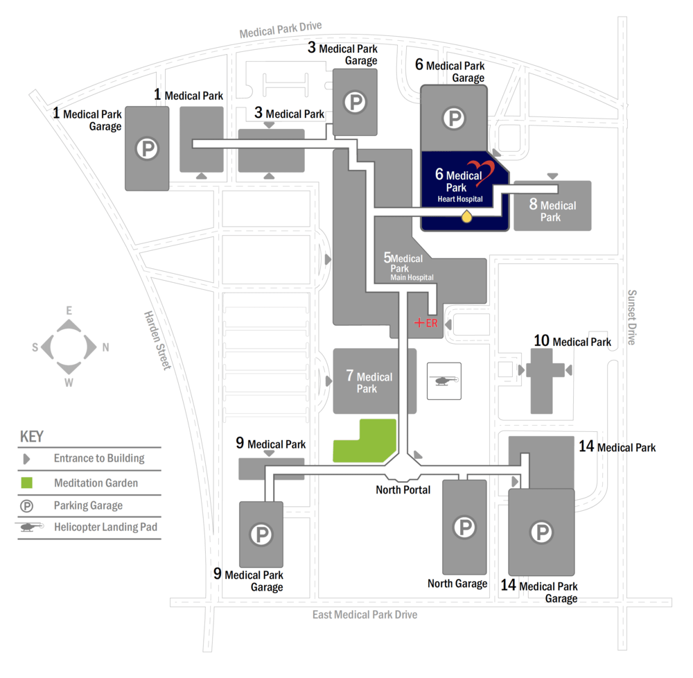
Have you ever found yourself lost in a hospital? Have you ever gone into one entrance only to realize you should be at a completely different entrance in a building around the corner?
This happens every day in hospitals all over the world. When we are in acute situations we tend to not have the same attention to detail as we might in a more relaxed state. This makes getting around so much more frustrating than we would like. As hospitals grow over time they expand in ways that make finding our way challenging.
While we have become one with our technology - in acute situations we find it more comforting to talk to someone, a real live human being! With that we are often given detailed directions verbally and find ourselves lost two turns into what we were told.
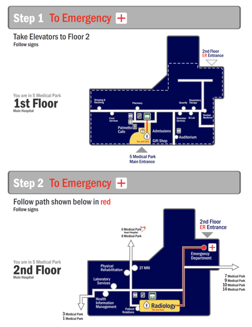
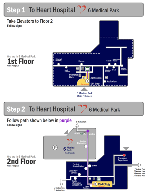
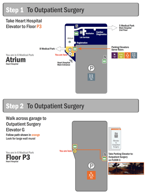
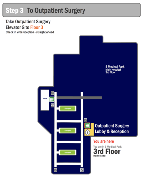
For this we suggest a route map - a small handout that can be given to the patient or visitor showing a clear path to their destination.
