That was the question.
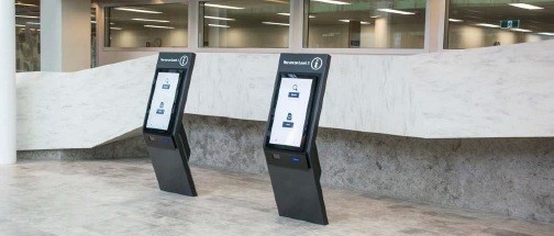
As part of a broad digital strategy, Westmead Hospital, a 900 million dollar redevelopment project in Sydney Australia, was contemplating the potential impact of a kiosk-based “arrival” system. They engaged in a research process led by ID/Lab, a Melbourne-based design consultancy which has been developing a comprehensive wayfinding design strategy for Westmead. Connect_CX were asked to consult and peer review this research process and findings.
We established from the outset that one potential finding must be that kiosks are not necessary. Based on extensive surveys and interviews with staff, patients and family members, the goal was to first define the need for such investment, and second to understand the terms by which the system might be designed and integrated into the broader wayfinding strategy and IT environment.
Data Sources
- Surveying staff over two weeks and collecting 3288 responses.
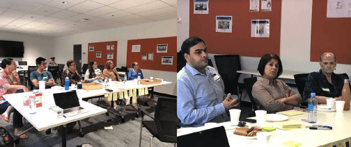
- Engaging in 8 focus group workshops with 34 consumers, a diverse range across gender, age, language, ethnicity and consumer types, to explore and map their experiences with Westmead services.
- Interviewing 12 staff members/volunteers to better understand their work processes and interactions with consumers.
- ID LAB also spent time observing key service points in Westmead and consumers interacting with the recent installed digital kiosks at Blacktown Hospital, located 13km from Westmead’s campus.
- These primary data were supplemented by existing clinical research and reviews of how digital wayfinding technology has been deployed in other hospitals around the world.
“On a busy day probably 50% of our time is spent directing patients — navigation kiosks would be really helpful. If patients could “arrive” themselves that would also save a heap of time — that’s a significant part of the job.”
— Therapies Clinic reception staff
Establishing the need: key findings
We’ve written extensively on the need to design the nouns and the verbs when a health system considers an investment such as this. Facilities and operations may be able to check a box once the tender is complete and the purchase order is signed, but every person around these new kiosks must have a basic knowledge of how they work in order for the investment to pay off, and processes must also be adjusted accordingly.
Additionally, they must integrate with other forms of communication so that users are not confused by the provision of different content, including terminology, numbering systems, map graphics and the like.
And finally, they need to be designed and tested alongside end users (staff, volunteers, patients and families) so that designers/developers have no blind spots with respect to content, usability, form, maintenance, etc.
These key findings are recorded in the report:
1. There are significant problems with the entire system of wayfinding communications tools at Westmead, which results in high costs on staff time and negative consumer experiences.
2. A vast amount of staff time at points of service is spent on the following:
- 26% “arriving” patients,
- 24% wayfinding directions,
- 20% booking appointments,
- 8% patient enquiries,
- 12% other administrative tasks.
3. Consumer and staff attitudes towards self-service kiosks are generally positive, as long as they supplement rather than replace options to interact with service staff.
“If people could self-serve using a kiosk it would free me to spend more time better organizing the appointments, speaking with patients on the phone to confirm their details and create a better experience for them.”
— Dental reception staff

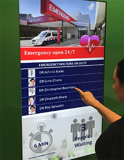
4. Consumer frustrations are most acute when dealing with the Emergency Department, but simple interventions could help alleviate negative experiences.
“Rather than standing at triage and being ignored, it would be good to know earlier how long you need to wait…real time updates would help a lot with our anxiety when waiting.”
— Jacqueline, ED and outpatient consumer
5. Consumers want to be able to book appointments online and access more information online about planning their journeys to appointments within the hospital. The kiosk should integrate with these pre-visit efforts.
“My one wish is that we could book outpatient appointments online — I’ve waited 45 minutes on the phone to do a simple administrative procedure.”
— Belinda, ED/outpatient consumer
6. Consumers want better and more flexible queue management systems at appointments and to avoid duplicate filling in of health data (via digital tools, printed forms, verbal confirmation, etc.).
7. Consumers are confused about the hospital services and amenities that are available to them, and receive conflicting information.
8. Students on hospital placements have distinct wayfinding needs that entail general familiarity with the hospital, and this need is not currently well served.
9. Appointment letters are inconsistently designed and often ineffective in communicating wayfinding information.

Understanding the User: Consumer views on kiosk design
The focus groups were especially helpful in determining design considerations for the kiosk. On the whole, attitudes toward kiosks were positive and many consumers expressed their preference to use them rather than approaching staff. These were their comments:
- Kiosk wayfinding directions must align with the physical wayfinding system and signage.
- Kiosks must be extremely simple to use.
- Wayfinding directions should be provided in a portable form, either printed or sent to a smartphone.
- Navigation kiosks should be strategically located at multiple sites around the hospital.
- Multilingual options will be an important feature.
- Volunteers available to personally assist using the kiosks would be welcome.
“I would not use the kiosk if it looked dirty.”
— Andrew, ED and therapy patient
- Hygiene management should be factored in to the design.
- Kiosks could assist with the discovery of services and amenities.
Additional Recommendations
- Integrate wayfinding and service design expertise into the design and testing of kiosks. Avoid purchasing an off-the-shelf system that doesn’t take into account the breadth of knowledge and skills of designers who have heard firsthand the stories of consumers and staff.
- Align information provided by kiosks with the wayfinding and service information provided in pre-visit communications, the built environment and by staff.
- Implement self-service arrival kiosks at all clinics where feasible: once this is established, make it a consistent amenity across Westmead campuses.
- Design waiting experiences across the hospital to align with best practices around the psychology of waiting. Review emergency department entrance and admission process, the design of the waiting areas and frequency of rounding by staff.
- Ensure kiosk designs are sufficiently prototyped and tested with users before widely deploying — a lot can be learned through prototyping with tablets.
Next Steps
Westmead Hospital has integrated these findings into a tender process and is now seeking software development and hardware providers to begin the design process. ID/Lab, as primary wayfinding consultant, will be integrated with this team once a decision has been reached.
Research Team
- Dr. Julian Waters-Lynch, Industry Fellow in Innovation and Entrepreneurship at RMIT University;
- Michel Verheem, founder of ID/Lab and co-author of this report;
- Magdalena Zatorska, ID/Lab designer and project manager; and
- Mark VanderKlipp of Connect_CX, peer reviewer.


